Let us create a report that provides a visual representation of the actual action periods for calculation records.
In addition to a visual demonstration of the displacement of records by action period, this report introduces the Gantt chart form control.
A Gantt chart is a chart of intervals on a time scale (fig. 18.35) that reflects usage of resources (series) by objects (points).
To better understand components of a Gantt cart, let us examine the chart that you will get as a result of this tutorial.
As we have already mentioned, for each employee the chart displays actual action periods for each record of each calculation type available for that employee.
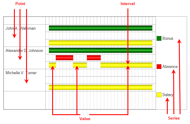
Fig. 18.35. Example Gantt chart
A Gantt chart is a total of points, series, and values for each point-series combination.
In this case, the chart points are employees and the series are calculation types. Thus, for each employee there is a certain chart value for each of the series (for each calculation type).
Gantt chart values are objects generated automatically based on the points and series defined for this chart.
These objects represent a collection of intervals, in other words, they can contain not just one, but multiple intervals, which exist for a point-series combination (by default, GanttChartValue objects are created containing no intervals). A developer can create a chart value by specifying the point and series and then adding any number of intervals to the collection.
All intervals for all chart values are arranged in relation to a single time axis, which shows their relative positions.
Now we will briefly explain what you will do next.
As source data for the chart, you will take data from the Accruals calculation register. Each of the register records contains everything you need to create the chart: employee, calculation type, and the beginning and end of the interval.
All you need to do is use the 1C:Enterprise script tools to arrange all that in a chart.
So, let us proceed.
Next page: In Designer mode