Let us create a report option.
- In Designer, open the data composition schema, and click the Settings tab.
The left pane displays a list of report options.
When you first create report settings, the data composition system automatically creates the Default settings option. You can see this option in the list. Let us add another option. - Click the Add
 button above the list.
 - For the report option name, type RevenueAmounts. For the report option presentation, type Revenue amounts (fig. 13.78).
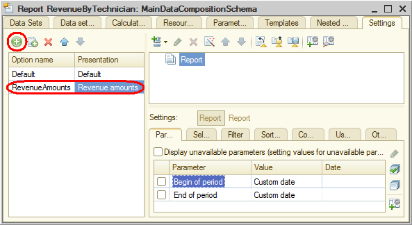
Fig. 13.78. Adding a settings option
You can see that the report structure and all report settings are cleared.
But they are not gone. They are simply invisible because they belong to the Default settings option.
If a report has multiple options, you can only see and edit the settings for the currently selected option. And the other parts of the data composition schema (resources, parameters, and data sets) are not changed. The report data is obtained using the same database query. Only the settings that define the report view are different.
Let us add a chart to the report structure. - Right-click the Report root item and click New chart (fig. 13.79).
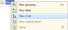
Fig. 13.79. Adding a chart to report structure - Click the Points branch and add a grouping by the Technician field to this branch.
A gauge chart is handy for displaying the share of each technician in the entire revenue amount. For this chart type it is enough to specify points, you do not have to specify series.
One or several report resources are always used as chart values. You have a single Revenue resource (the resource field is marked with a specific icon, so you can easily distinguish it from other fields). - Click the Selected fields tab and select the Revenue field to be displayed in the report.
The report structure should look as follows (fig. 13.80).
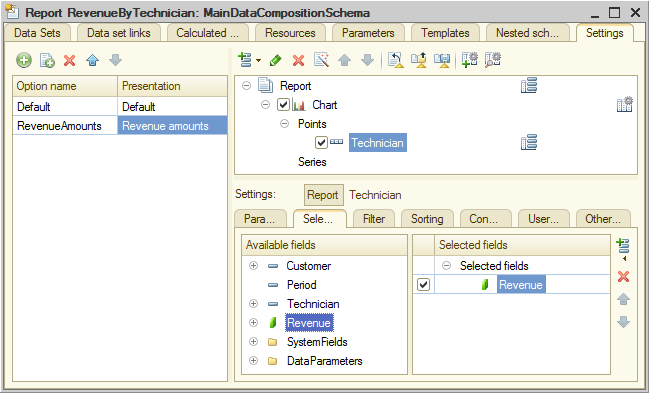
Fig. 13.80. Report structure and chart settings
Important! A chart must always display one or several report resources, otherwise it will return an error. - On the Other settings tab, select Gauge as the chart type (fig. 13.81).
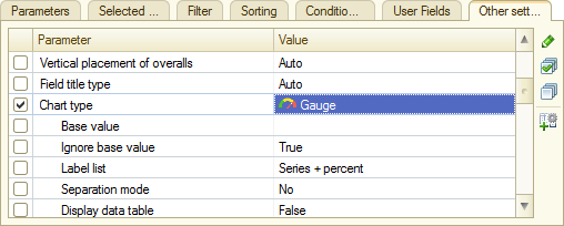
Fig. 13.81. Specifying chart type - Scroll down the list of gauge properties and define the gauge bands: Bad, Good, and Excellent (fig. 13.82).
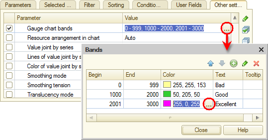
Fig. 13.82. Specifying gauge band settings - Include Begin of period and End of period to the list of user settings and set their Edit mode to Quick access.
Important! You have to specify the user settings for each report option independently because each option has its own user settings.