1C:Analytics. Creating a Dashboard
In the previous articles, we walked through the core capabilities of 1C:Analytics step by step.
First, we installed the system and built simple reports based on data from 1C registers. Then we learned how to work with additional data sources: combining information from multiple registers by using the 1C query language.
At this point, we already have everything we need: data sources are prepared and charts are built. But so far, each report exists on its own, as a standalone chart in its own browser tab.
In real-world use, this approach is not convenient. Sooner or later, you need to see the full picture without switching between multiple tabs and trying to keep everything in your head.
The next logical step is to combine the charts into a single view. This is exactly what dashboards are for in 1C:Analytics. In this article, we will not spend time explaining why dashboards are valuable as a management tool. That is already obvious to the intended audience. Instead, we’ll jump straight into the hands-on part and see how dashboards are created in 1C:Analytics, how they are filled with visualizations, and how a collection of charts turns into a complete analytics dashboard.
As before, all examples will be based on the same data as in the previous articles to keep continuity and avoid unnecessary complexity.
Before we start building a dashboard, let’s quickly review the basic concepts.
In 1C:Analytics, a dashboard is a container for charts. It does not contain its own data and does not perform calculations. All data still comes from standard metadata objects or from additional data sources that we created earlier.
The purpose of a dashboard is to bring several visualizations onto one screen and provide a shared context. Typically, a dashboard includes:
-
Several charts built on related data
-
Shared filters
-
Interaction logic between visualizations
At the same time, the charts themselves remain fully independent. Any chart can be opened separately, edited, or reused in another dashboard. A dashboard does not bind a report to a specific screen.
It simply uses the chart as a building block. One more important point: a dashboard is primarily designed for the end user, most often a manager. For a developer, that shifts the focus away from complex calculations and toward readability, clarity, and user interaction.
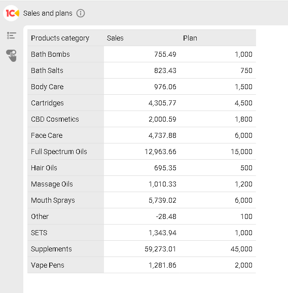
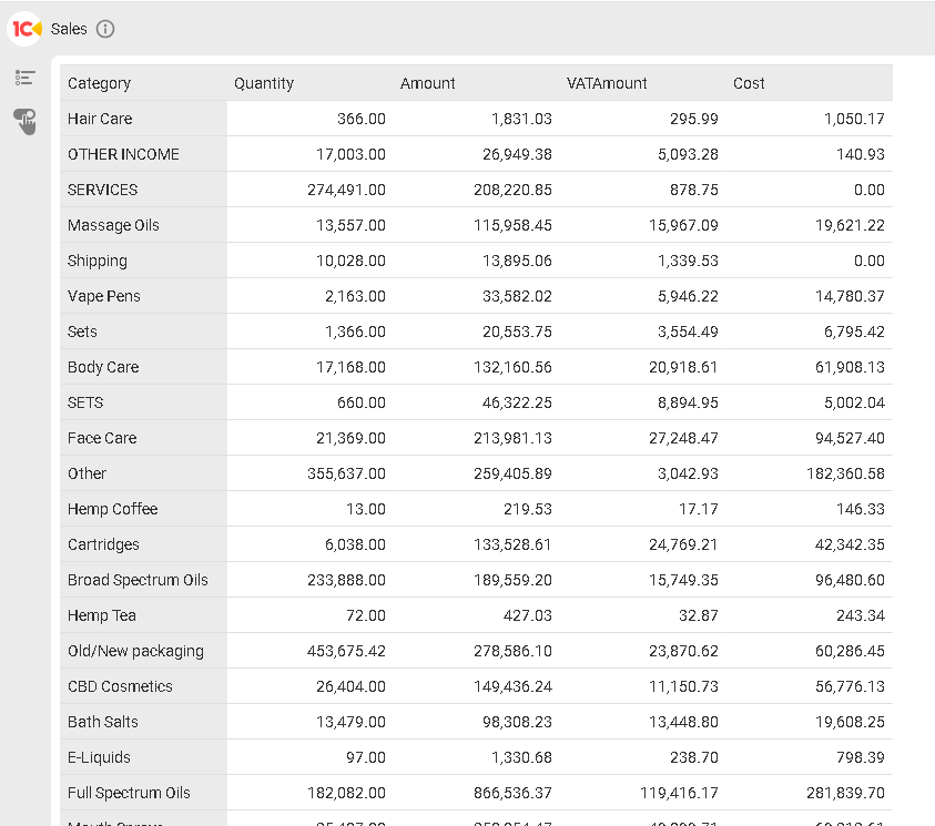
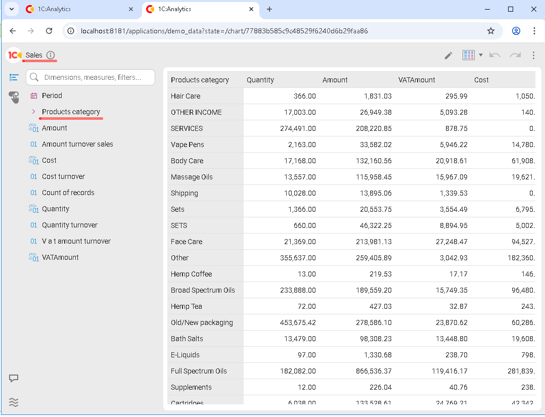
By now, we already have a couple of ready charts: a report on actual sales and a summary Plan vs. Actual report built on an additional data source.
All these reports work great on their own, and it is important to emphasize this: you do not create a dashboard from scratch. You always assemble it from existing visualizations. So the correct workflow in 1C:Analytics looks like this:
-
Prepare data and data sources.
-
Build individual charts.
-
Combine them into a dashboard.
A useful rule of thumb: each chart should answer a single question. A chart should not try to tell the whole story at once. The dashboard then ties those answers together into a complete picture.
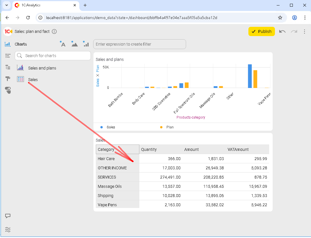
Before creating a dashboard, it helps to look at the list of available charts from the end user’s perspective and decide which ones should appear together on a single screen. We only have a couple, so let’s place the Sales and plans chart:
and the Sales chart:
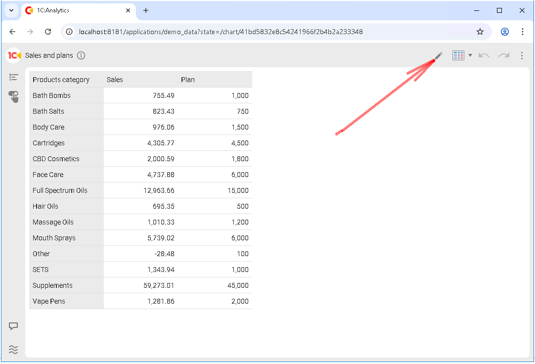
Before creating the new dashboard, let’s slightly improve the look of the Sales and plans chart. Right now, it is displayed as a table, but we will turn it into a bar chart.
Open the report and click the pencil icon to edit it:
Open the chart type menu and select Bar chart:
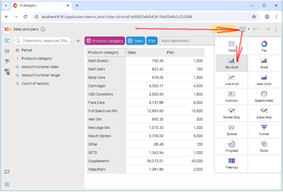
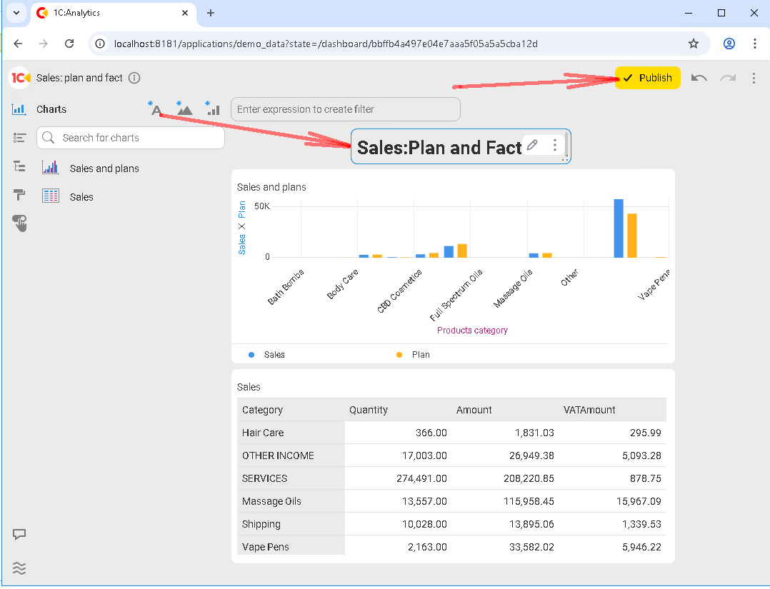
The chart changes immediately. Don’t forget to save your changes by clicking Publish:
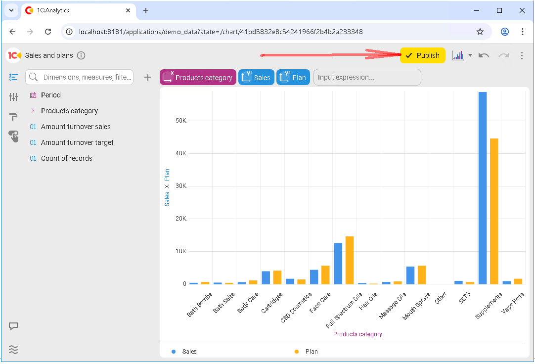
Now this chart is ready to be added to a dashboard.
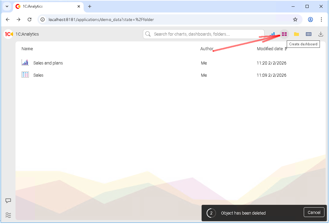
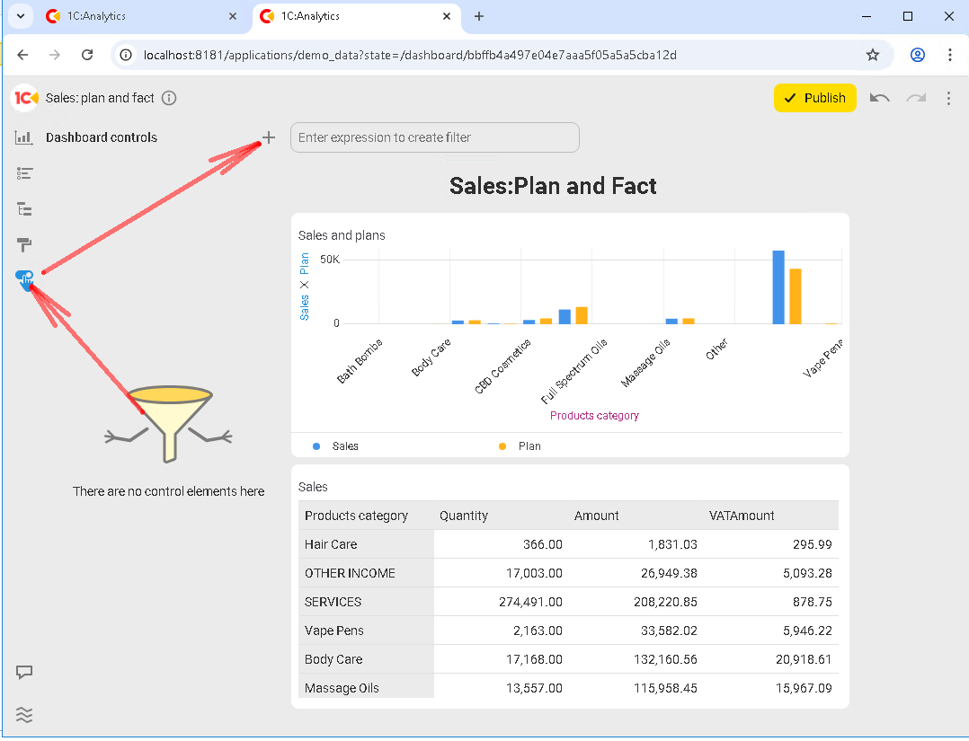
Create a new dashboard and give it a meaningful name that reflects its purpose. For example, Sales: Plan and Fact.
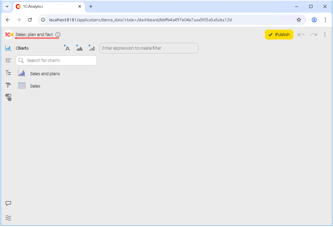
After that, you enter edit mode. At this stage, a dashboard is an empty canvas, and that is normal. From here on, the process is simply adding existing charts and arranging them on the workspace.
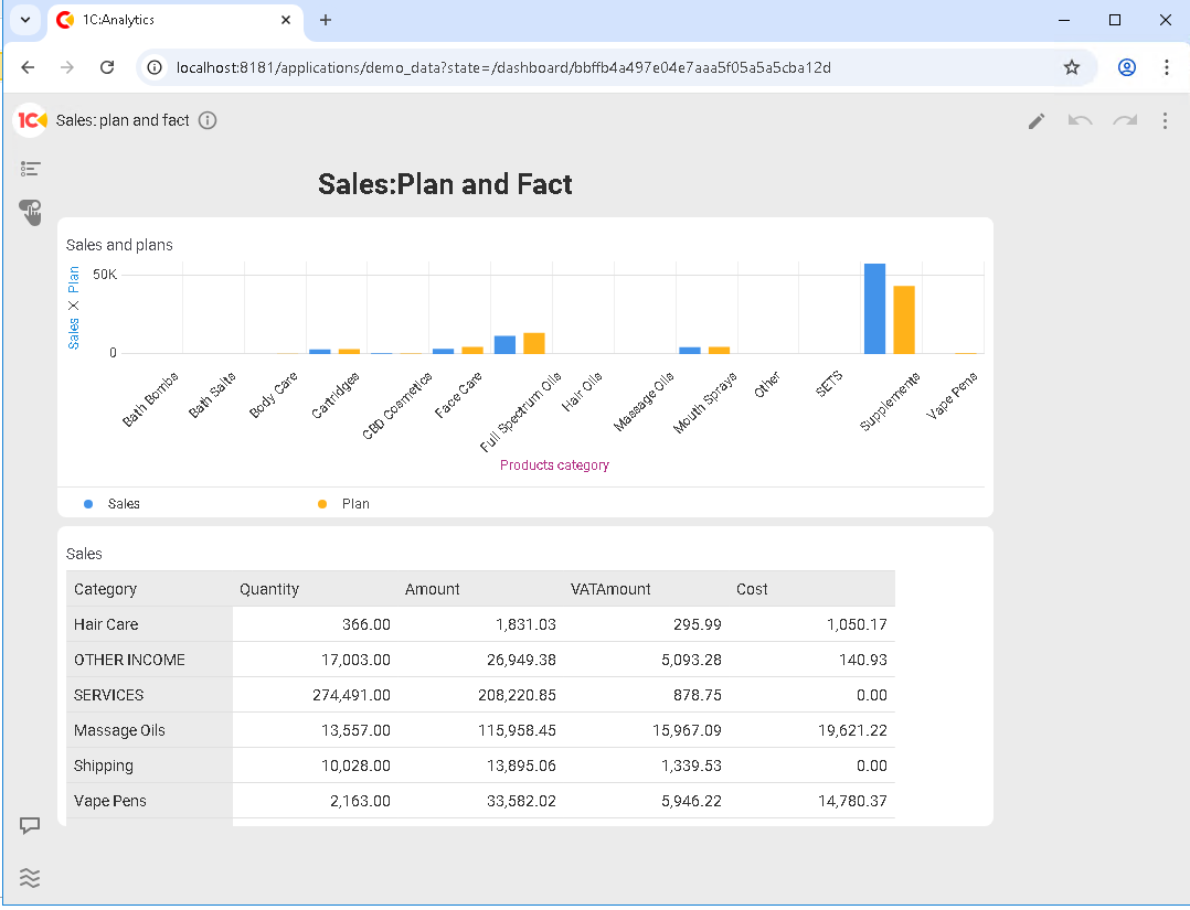
Next, add the charts you need to the dashboard workspace, then use the mouse to resize and rearrange them.
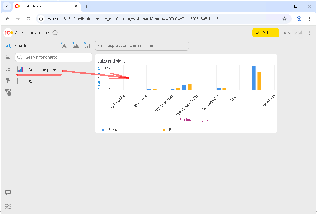
At this point, a unified analytics dashboard starts taking shape from several standalone visualizations.
As a rule, users read a dashboard from top to bottom:
-
Summary indicators at the top
-
Details below
-
Auxiliary or clarifying reports at the bottom
Let’s add a header at the top of the dashboard and finish creating our first dashboard by clicking Publish:
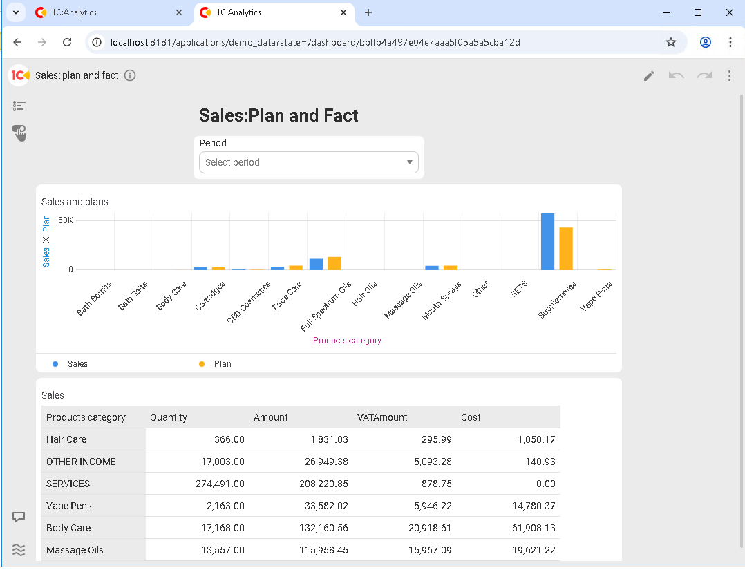
So, our first dashboard is ready:
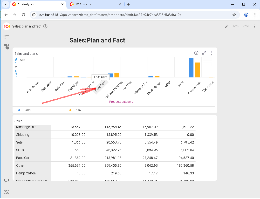
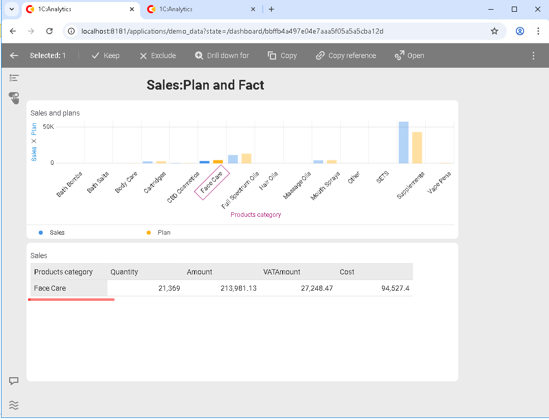
At this stage, the dashboard becomes interactive: cross-filtering starts working automatically. What is it, and what does it look like?
It works like this: a click on an element in one chart is automatically applied as a filter to other visualizations on the dashboard. The user simply narrows down the area of interest.
For example, selecting a product category in one report causes other charts to refresh in the same slice. A single click on the Face care category enables filtering both in the first chart and in the second:
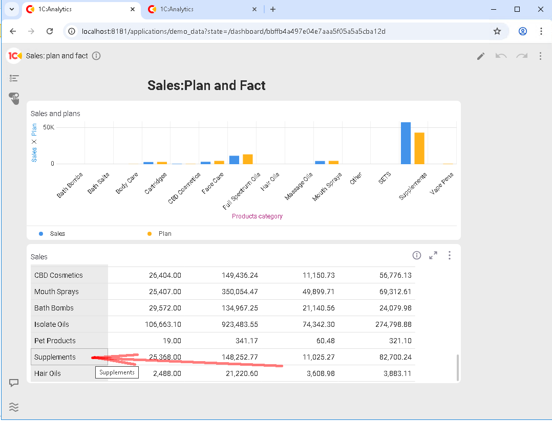
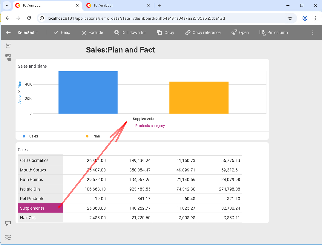
It also works the other way around: if you select a category in the second chart, the first chart will be filtered by that category:
It is important to understand that not all charts can react to each other’s events. If data sources or the dimensions used are incompatible, cross-filtering will not work.
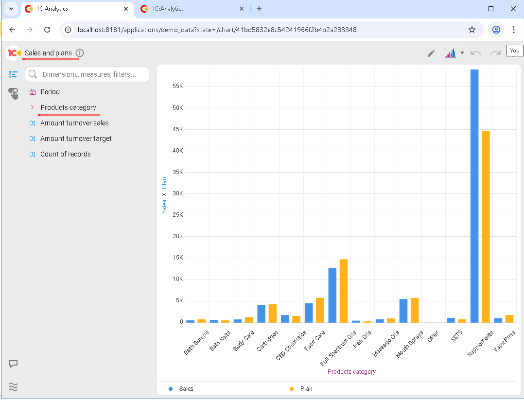
In our case, cross-filtering works because in both charts the dimension used for filtering has the same data type and the same name:
In addition to cross-filtering, 1C:Analytics supports other types of filters:
-
Dashboard-level filters
-
Chart-level filters
Dashboard-level filters apply to all charts at once and are most commonly used to filter by period, department, or company. Chart-level filters, on the contrary, limit only a specific visualization.
A good practice is to start with a minimal set of filters and add more only when there is a real need. Too many filters quickly make a dashboard harder to read.
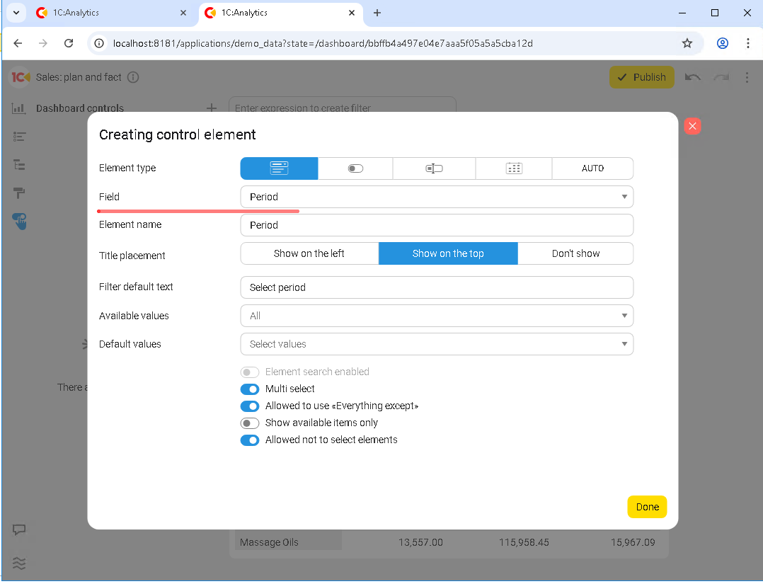
As an example, let’s add a period filter to the dashboard. First, create a control element in Dashboard controls that will handle filtering, configure it, and then place it on the dashboard:
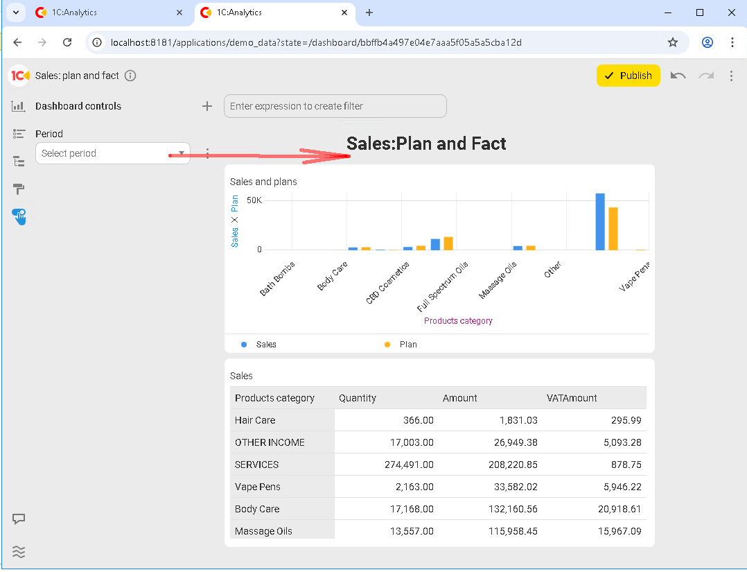
After you click Publish, you can start using the new filter immediately:
For example, select a period where sales plans were not defined, and the dashboard updates right away:
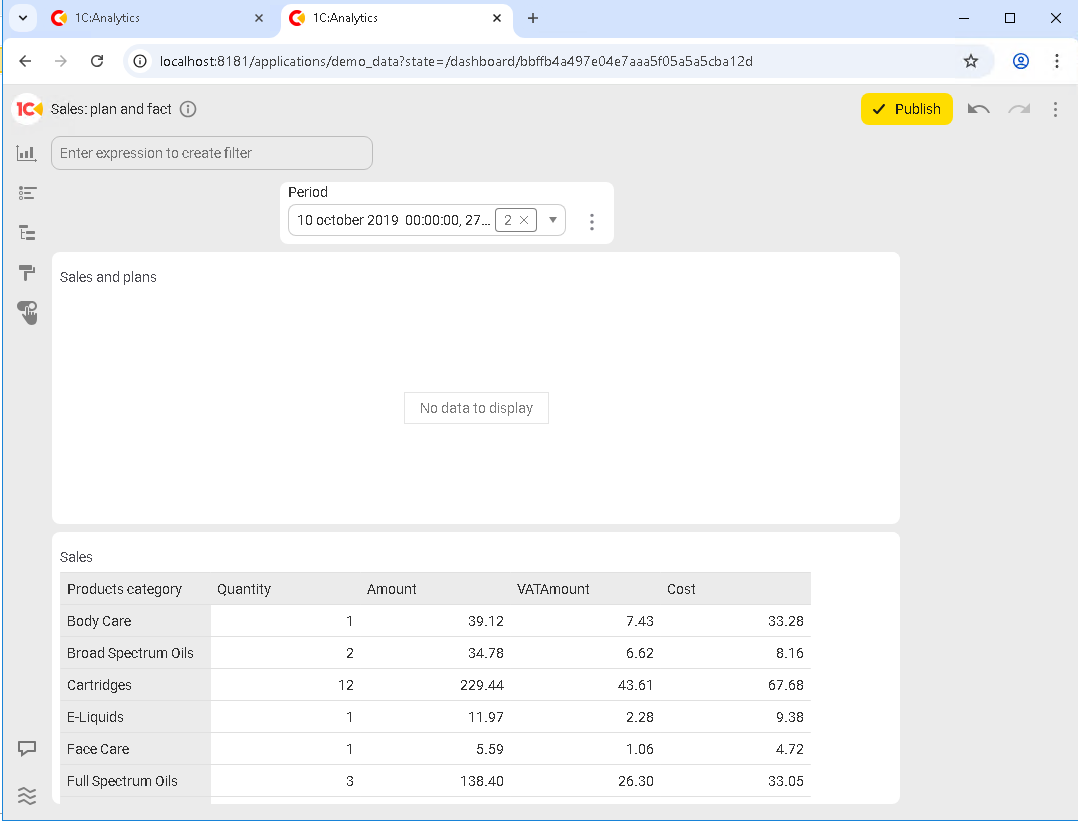
The first chart, where the plans should be, is empty. But there were still sales in that period, and the second (lower) chart shows them.
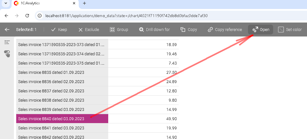
Let’s move on. One of the key features of 1C:Analytics is that you can jump directly from analytics to the underlying records. You could call this a “killer feature”.
What makes it so powerful? Let’s take a look. For the example, let’s create one more chart based on the Sales accumulation register:
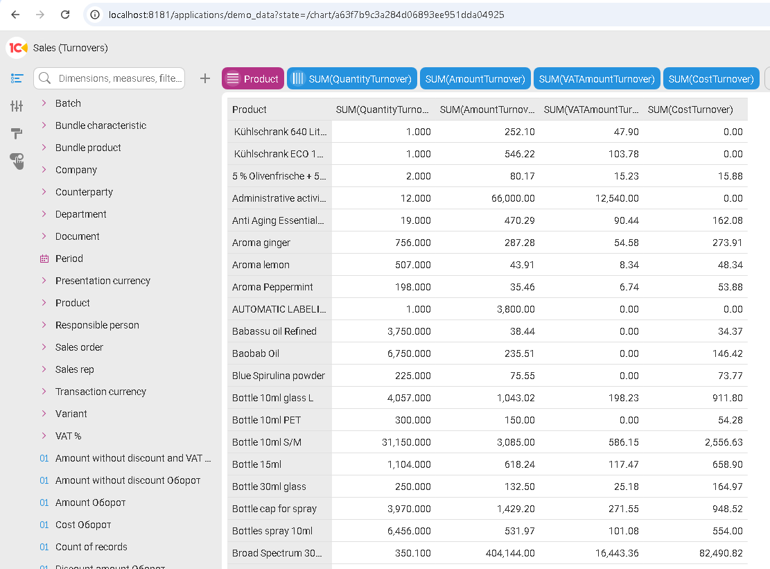
We won’t embed any filters into it, and we won’t add it to any dashboards because that is not relevant for this example. Just click Publish and select any product from the list. After you click a row, a menu becomes available at the top of the chart. We are interested in the Open button:
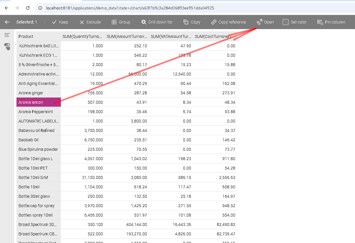
After you click it, the 1C application opens in another browser tab, and the product form for the selected item opens inside 1C:
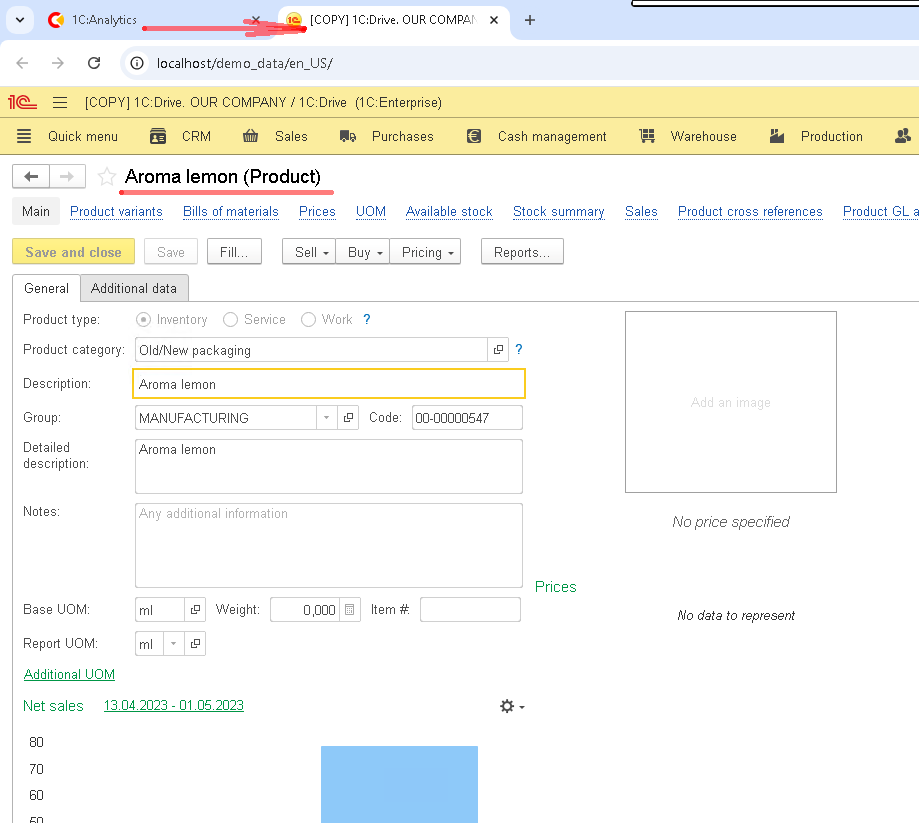
You can do the same not only for products, but for any other object in 1C that is exposed in 1C:Analytics as a link: a catalog item or any document. In the screenshot below, we jump from 1C:Analytics straight into the 1C application and land directly on the required document:
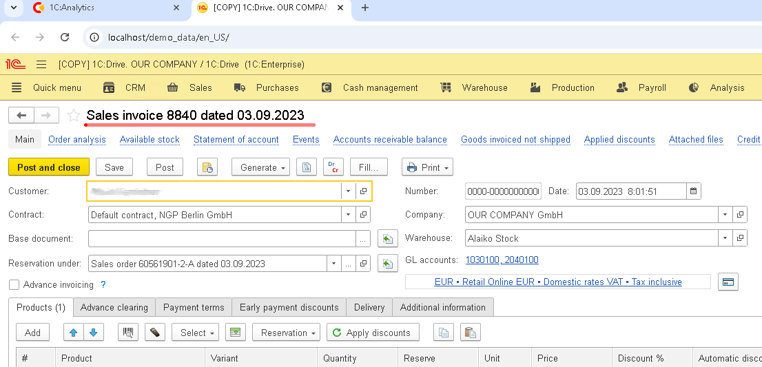
What do we see? Unlike most BI systems, where a report is the end point, here a chart (or a dashboard) becomes part of a single workflow. Clicking a chart element opens the related document or catalog item in the 1C application, preserving the full analysis context.
This is possible because 1C:Analytics works with live data and fully understands configuration metadata. Analytics and accounting are not separated here. They are connected.
This is exactly what distinguishes 1C:Analytics from third-party BI solutions and turns a dashboard from a “pretty picture” into a real tool for everyday work.
It is time to summarize. In this article, we covered dashboard creation in 1C:Analytics, from basic concepts to real-world dashboard layout and configuring interactions between visualizations.
As a result, we ended up not with a set of isolated reports, but with a cohesive analytics dashboard connected to the underlying data and suitable for everyday use.
In the final article of the series, we will cover more advanced scenarios: working with external data sources and retrieving data from multiple 1C infobases within a single analytical system.

Writen by
1C Developer
20+ years of experience in the software industry in Russia, UAE and Germany. My main fields of expertise are developing and implementation of business applications (Retail, CRM, WMS, and Accounting) and integration of software with POS equipment and web portals.


