Better Appearance and Improved Functionality of Gantt Charts

Gantt charts are an important element of user interfaces and serve to visualize tasks progress, resource planning, and work schedules. Due to many requests from developers using our technologies, in version 8.3.23 we improved the charts’ appearance and expanded their functionality.
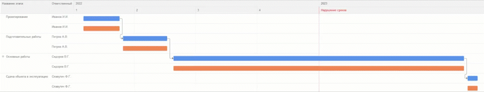
Prior to version 8.3.23, a Gantt chart would look like this:
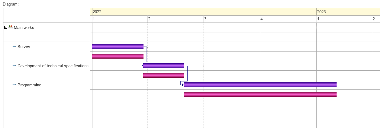
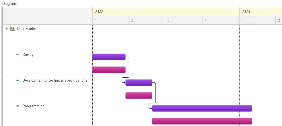
Starting with version 8.3.23, it looks like this:

Now it is possible to place text on intervals.
It is possible to adjust the text placement on chart elements, such as intervals, text areas for points, and areas for data tables.
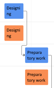
Text can be cropped:
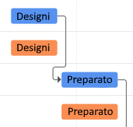
And moved:
The feature of highlighting values in Gantt charts has been improved. Now you can highlight the values in a chart in exactly the same way as rows in the chart’s predefined table:

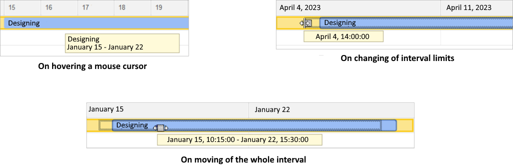
Select intervals interactively:
Choose how to display vertical and horizontal lines in the chart area:
Selection or changing an interval brings up a tooltip with the currently selected values:
When used in a web client, charts are rendered on the client, which makes them behave the same on both thin and web clients. One more benefit is the better speed of interactive operations with the chart.
Gantt chart object received new properties, methods, and events that support the described functionality.
The new features introduced in the Gantt charts make the user interfaces in your and our applications more functional and better looking.

Writen by


