Dashboards and Diagram development
Diagram development
We continue developing the diagram mechanism in terms of the typal «1C:Enterprise» platform instruments.
The following functionality is available in the version 8.3.16:
-
The output of an additional value scale
-
Series display settings
-
Interactive editing of the diagram values
-
Automatic saving of the series color
The output of an additional value scale
It is frequently convenient to display graphically some figures in different units of measure. For example, to output the revenue and the sales volume. When a user tries to output such data in one diagram, a scale problem appears immediately – some figures may be in millions, others in thousands. It is impossible to analyze such a diagram.
In the new version will allow outputting an additional value scale. This scale will have its own measurements, its own settings which will allow us to carry out an analysis based on such a diagram.
Example:
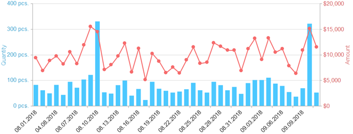
The additional scale may not have its own measurements. It is possible to output an additional scale for duplicating the core one in order to make the information reading more convenient.
Series display settings
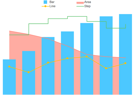
Series type
For displaying different figures on one diagram it is convenient to assign them distinct types. For instance, in the previous example, we outputted the indicator “Turnover amount” as a graph and “Turnover quantity” as a bar chart. You also now can adjust the displaying type for a certain series. The following types are available for selecting:
-
A bar chart
-
A 3D-bar chart
-
A graph
-
A graph with areas
-
A graph by steps
An example of a diagram displaying where each series has its own displaying type:
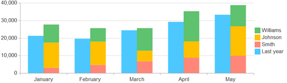
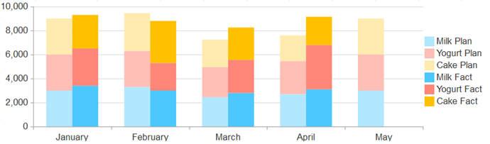
Series summarizing
Previously, the accumulation regime could be adjusted when the user was choosing a diagram type. We added functionality to adjust the accumulation type for each series separately and to indicate which series must accumulate altogether and which individually.
Some examples of this functionality usage:
- Grouping by a contractor and comparing with the previous year
In this example, we state that the series “Previous year” mustn’t be summarized, but all the other do must. This allows to compare the whole sum with the previous year and to observe who and what share has integrated this year.
- Plan and fact with grouping by a product
Interactive values editing
Sometimes while users are analyzing or planning something, they also may change some values on the diagram to see how such changes affect the other indicators. Now you will be able to carry out this scenario when working with diagrams.
We added the functionality of interactive values editing. To edit you need to pull the diagram column edge or the graph cursor. When changing the values, the event handler will appear where you will be able to employ your own logic (e.g., to check if the value moves beyond the defined diapason or to recalculate the diagram values). When terminating the editing, the handler will also appear where you can realize the heavy logic (e.g., a server call).
Editing functionality may be applied as for the entire diagram, as for some specific values.
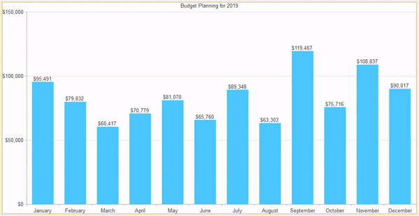
In the example below, shown how to allocate the financial resources by months by using the diagram.
Automatic series color saving
We implemented the functionality of the series color saving and applying this color to another diagram. Why do we need this? Let’s experiment with it.
Supposing that we have two reports. In one report there is information about mutual settlements balance, in the other – sales dynamics. It will be convenient for the user if the same contractors have the same colors in both reports. Previously, for realizing such functionality from the applied solution’s code it was necessary to spend a lot of time and effort. Now the platform allows to fulfill it by using the report settings. The correspondence between series and their colors will be saved in the system settings storage, so the colors will not change even after the application restarts.
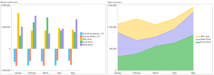
A citizen developer will have access from the built-in 1C:Enterprise language to the object which contains all saved series colors. It will be able to add own pairs “series-color” (e.g., “Milk-blue”), to give the user an opportunity to adjust the colors, to synchronize the colors between users or infobases and so on. Obviously, it will be possible to use the mechanism for the diagrams inserted into the form. Having added a bit of code, you will be able, for example, to synchronize the series colors of several diagrams. This will allow the user to analyze and read the information faster.
Upgrades of the rendering mechanism
Now some diagram kinds can be drawn in a browser by using the “canvas” technology. This has substantially accelerated the diagram rendering in the web-client and has allowed us to realize the animations of a diagram changes. The diagram automatically detects what has changed and displays the animation. Such a modification will make it possible to show the user visually indices dynamics and as a whole must perfect the user experience in work with diagrams.

Writen by


