New features in charts
We have added some new features to the charts to make them more convenient, more graphic and more familiar to users of other products. Besides, we have changed the way charts behave in some cases to better meet user expectations and created two new chart types.
Trendlines
From now on, your charts can plot not only data as such but also forecasts or tendencies, which are displayed as trendlines.A trendline is a most useful chart element. You can use it to underscore a consistent data pattern or to make forecasts based on the trendline formula. In addition, we have introduced several types of approximation: linear, polynomial, logarithmic, power, and exponential.
You can use polynomial approximation, for instance, to see how your profits depend on income and expense trends.
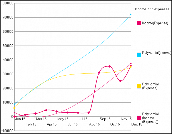
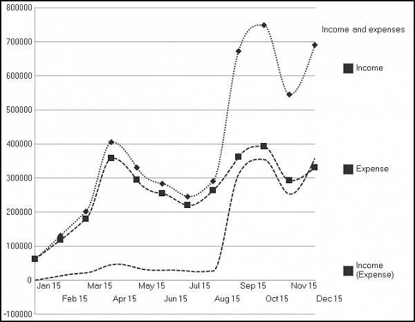
This chart demonstrates another new feature: you can hide the irrelevant data and leave only the trendline visible. You can do it with the new series property ShowGraphicalDataRepresentationInChart. The Income and Expense series are represented by trendlines only, but for the Income (Expense) series, you can see both the values and the trend.
If the chart has only one series, the trendline is black. If there is more than one series, every trendline is the color of its respective series. This is default behavior, and if you don't find it suitable, you can set your own trendline colors.
A single series can have several trendlines at once. They are stored in the new chart property ChartTrendlines. You can display them all at once, together
with their formulas.
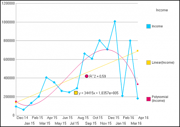
The point is that different approximations have different applications. For instance, linear approximation plots the global trend, while hiding the fluctuations. Polynomial approximation, on the other hand, displays more subtle changes, visualizing significant trend shifts within the defined period. When we combine the trendlines in the chart above, we clearly see that, despite a positive global trend, there has been a noticeable drop in customer payments.
You can choose whether to display the trendline formula and the by managing the new trendline properties ShowEquation and ShowDeterminationFactor.
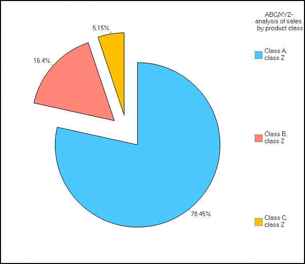
Legend improvement
As you may have noticed from the first illustration, you can now hide a series not only from the plot but from the legend as well. To do this, use the new series property ShowGraphicalDataRepresentationInChartLegend. Use it to hide irrelevant information from the plot and the legend.The legend is designed for the user to quickly make sense of the charted data. However, it didn’t always work as planned. For example, a colored chart, quite readable on the screen, would become incomprehensible after being printed in black-and-white, because the series and the legends were too difficult to match.
To address this, we made some improvements to the mechanism that displays markers and series in the chart legend. As a result, black-and-white charts are now much more readable.
Here are some of the changes we have applied:
- If the series is represented by a line, the legend displays a fragment of that line in the same style.
- The trendline fragment in the legend is always displayed in the same style as the trendline itself.
- If a series or a trendline contains a marker, the legend also contains that marker in the middle of the fragment. The size of the marker in the legend depends on the size of the marker in the plot.
- If a series isn’t a line (e.g., in a gauge chart), the legend displays a square marker the size of the legend's font height.
For instance, a regular chart will exhibit series in direct order (Vacuum cleaners first) and a stacked column chart will display its series in reversed order (Vacuum cleaners last). This goes in line with the way the series is displayed in the plot and improves chart readability.
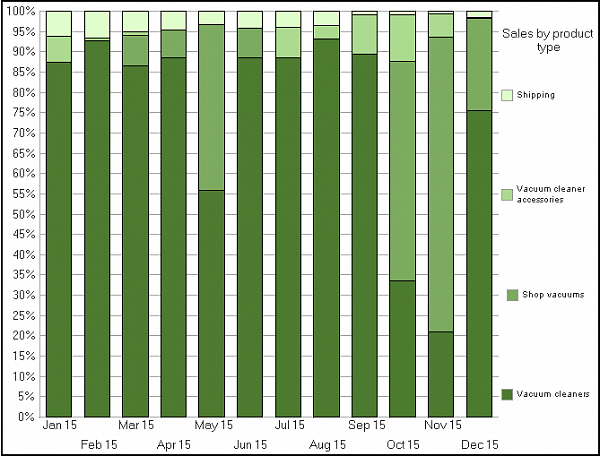
If you need to, you can manage the series’ order in the legend yourself with the new chart property SeriesOrderInLegend. You can set automatic, direct, or reversed order.
Scatter chart
This is a new type of chart. It’s a convenient tool for displaying and analyzing value correlations. Another benefit is that it’s well adjusted to working with large bulks of data. The point axis in such a chart can contain both categories and continuous values.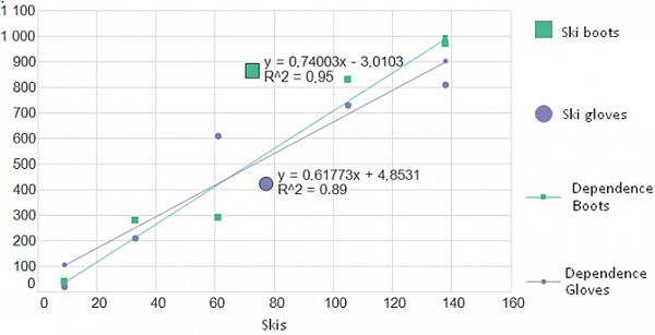
For instance, the point axis of the chart below represents ski sales and the value axis represents ski boots’ and gloves’ sales. The series’ values are shown as points, and there is a trendline for each series. This helps spot an obvious correlation between the number of boots and gloves sold and the number of skis sold.
Bubble chart
Another new chart type is the bubble chart, which is an advanced version of the scatter chart. The difference is that it adds a third dimension to the chart, represented by the size of the point (bubble). You can plot more than one series in a bubble chart. Also, there are several algorithms to calculate the bubble size.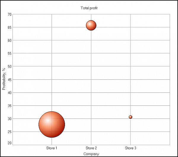
For example, this chart’s horizontal axis represents three stores, and the vertical axis represents store profitability percentages, while the bubble size indicates the total profit by store.
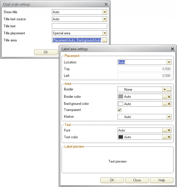
Scale titles
Another new feature allows you to create scale titles and manage their display settings. Titles make charts more readable, and when a chart has only one series, the title makes it unnecessary to put the series in the legend. As a result, you have more unoccupied space for plotting the data.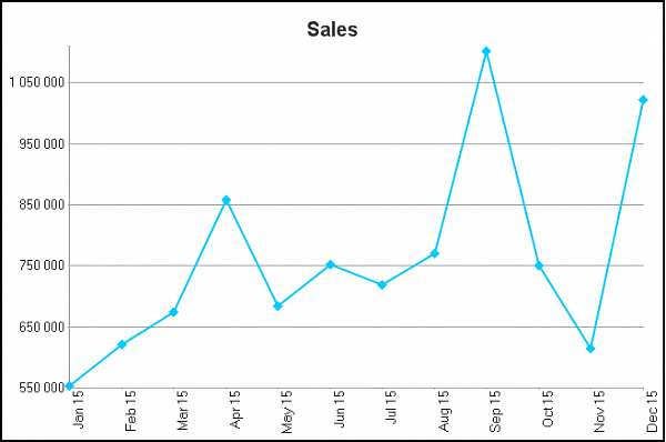
We have introduced title settings for point, series, and value axis scales. A series axis scale can be displayed only in 3D charts. We have even created a special editing tool for you to easily adjust your title area.
Minimum and maximum values
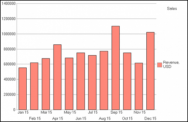
Setting the chart data range has been possible in earlier versions, but, first of all, it used a complicated algorithm and, second of all, the resulting values would always depend on other parameters.We addressed this by implementing a simple and intuitive mechanism that will enable you to set strict upper and lower limits to the data range. This feature will come in handy when a value changes only slightly compared to the absolute values.
Let's say your overall sales figures reach at least 500 thousand a month. A chart with a minimum value of zero clearly shows the changes in sales, but the dynamic pattern of these changes is weak.
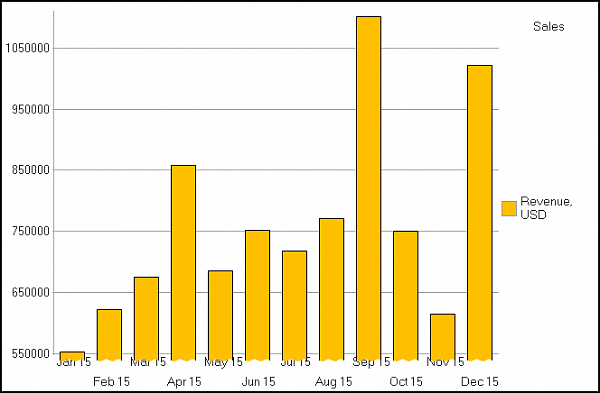
If, however, you set a different minimum and maximum value, the dynamic will become much curvier and easier to notice.
This mechanism can also be useful in a scatter chart where there are many points and you want only a fragment displayed.
Color palettes
In earlier versions, the charts used to have only two fixed palettes – one with 8 and the other with 32 colors. You could also set the color of each series manually.Now you have an entire range of pre-installed, ready-to-use palettes. You can choose one to use in your chart or create your own palette and apply it to different charts.
We have also added new palette categories, such as Bright, Soft, Pastel, Warm and Cold.
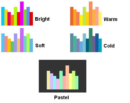
The Bright palette is best suited for charts with thin-lined series, such as graphs. The Pastel palette is best used against a dark background. The Soft palette looks good in charts with large geometric objects for series, such as bar charts or pie charts.
Another category of pre-installed palettes is gradient palettes: Blue, Orange, Green, Yellow, and Gray.
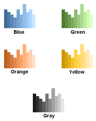
Gradient palettes are perfect for charts with homogeneous data.
If you don’t find any of the gradient palettes suitable, you have the option of creating your own by setting the first and last color of the gradient.
Gauge chart bands
Another update worth noting allows you to use decimal numbers between gauge chart bands. Previously, bands could be marked with whole numbers only, but now you can set arbitrary values, even below one.
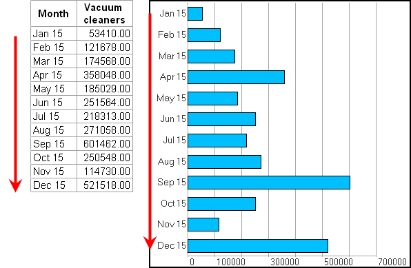
Point order in bar charts
Bar charts used to have a fixed point order. The first point would always be displayed in the lower part of the chart and the others were stacked above it. Correct from a mathematical standpoint, this behavior would sometimes take users by surprise, especially when a data table would appear alongside the chart with the data sorted in the opposite order.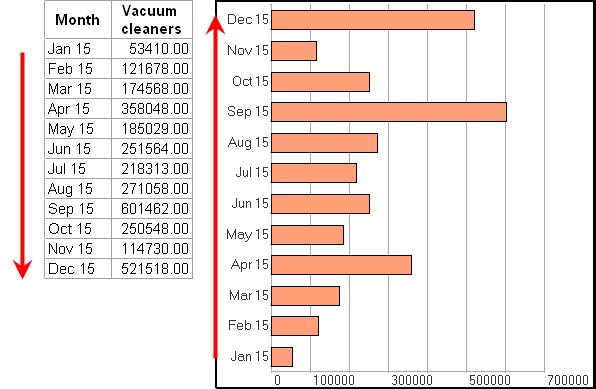
In response to all the feedback we have received on the issue, we reversed the standard point order in bar charts. In addition, you can now select the preferred order yourself with the new chart property BarChartPointsOrder: TopToBottom or BottomToTop.
New parameters in the data composition system
Feel free to use the above-mentioned features to adjust the charts both interactively and via 1C:Enterprise script. Plus we have added a whole range of new parameters to the data composition system so that you could also use the new features to do reports.You will find most of the settings in the Other settings tab.
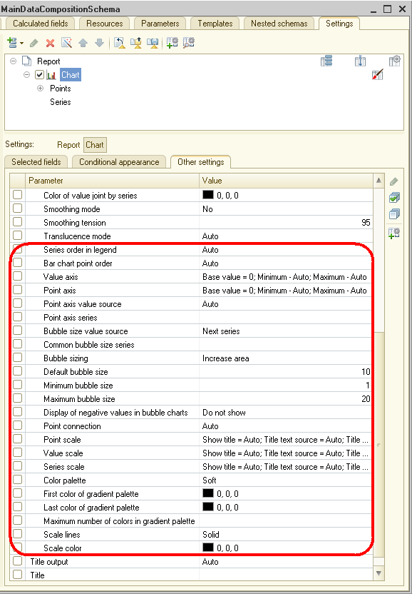
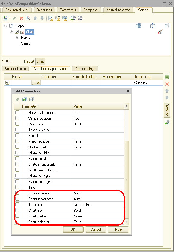
The remaining settings that deal with specific series are in the conditional appearance tab.
This is a preview of new functionality. We recommend that you do not use the content of this article as a practical guide to the new functionality. The new functionality will be fully described in the documentation to the relevant version of the software. You can find the complete list of changes in the v8Update.htm file.

Writen by


