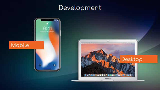
Simple and beautiful interface
We develop programs to solve frustrations experienced by users, to contribute some value, to help users. For ourselves, of course, we want our programs to be popular, and in the end, we want to make money.
But few people know that 96% of newly released programs are not used at all. We conducted our own research and learned that in 2018 our competitors had released hundreds of programs, 96% of which were not installed at all. That is, the developers had wasted their time.
Today I will tell you how to make the application interface on platform 1C:Enterprise simple and nice so that you have a good chance of getting to the remaining four percent.
Interface features during development on 1C platform
In the mobile world, wherever we go, we usually already have thousands of competitors. Specifically, we have from 1.5 thousand to 20 thousand competitors, depending on the direction. Therefore, if we allow ourselves to make an unpleasant or inconvenient interface, the user will just pass on it - why would he spend time and effort on this when you can just download another application.
When we develop a "heavy" corporate-class ERP system, sometimes interfaces are overlooked as more attention is paid to issues such as functionality, performance, scaling, etc.
In addition, on the large desktop screen, where you can place a lot of elements that are controlled by the mouse, the criteria for the construction of the interface is significantly different from the mobile interface, where the user's work takes place in other scenarios. Therefore, when the desktop 1C platform together with the existing desktop account solutions was migrated to the mobile one, all the basic principles and approaches were transferred there by inertia. And if we now try to compare the mobile application on the 1C platform and the native mobile application, we will see a significant difference between them in terms of interface and usability.
But fortunately, we can work with it and make interfaces cool, and the 1C platform has all the tools. And now I will tell you about all these tools and techniques that we use.
Levels of interface development
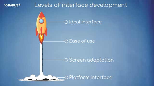
We divide interface development into 4 stages:
● level one "Platform Interface";
● followed by "Screen Adaptation";
● then "Ease of Use."
● And, lastly, the "Ideal Interface."
Let me tell you more about each of them now.
Stage 1: Platform Interface
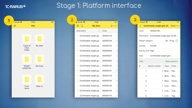
The first stage is the interface of the platform itself. When we do not modify the interface in any way, but only get what the platform has generated for us.
● Look at the first screen. We'll see what's called a "hamburger" menu.
● On the second screen, we see the standard list form.
● On the third screen, the form of the document with the tabular part.
This is usually the way the interface of a corporate system looks, but the user of a mobile application is unlikely to like it. Of course, it's better not to leave it, but to adapt it to make our application more user-friendly and convenient.
Stage 2: Screen Adaptation
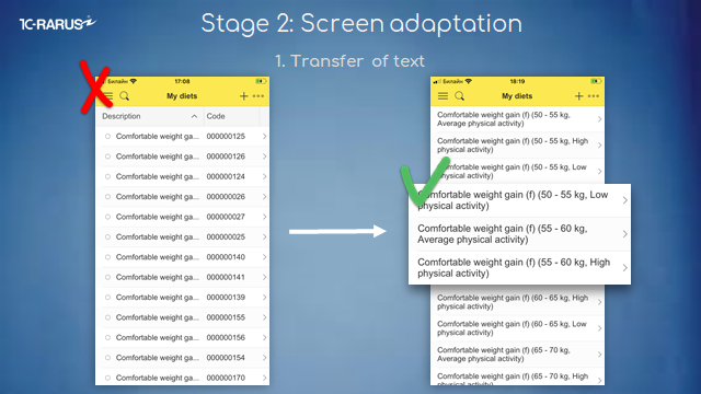
So the second stage is screen adaptation. And here we have a simple goal - to make information accessible and readable. Allow me to lay out some specific techniques. They're pretty simple.
The first technique is to transfer the text. This is an example of a list form where information was trimmed and there was an unnecessary column. We removed the unnecessary column, moved the text to make it easier to read - a simple method.
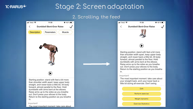
The second technique is to scroll the feed. By inertia, many do on the screen a few columns, as in the desktop 1C application. But the screen on your smartphone is small, so everything is cut off.
It is not convenient to use columns here, it is better to place everything under each other. The information will be presented as a long feed, but it is easy to scroll - a familiar gesture for the mobile world.
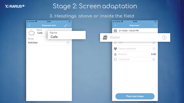
The third is the headings above or inside the field. It's also a simple technique. By default, we have a header on the left and a field on the right. In the end, you can't see either one on your smartphone.
So place the header on top so that you can see both the header and the field. Or inside. But if we have it inside, , the headline will disappear when we choose an element. So choose either the first or the second option for different cases.
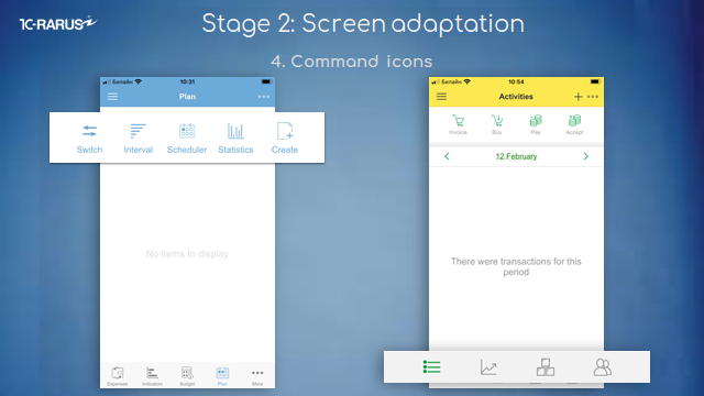
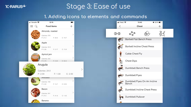
The fourth technique involves command icons. If we will write down commands as a text the same way as we do in the desktop 1C application, it will take up the whole screen, so make sure to change everything to icons.
There are two options - you can make an icon and place a small text under it (as on the screen on the left), or use icons only. If they are intuitive, it takes up little space and is easy to use.
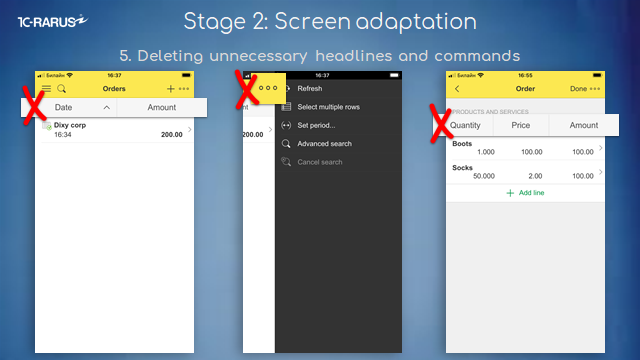
The fifth technique is to remove unnecessary headers and commands. The default platform generates many redundant elements.
For example, on the left screen, it is obvious where the date is and where the amount is. But remember, we have a small screen, so we get rid of duplicate elements.
The middle screen has standard commands, which no one uses. You can safely remove them and not confuse the user, because the user thinks it’s important and tries to understand it.
The third screen also has a header, which is duplicated by the data itself, it is clear where the number is and where the sum is.
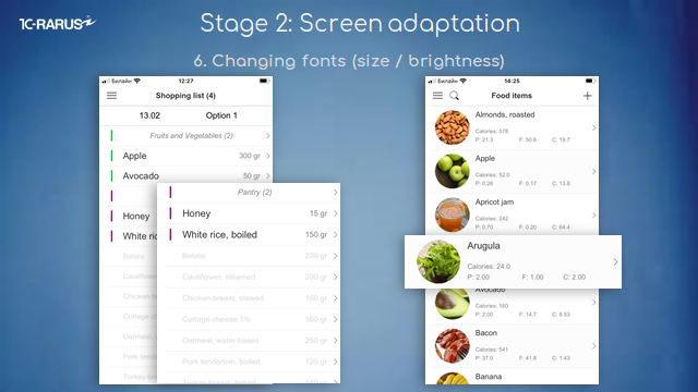
The sixth technique is to change fonts, dimensions, brightness. Focus the user's attention on everything important. Draw attention away from anything that doesn't matter. If the user needs to, he will read the small text.
These are good examples where we change transparency and dimensions. This set up makes it much easier to read.
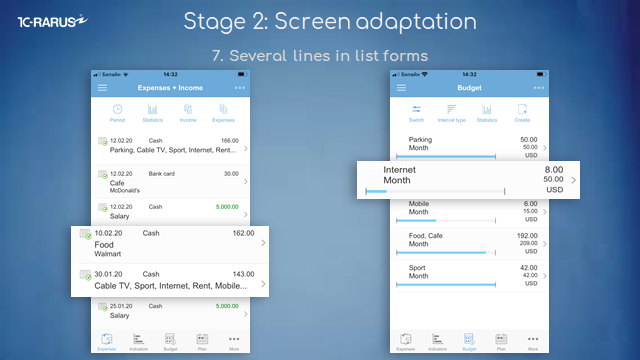
The seventh technique is to make several lines in the list form. By default, our platform does everything in one line. This leads to the fact that, again, the text is trimmed, and the lines themselves are very narrow. So make a few lines for one element. And then the line becomes higher - it is easy to click, and it is better to read - all the information fits on the screen.
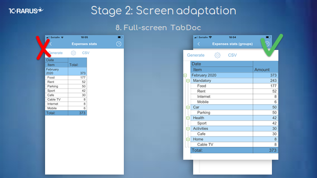
The eighth technique is a full-screen tabular document.
By default, a tabular document is as small as the one on the left. Naturally, you can't fit anything into such narrow columns, and it just doesn't look nice.
So just stretch the tabular document to fit the whole screen. It's a simple operation that makes the application much more elegant.
It was a level of screen adaptation. This, fortunately, in one way or another, is done by almost all developers of mobile 1C applications, otherwise, they become too cumbersome to use.
Stage 3: Ease of use
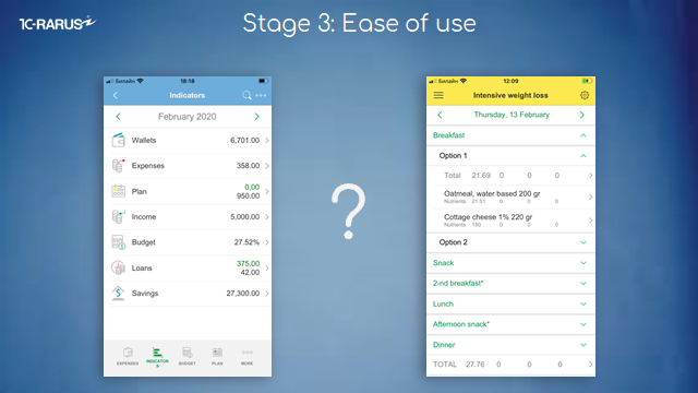
And the next stage is the ease of use.
This is the most important stage among the others. Why? Because if the application is understandable, easy to use - it is used. Your Retention will be good, and your feedback will be good - and based on these two indicators, you will start to grow installations that are converted into money. In principle, the success of an application depends on how we make it user-friendly and understandable.
Let me show you some tricks to make it easier to use.
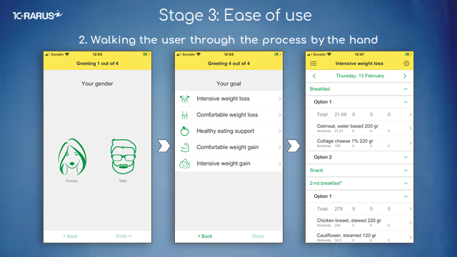
This leads us to the example of "Diet" app technique. This is an individual diet for the user. They answer a number of simple questions and in the end receive a tailor-made diet. We ask them about gender, purpose, daily activity, weight and assign them a diet. These are four simple questions: but the answers are binary, there is no wiggle room. These are very easy questions to understand, he answers them in a second and at the end gets the result. This is very well received by users. When we organize work like this, it's very easy to use.
The third method is to minimize the number of user actions in the application.
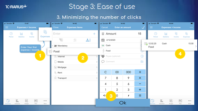
Here is the "Budget" application for recording personal finances.
User input of their daily expenses is the most frequent operation in this application. A man came to the store, bought milk - he needs to record this expense.
What's he doing? He opens the application, clicks on "Expenditure." According to the classic model, a document with a lot of details would open up. You'd click the characteristic, then select, then click "OK" to fill in the details.
Instead, we immediately, without opening the document, offer him to select the expense item, thus bypassing many clicks. He chooses the expense item and immediately goes to the next form, without confirming anything and without returning to the further choice of details. He enters the amount, clicks "OK", and it’s done - the transaction is completed, the document is created. Specifically in this operation, we saved users 12 extra clicks.
If this is a very frequent operation, we can make life easier for the user by choosing this way - he will be pleased and happy to use the application regularly.
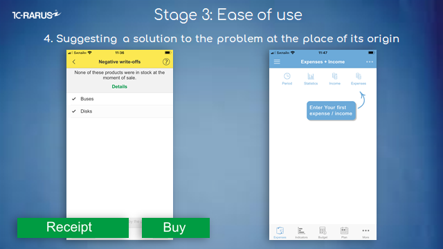
The next technique is to propose a solution to the problem where it occurs.
A classic example of a corporate accounting application is when we sell a product, and the system tells us: "You don't have the goods in stock, you can't post the document." What usually happens after that? The user starts to sort things out, opens up some reports. If he knows what the problem is, he will find it right away. Otherwise, he may even have to look at a few reports, and only then he will decide whether to make an inventory or buy a product. And then he goes back into that document and checks it out.
Why do we have to make the user suffer when we can offer him or her to either enter into the books or buy a product right here? Problem solved? After such torture, a user only wants to delete the application and give it a bad rating. Nothing more.
In our solutions in such cases, we immediately offer to enter the product into the books or buy the goods. The screen on the right is the solution to the problem before it occurs. The user hasn't entered a single document yet - he just walks in, and we tell him right away: "This document is entered right here." So that the user does not get agitated while exploring the application.
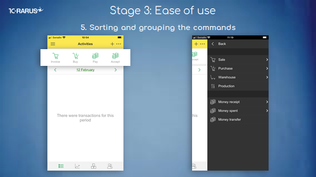
The fifth technique is to sort and group the commands.
As a rule, we have a lot of commands. There is a Pareto rule where 20% of the commands are used in 80% cases. So, select the most frequently used commands on the main screen (like on the left screen), and the less frequently used commands in a submenu, where you can organize a hierarchy, etc.
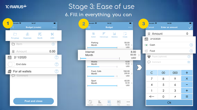
The sixth technique is to fill in everything you can. If we can understand how to fill some data in this document, it should be done.
For example, on the first screen, we have a "Budget" document.
This block in the top menu is not a command bar, it's details, and it's already prefilled. Down below, where you see "Date", "For all wallets", - these are also details. As it turns out, we filled out 70% of the document at once.
How to use prefill? There are all kinds of methods. We prefill the details either based on the behavior of the user himself, based on the behavior of all the users, or based on some data in the application. For example:
● the currency "ruble" on the top of the block was filled in because the Russian language was chosen;
● The "Month" field was filled in based on the popularity of all user data;
● and the "Expenditure" field is also based on all user data;
● details "For all wallets" and "For expense group" were filled in based on the behavior of a particular user.
If we force a user to enter data every time, no one will use it.
The second example is that on the basis of the same budget we create expenditure. On the second screen, we click on the budget and we open the document "Expenditure", screen number 3. We've already filled out everything there and only need to enter the amount. It is easy to use.
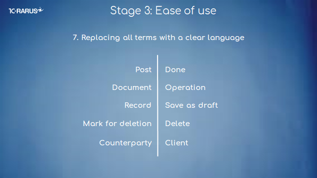
The seventh technique is based on a common mistake of developers accustomed to working in the corporate sector - replace all complex terms with simple understandable alternatives.
Our users basically do not know 1C at all, and we have replaced some business terms right away. For example:
● "To post". A person who doesn't do accounting won't always understand what the word means.
● "Document." In corporate accounting, we are used to the fact that there is a document behind every transaction, but for a user of a mobile application this may raise a question: "Why enter passport details here?" So replace "Document" with "Operation."
● "Record". In fact, this term in 1C means "Save as a draft". So it's better to call everything by its own name.
● "Mark for removal." It is relevant for systems with large document flow, but it is not clear why it may be needed in a mobile application. Remove the documents immediately. If someone says that there will be a problem with empty links, this issue is solved very easily and elegantly.
● "Counterparty". That's a word people don't understand either. Replace it with "Client" or "Supplier" or another word according to the role.
It's not all terms, of course.
The eighth trick is to remove anything that is not used, without thinking or regret.
Because if there is some functionality that is not being used, it will make it harder to use the application because people have to deal with it all the time, and that's already inconvenient for the user.
Each popular native application uses its own statistics, where developers look at what features people mostly use. But to understand this, you need to implement your statistics and study what users do in your program.
I've described above the basic techniques aimed at ease of use. Of course, this isn't everything. But these are the main ones that we've highlighted.
Stage 4: Ideal interface
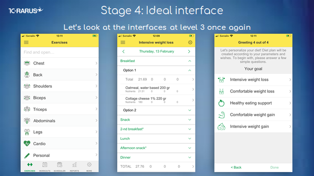
And after that, the ideal interface. Let's take another look at the interfaces that were on level three.
What do they look like?
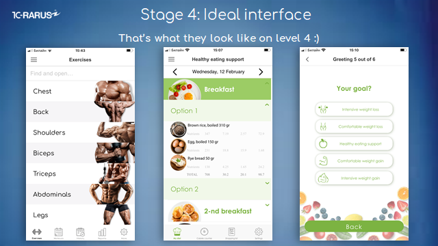
Now let's see how these same interfaces look at the " Ideal Interface" level after we have redrawn them.
They have the same navigation and the same features. But they look a lot nicer.
Let's look specifically at how each form has changed.
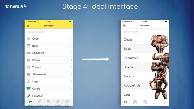
It's an exercise form.
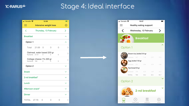
Next is the form of the Diet application.
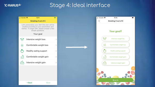
This is the form of the original questionnaire in the Diet app.
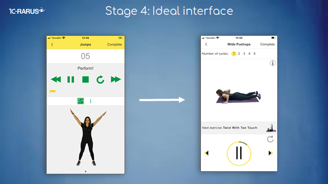
This is a form for performing an exercise.
When we had the interface on the left, we often got a message: "Are you developing using Windows 95?" And someone wrote that we have a designer working for bread :)
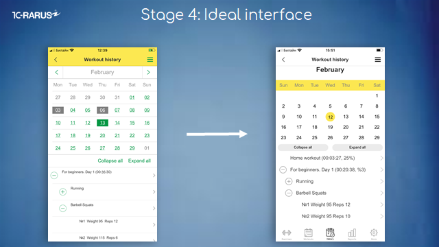
That's how our calendar changed.
How to make an ideal interface
But how did we do it?
First, let me tell you about the technology in general, how we do it. And then we'll look at specific examples.
Step #1. Development of design project
About technique.
First, we make the interfaces user-friendly and bring them to the third level. And after that, we involve the designer. And he redraws these interfaces based on the standard interface when everything in navigation is already convenient. In the end, we get a design project.
Why do we bring it to level 3 on the 1C platform? Why don't we immediately involve the designer from the beginning? Because on the 1C platform you can go through the evolution of interfaces very quickly and at low cost - we do not always understand from the start how to make it elegant and user-friendly. That's why we re-do it many times on the 1C platform. If we did everything with the designer from scratch, it would be a very long and expensive process.
That's why we go through evolution on the 1C platform and only then do the design.
Step #2. Drawing an interface by design project in HTML
Further, when we already have a design project, we pass it to a programmer. Not to an ordinary programmer, but the one who knows both 1C and HTML.
He takes this design, draws it in HTML. And then he introduces this HTML into the 1C platform.
Examples of building an HTML interface in 1C mobile applications
Let's look at a concrete example of how we have implemented this in the 1C platform.
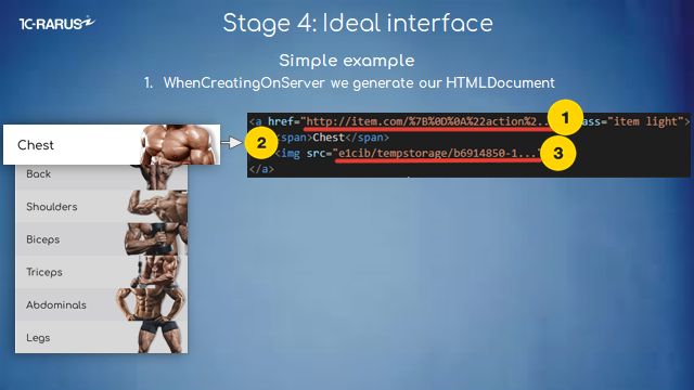
We have a form of exercise here. And to create this form, you need to make an HTML-document, place it in the form and describe this form in the event "Create on server". This is what the description of this form looks like.
● The first is a URL that will be returned when you click on a button.
● The second is a description of the text. For example, "Chest, back, shoulders."
● And the third is the pictures on the right. This is how they are assigned in an HTML document.
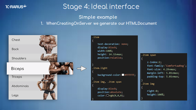
Next, we're making these side bars. That's what the design looks like. This is where we assign the fonts. Here, we assign the form how to stretch, what kind of transparency and background should be. All this is described by this code in the "Creation onServer" event.
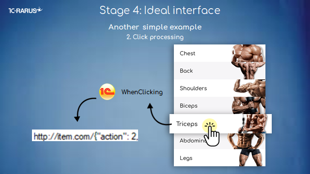
And all we have left to do is to process a click. When we click, the "Clicking" event in 1C is triggered. And in this event, we get back the same URL that we originally assigned in the "Create on Server" event. And that's it. We can process this URL any way we want. We can open another form or we can perform some other actions. We can do whatever we want.
I hope you will create your ideal interfaces and make quality products. Make your users happy, and this will inevitably translate into cool business indicators.
About evolvement of mobile development in 1C-Rarus Company
The company 1C-Rarus is a leader in developing mass-market replication solutions on 1C:Enterprise platform.
● To date, 1C-Rarus apps have been downloaded by over 2.5 million people worldwide.
● 25,000 of them gave a rating and wrote a review.
● The average score is 4.5.
● More than 5000 people pay a monthly subscription fee.
● Top 10 by category in 88 countries. These are both developed and developing countries such as the USA, the UK, Germany, Russia, China, Japan, Brazil, etc.
● The AppStore added 1C-Rarus solutions in its collections by category.


