1C:Enterprise 8.3 User Manual
Contents
-
Chapter 2. Forms
- 2.1. Form element overview
- 2.3. Segmented button
- 2.4. Progress bars
- 2.5. Sliders
- 2.6. Hyperlinks
- 2.7. Buttons
- 2.8. Tables
- 2.10. Charts
- 2.11. Text document fields
- 2.12. HTML document fields
- 2.13. PDF document field
- 2.14. Graphical schema fields
- 2.15. Picture fields
- 2.16. Spreadsheet document fields
- 2.17. Formatted document fields
- 2.19. Saving field values
-
Chapter 8. Service features
- 8.1. Global search
- 8.3. Favorites
- 8.4. User work history
- 8.8. Viewing messages
- 8.9. Understanding progress indicators
- 8.11. Calendar
- 8.12. Analytics system
- 8.13. Using the clipboard for calculations
- 8.14. Scaling forms and documents
- 8.15. Using temporary locks
- 8.17. Error messages
- 8.18. Features specific to Windows 7 and Linux Unity
- 8.19. Using nonvisual access
- 8.20. Using a touchscreen
-
Chapter 11. Web client
- Chapter 12. Search expressions form
Introduction
This manual covers the features that are common for all 1C:Enterprise applications.
For information about application-specific features (documents, reports, and so on), see the application manuals.
Overview
Chapter 1 provides the overview of navigation methods.
Chapter 2 describes operations with forms.
Chapter 3 describes operations with lists.
Chapter 4 describes operations with data types.
Chapter 5 and Chapter 6 describe operations with reports and report options.
Chapter 7 describes operations with collaboration system.
Chapter 8 describes the service features of the platform: links, favorites, history, the built-in calculator, and so on.
Chapter 9 describes customization of user interface, forms, and system parameters.
Chapter 10 describes operations with the help system.
Chapter 11 describes operations with the web client.
Chapter 12 describes available search expressions.
Note types
This manual includes the following note types:
-
TIP. An alternative method to perform an operation.
-
NOTE. Additional information.
-
WARNING! Information that is important for correct operation of the application.
Conventions
Keys. Key names are highlighted in the text, for example: Enter, Esc, and Delete.
The cursor control keys are referred as Arrow keys. They are referred to individually as Up Arrow, Down Arrow, Right Arrow, and Left Arrow.
Keyboard shortcuts. Keyboard shortcuts are specified in instructions as follows: Ctrl+F3. All keyboard shortcuts in the guide are specified for PC-compatible computers. On Apple computers, use the following keys in shortcuts:
-
Ctrl – Cmd,
-
Alt – Option,
-
Home – Cmd+Left Arrow or Fn+Left Arrow
-
End – Cmd+Right Arrow or Fn+Right Arrow
So, the keyboard shortcut Ctrl + Alt + Shift + F5 for a PC-compatible computer will look as follows for an Apple computer: Cmd + Option + Shift + F5.
Buttons. Names of buttons that appear in forms, tabs, and dialog boxes are given without quotation marks, for example: OK, Cancel, Delete, and so on.
Action descriptions. To perform actions described in the manual, select the menu items in the main window, an active window, or the context menu. In most cases, you can perform the same actions using the command bar buttons. When selecting a menu item, pay attention to the icon to the left of its name. The command bar button with the same icon performs the same action. In most cases, this manual does not describe the icons. Also note the keyboard shortcuts, they are displayed to the right of menu item names.
To select an item, usually you have to click or double-click it.
What you need to know
It is assumed that you are familiar with the operating system of the computer where 1C:Enterprise is installed (Microsoft Windows or Linux), and that you have the basic skills required to work with this operating system.
For example, if you are using Windows, you must be familiar with the following concepts:
-
Start menu
-
Windows
-
Menus
-
Controls
-
Standard dialog boxes
-
Clipboard
-
Control Panel
If you have not completely mastered these concepts, we recommend that you refer to the operating system documentation.
If you use mobile 1C:Enterprise applications, you must be familiar with the mobile device operating system: iOS, Android, or Windows Mobile.
You must be familiar with the following concepts:
-
Installing and updating applications using the application store
-
Deleting applications from mobile devices
-
Operating system user interface
-
User data backup options
Chapter 1. Interface
1C:Enterprise interface is a window-based system. There are two types of windows: main and auxiliary.
In the main application window, you can navigate throughout the application, execute functions, and perform operations with specific infobase objects (such as documents or list items). Auxiliary windows provide access to system functions such as calendar or calculator.
To open a form, find the required function (open list, enter document, and so on) in the interface, and then execute the function by clicking it or pressing Enter.
The interface mode is set by the application developer. You can change it if the developer provided this option. For more information about changing interface mode, see Customizing system options.
When you start an application, its main window is displayed. This window outlines the application structure. The major application features are listed in the sections panel. The standard layout of the main window is shown below.
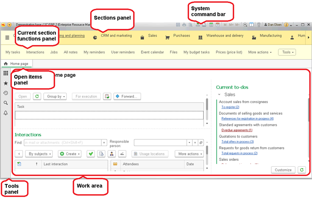
Fig. 1. The main application window
Depending in which operating system the application is launched:
- No operating system header is presented under the management in Windows OS (neither in the terminal nor remote desktop modes).
- The operating system header is displayed on Linux and macOS and in the web client.
The window layout provides easy access to application functions and navigation between application areas, open forms, and windows.
You can resize the main window.
The top part of the application window contains the main panel for navigation and application management.
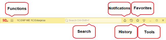
Fig. 2. Main panel
Main panel contains the following elements:
-
Functions menu open button (Functions).
-
Application title.
-
Global search field (Search).
-
Notification center button (Notifications).
-
History panel open button (History).
-
Favorites panel open button (Favorites).
-
Link to the current user profile (<Username>).
-
Menu Service and settings.
Window minimize, maximize, and close buttons.
1.1. Home page
When you run an application, its home page is displayed, provided that it contains at least one form.
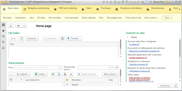
Fig. 3. Home page
You can customize the home page if the application supports this option. To set up the home page, click Service and settings – Settings – Home page setting in the main menu. For more information, see Home page.
To switch between the home page forms, press F6.
To get a link to a form or object located on the home page, click Get link. For more information about object links, see Using links.
To return to the home page from any other open form, click Home page in the form header or on the open items panel. For more information about the open items panel, see Open items panel.

Fig. 4. Button Home page in the form header
If the application does not have any content for the home page, the Home page button is unavailable.
1.2. Sections panel
The sections panel displays a list of application sections. Each section represents an application subsystem.

Fig. 5. A sections panel
The first section name is always Quick menu. It contains the most important and frequently used functions.
If some sections do not fit the panel width, the panel has a scroll button.

Fig. 6. A scroll button on the sections panel
The sections panel can display section names, icons, or both. You can customize the sections panel. To open the dialog box for sections panel setup, click Service and settings – Settings – Sections panel setup. For more information, see Sections panel.
If the current section functions panel (see Current section functions panel) is displayed, when you click a section in the current section command panel, the functions available in the section appear in that panel.
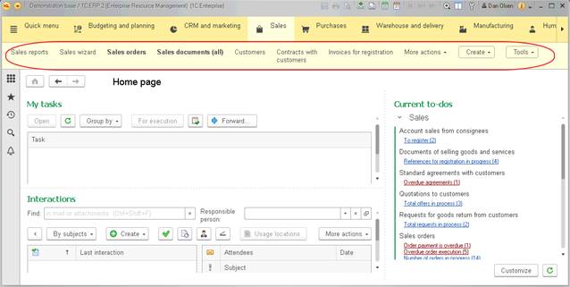
Fig. 7. The functions panel of the Inventory section
Some functions can be hidden from the current section functions panel if you do not have the right to access them or if you choose to hide these functions.

Fig. 8. The current section functions panel does not contain functions
When you click the section again, the function menu (the list of all section commands) is displayed. If the current section functions panel is hidden, clicking a section for the first time opens its functions menu.
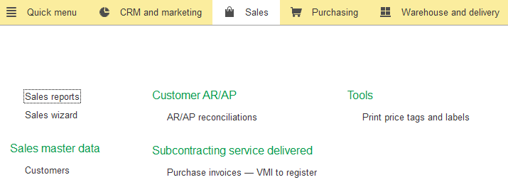
Fig. 9. List of all functions available in a section
The function menu contains navigation and action commands (in the Create, Reports, and Tools sections). For more information, see Navigation and Description.
To use a function (open a list form, create an object, run a report, and so on), click its hyperlink.
You can search through the list of functions. To search for a function, enter its name or a name part in the Search field. The search is performed in all sections, not just in the current section functions. As a result, the functions menu displays all functions whose names contain the search string.
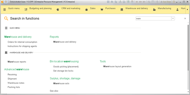
Fig. 10. A function search example
To cancel the search, press Esc.
If the current section functions panel is hidden, clicking a section opens its functions menu.
If the sections panel is hidden (because the default view does not include this panel or because you have hidden it using the panel editor), a list of sections is displayed above the functions menu, and selecting a section opens the functions of this section.
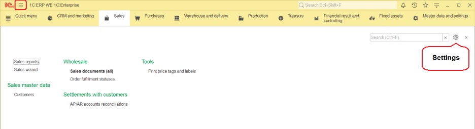
Fig. 11. The sections panel in the functions menu
Clicking the Settings icon in the right top corner of the functions menu opens a menu with the Navigation settings and Actions settings commands. These commands open dialog boxes with current section navigation or action settings. For information about customizing a list of navigation functions, see Navigation panel. For information about customizing a list of actions, see Customizing actions panel.
You can add links from the functions menu to Favorites by clicking the star icons next to their names.

Fig. 12. Adding functions to Favorites
1.2.1. Current section functions panel
This panel contains the functions available in the selected section. First, it displays links that open the list forms available in the section. If the links do not fit the panel, the rest of the functions are available on the More menu. The right part of the panel displays buttons that open menus with actions available in the section (showing only menus that are not blank).
For example, the functions panel of the Inventory section contains the following links: Products (opens the list of inventory items) and
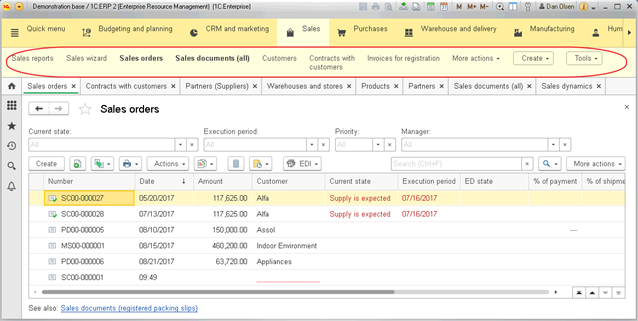
Fig. 13. Current section functions panel
To execute a function (for example, open the item list form), click the respective hyperlink.
1.2.2. Navigation
The navigation panel contains a list of functions that mirror section structure. If a section has subsections, they are displayed as separate groups.
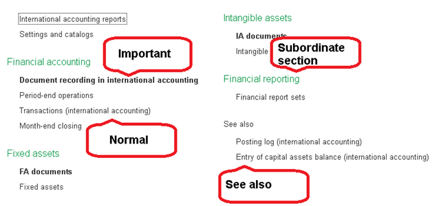
Fig. 14. Functions
There are three types of functions:
-
Important. Navigation to important data areas in the current section.
-
Normal. Navigation to current section data.
-
See also. References to additional information, which might not be directly related to the data of the current section, but can be useful.
The list of functions and the groups where they belong are defined by the application developer.
You can customize the list of navigation functions. To open the customization dialog box, in the section functions menu, click Navigation settings. For more information, see Navigation panel.
1.2.3. Description
The functions panel displays lists of actions available in the section.
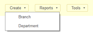
Fig. 15. Actions available in a current section functions panel
Many applications feature three standard command groups: Create, Reports, and Tools. The standard groups may not be available and other groups may be available instead.
The Create group contains actions that create objects, such as documents or list items.
The Reports group contains actions that open report forms.
The Tools group contains actions that provide access to service tools.
You can customize the list of actions available in each group and their order. For more information, see Customizing actions panel. To open the customization dialog box, in the section functions menu, click Action settings.
1.3. Open items panel
The open items panel contains a list of open forms. It can have horizontal or vertical orientation. When this panel is displayed, the home page button is hidden from the work area.
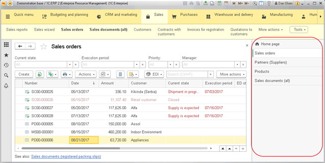
Fig. 16. Open items panel
If the home page contains at least one form, the list includes the Home page tab. Panel tabs are arranged by their opening time, new tabs are added to the end. Clicking a tab activates a form. Clicking on the “cross” icon in the upper right corner of the panel element closes the form corresponding to this element.
You can drag the tabs to reorder them for your convenience.
If the panel is oriented vertically and the tabs do not fit the height of the application window, a scroll bar is displayed. You can scroll through all tabs with the exception of the home page tab, which is pinned at the top.
If the panel is horizontal, all tabs are in one row.
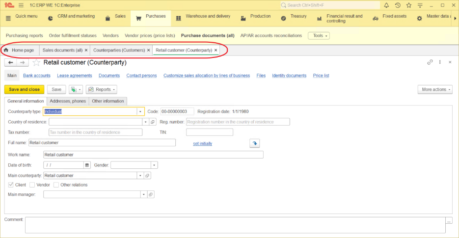
Fig. 17. Horizontal orientation of the open items panel
If window titles do not fit the tabs, a button that opens the list of open windows is displayed to the right, and the Home page tab only displays its icon. For windows that display documents or business processes, the number of a document or a business process is displayed at the right part of the tab.
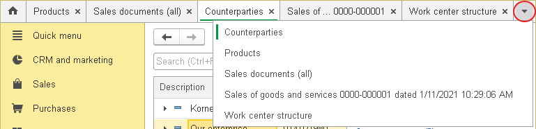
Fig. 18. The button on the open items panel that lists open windows
The list contains full names of all open windows, sorted alphabetically. The active window is marked.
1.3.1. Docking windows
Any open windows can be docked in the work area of the application window. To dock a window, drag its tab to the work area. When dragging, you will be asked to choose whether you want to dock the window on the left side, right side, top, or bottom of the work area.
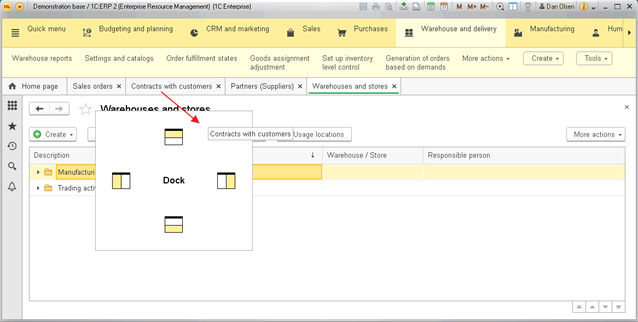
Fig. 19. Docking a window by dragging its tab from the open items panel
If the open items panel is oriented horizontally, a tab of a docked window displays an icon without text.

Fig. 20. A docked window
You can also use the tab context menu to display two windows side-by-side (Show side-by-side... commands), or to dock a window (Dock... commands). For more information on working with multiple windows, see Viewing two windows simultaneously.
1.3.2. Closing windows
You can close a window by clicking a cross in its tab. If the panel is oriented vertically, the cross is displayed when you move the pointer over a panel tab.
You can also close a window by clicking its tab with the scroll wheel.
To close multiple windows, you can use commands from the panel context menu:
-
Close all. Close all windows.
-
Close other windows. Close all windows except this window.
-
Close windows to the right (or Close windows below if the panel is oriented vertically). Close all windows whose tabs are located to the right of (or below) this tab.
1.4. Main window views
The main window view may vary according to application settings. It may look as a standard main window, workplace, full-screen workplace, or kiosk.
1.4.1. Workplace
In this view, the system command bar contains only the application logo, the window title, the username hyperlink, the About button, and window management commands. The main menu and all other items are hidden. Keyboard shortcuts of the hidden items are unavailable.
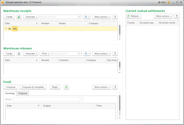
Fig. 21. Workplace view of main application window
This mode has the following distinctive features:
-
All panels, except the messages panel and the performance indicators panel (if used), are hidden.
-
Form navigation arrows, the Home page title, the Home button, the Favorites button, and the Close button are hidden.
-
The form header context menu is hidden.
-
If the form header and the Close button are both hidden, the entire area that contains them is hidden.
-
The following shortcuts become unavailable:
-
Panel navigation (Alt + 1, Alt + 2, Alt + 3, Alt + `, F10)
-
Form navigation (Ctrl + Tab, Ctrl + Shift + Tab, Ctrl + F6, Ctrl + Shift + F6)
-
Show/hide all panels (Ctrl + Shift + `)
-
Create new document (Ctrl + N)
-
Open document (Ctrl + O)
-
Save (Ctrl + S)
-
Print document (Ctrl + P)
-
Print document with current settings (Ctrl+Shift+P)
-
Open calculator (Ctrl + F2)
-
Follow the link (Shift+F11)
-
Get a link (Ctrl + F11)
-
Add to favorites (Ctrl + D)
-
Open the history panel (Ctrl+Shift+H)
-
Open favorites (Ctrl +Shift + B)
-
Open the search panel (Ctrl+Shift+F)
-
Open application help (F1, Shift + F1, Alt + Shift + F1, Alt + F1, Ctrl + Shift + F1) (the form help is still available)
-
Operations with numbers in the clipboard (Shift + Num *, Shift + Num+, Shift + Num-)
-
In the web client, if your browser supports full-screen mode, selecting kiosk view displays "Switching to full-screen mode" dialog box. Pressing Esc in kiosk mode exits the full-screen mode and displays "The application requires full-screen mode" dialog box proposing to switch back to full-screen mode.
1.4.2. Full-screen workplace
In this view, the application window is maximized to full screen (unless you access the web client through a browser that does not support full-screen mode). Besides Workplace mode features, this mode also features:
-
In the web client, if your browser supports full-screen mode, a confirmation dialog box is displayed before the full-screen mode is enabled.
-
In the web client, pressing Esc exits full-screen mode.
-
In thin and thick client application, the Collapse, Expand, and Close buttons are hidden in the main application window. The Collapse button is hidden in the auxiliary windows.
-
Clicking the system command bar does not open the context menu.
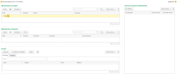
Fig. 22. Full-screen workplace view of the main application window
1.4.3. Kiosk
This mode has all features of Full-screen workplace mode (see Full-screen workplace). Besides, the hyperlink with username and the About button are hidden from the system commands area.
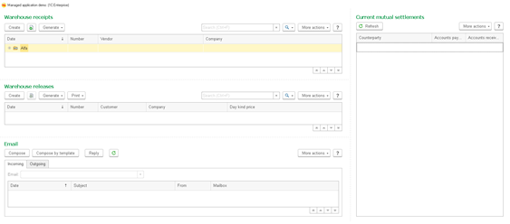
Fig. 23. Kiosk view of the main window
1.5. User profile settings
Click the username to display a menu containing your profile settings and the Log out command.
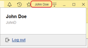
Fig. 24. User profile settings
If the application is connected to the collaboration server, the window also displays user profile picture, phone and email fields, and user's current status.
Data editing. To enter your phone number or email address, click the respective profile line, and type in the phone or address. When you are done, press Enter or click the check mark at the end of the line.
Profile picture settings. To change the profile picture, click it.
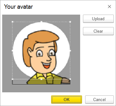
Fig. 25. User profile picture settings
You can do the following:
- Load. Load a profile picture from a file.
- Clear. Clear the profile picture.
You can use markers to crop the profile picture.
To save the profile picture, click OK.
Changing user status. If the application is connected to the collaboration server, current status is displayed for each user. To choose a status, click the line with your current status. The following statuses are available:
Status
Description
(Not displayed)
- Offline. The user is disconnected from the application. Next time the user goes online, they will get notifications for any new messages in their conversations. Offline users are not available for video calls.

- Available. This status is set when the user logs in to the application. For online users, notifications and incoming video calls are displayed on the screen.

- Do not disturb. This status explains to the conversation participants that you do not want to be disturbed. Pop-up notifications on new messages, sound notifications, and incoming video calls are disabled. The missed calls are displayed in the notification center.

- Away. In Windows, this status is set automatically if the 1C:Enterprise user does not take any actions for more than 5 minutes.
To log out, click Log out. If OpenID authentication is in use, your User-Supplied ID will be logged out as well.
1.6. Object form
Header of this form contains buttons for navigating to the home page, navigating between the forms, and more.
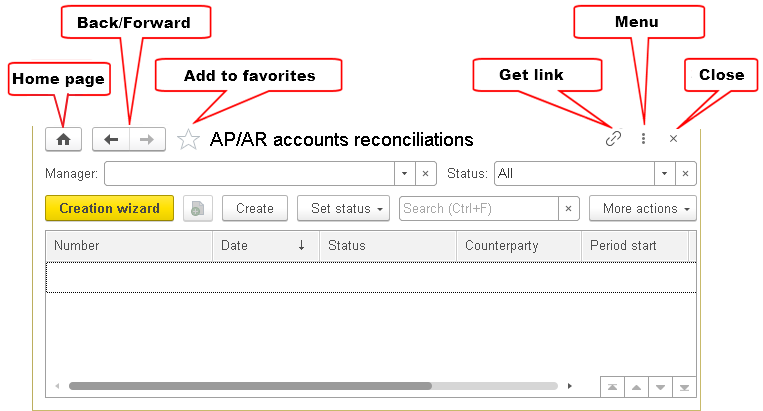
Fig. 26. Object form
The following commands are available in the form header area:
-
Home. Go to the home page of the application. This button is active if the home page forms are set in the program and open pages panel is not displayed.
-
Back. Go to the preceding active form.
-
Forward. Go to the form that was active after the current one. If the form is activated the last this button is displayed as unavailable.
-
Add to Favorites. The star icon allows you to add the current form to the list of favorites and delete it from the favorites. For more information see Favorites.
-
Get link. Get the URL to a form. For more information about get link dialog box, see Getting a link.
-
Form menu. The menu contains window merge commands (Window), scale settings (Change scale), call settings of the Information for technical support dialog box (Information for technical support), and commands specific to a certain object form. For example, for a spreadsheet document, this menu will contain commands of the menu: Edit, File, and other.
For an open document, document save, print, and preview commands are also displayed in the header area.
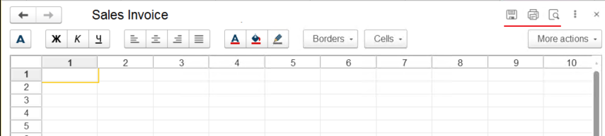
Fig. 27. Document commands in form header
To close the form, click Close.
1.6.1. Form navigation panel
If a form navigation panel is available, it is displayed horizontally under the form header.
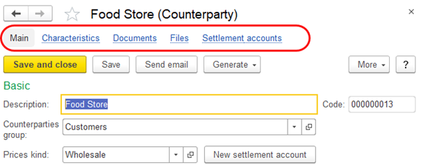
Fig. 28. Form navigation panel
Use this panel to view data that is logically related to the data displayed in the main object form.
The command that navigates to the current form is highlighted. Clicking Main activates the main form of the current object. Clicking other links in the form navigation panel activates auxiliary object forms (see the figure below).
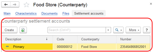
Fig. 29. An auxiliary form of a counterparty that stores settlement accounts
A navigation panel can include functions from the Go to and See also groups. It can also contain other functions.
If you click a link in a form that contains unsaved data, the application displays the following warning: Data has not yet been recorded. Switching to "<window name>" is allowed only after the data is recorded. The data will be recorded.
Clicking OK saves the current data and activates the other form. Clicking Cancel returns you to the current form to continue editing.
To customize a form navigation panel, in the form menu, select Window – Form navigation panel setup. This command is displayed, if the said setting is available in the form. Customization of a form navigation panel is similar to customization of a section navigation panel. For more information, see Navigation panel.
1.6.2. Form command bar
A form command bar includes the commands that are directly related to the object displayed in the main form. The commands are displayed as buttons.
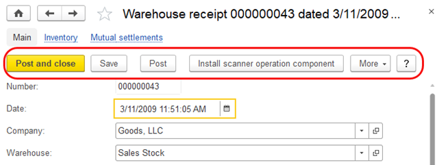
Fig. 30. Form command bar
One of the form command bar buttons can be the default one. To use it, you can press Ctrl + Enter. This button has bold text and yellow color. In the figure above, the default button is Post and close.
The More menu contains all available form commands.
The More – Show in list command opens the commands that navigate to the lists that contain the object (and sets the cursor to this object).
Chapter 2. Forms
In 1C:Enterprise, windows people use to interact with the application and data are called forms. Forms consist of elements that allow users to configure the application objects and manipulate the data. These elements include input fields, command bars, buttons, checkboxes, tabs, tables, charts, spreadsheets, HTML documents, and others. This article covers the most essential information about forms and form elements.
2.1. Form element overview
There are some elements that are common for all types of forms. The form title describes the name of the item or group of items a form contains. Form titles are defined during the application setup and are not editable by the users.
To select an item, click it, or navigate to it with the keyboard.
Shaded items are read-only.
To edit an item, double-click it or press Enter.
Form elements can be provided with tooltips that contain informative text about the element. To view a tooltip, hover over an element. The tooltip will pop up in 1–2 seconds unless no tooltip is provided for the element.
Navigating between form items. To navigate between form elements, press Tab or Shift + Tab, or click the element.
Some elements, such as the command bar, are cannot be navigated to with Tab or Shift + Tab. To navigate to such elements, click them or press Alt + F10.
To complete editing a form attribute, press Enter. The cursor will move to the next item. The movement direction is defined by the application developer.
Forms can validate the data the users enter. If invalid data is entered, the form displays an error message.
When you enter a value, the form can also populate some other fields with values based on the user entry.
Saving form parameters. The form's size and position are remembered automatically. The same applies to form controls.
Some forms can be customized. To edit a form, click More – Change form. For more information about form customization, see Customizing forms.
2.2. Fields
Fields are form elements people can use to view, enter, and edit data. To make an entry, left-click a field and type the value or choose from the list depending on the field type.
2.2.1. Input fields
Input fields are form elements people can use to view, enter, and edit data. To make an entry, left-click a field and type the value or choose from the list depending on the field type.
The actions available on an input field depends on the data type and the application custom features and settings.
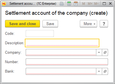
Fig. 31. A form with input fields.
To make an entry, click an input field or press Tab. When the field is selected, you can type in. Input fields support all text-processing features provided by the operating system, such as pasting from the clipboard.
Red underline means the field is required.
Pale borders mean the field is populated automatically or not meant for manual entries. For example, the field Code is populated when the form is saved. When a user attempts to edit a pale-bordered field, a warning pops up.
If a user enters invalid data, a warning pops up.
To open a list of valid values or a drop-down list, press F4.
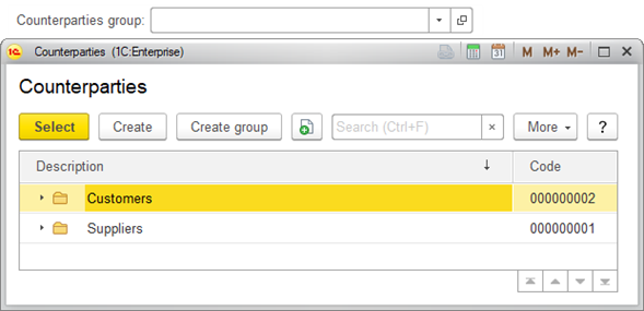
Fig. 32. Selecting a value from a drop-down list.
To open the form of the selected item, press Ctrl+Shift+F4.
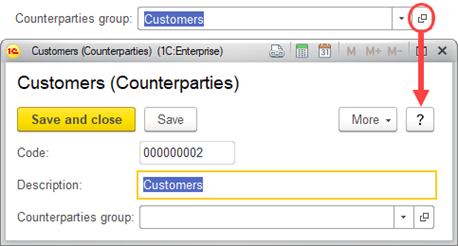
Fig. 33. Opening the form of a selected item.
Pale borders around Code warn that the value is not meant to be edited.
If a field supports multiple lines, Enter or Shift + Enter starts a new line.
Multiline fields can support tabulation and text search. Such fields don't support Tab to navigate to the next field.
If an input field has a character limit, when you paste a piece of text from the clipboard, 1C:Enterprise trims the characters that go beyond the limit.
2.2.1.1. String
Input fields that support String entries look as follows:

Fig. 34. Input field for String entries.
String fields support a hint that describes the expected value. The hint disappears as soon as a user starts typing in.

Fig. 35. An input field hint.
2.2.1.2. Number fields
Input fields that support numeric entries have a selection button shaped as a calculator. When a user clicks the button, the built-in calculator opens.
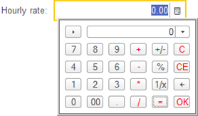
Fig. 36. Built-in calculator.
Some Number fields have spin controls.

Fig. 37. Spin control.
2.2.1.3. Date fields
Input fields that support Date entries have date and time separators, such as dots or colons.
Dates can be entered manually or selected from the built-in calendar.
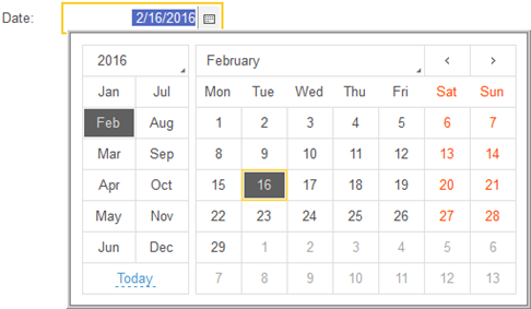
Fig. 38. Built-in calendar.
2.2.1.4. Multi-type fields
Some input fields support data of multiple types. Such fields are provided with the Select button. The button opens a list of the data types valid for this field.
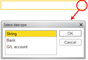
Fig. 39. Selecting data type.
First, a user chooses a data type, and then selects a value.
2.2.1.5. Selecting value from a list
You can select an object value without opening a new window. Use the drop-down list that is displayed when you put the cursor in an input field, or click the input field selection button, or press the Down Arrow key (except for multiline fields).
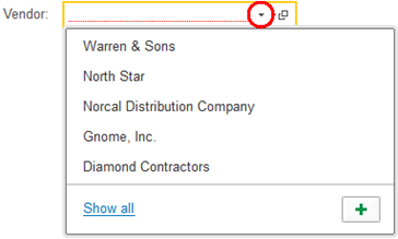
*Fig. 40. Input field with drop-down list.**
Drop-down lists store the history of entries. When a user selects an input field, a list of the last selected items drops down.
Value search. When you put the cursor in an input field, you can be prompted to enter a search string, view a full list of values (Show all or F4), or create an object (Create or F8).
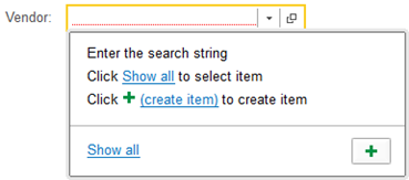
Fig. 41. Drop-down list.
If no entry is found, the user can see available items or create a new item.
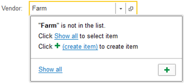
Fig. 42. Entry cannot be found.
If 1C:Enterprise finds matches to the user entry, it shows the search results as a drop-down list. Depending on the settings, the algorithm searches for the strings that contain the search text or start with the search text. Example:
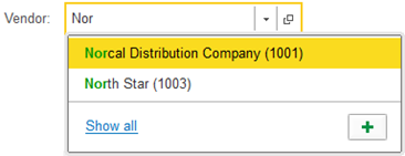
Fig. 43. Searching for strings that start with search text.
If the field supports substring search, the search text is looked for anywhere in the strings.
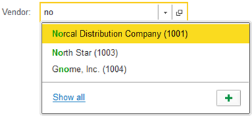
Fig. 44. Substring search.
If the amount of data to search through is too big to display the results instantly, a wait message will be displayed.
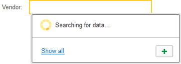
Fig. 45. User message during background search.
If a user selects an item that has been marked for deletion, a warning pops up.
If there are no matching search results, the user is prompted to select an item from a list or create a new item (if applicable).
To create a new item, click Create or press F8.
If a user opens a drop-down list of a field and then clicks another interface element, the drop-down list collapses and the field value stays unchanged.
Full-text search in input fields. Some input fields support full-text search. If a user enters a few words, the search results will contain either word and word combinations.
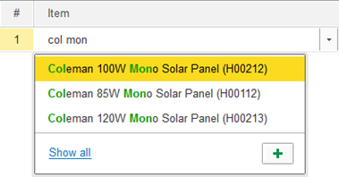
Fig. 46. Full-text search in input field.
The full-text search returns strings that contain either word and word combinations, including full and partial word matches, like when you use * in the full-text search.
Clearing selected values. To clear a drop-down item from an input field, click the clear button on the field's right or press Shift + F4. The field will reset to the default value.

Fig. 47. Input field with clear button.
To cancel the input and return to the previous value, press Esc.
For multiline input fields, when you press Esc, you are prompted to save the changes. To save the changes, click Yes. To cancel the changes, click No. To continue editing, click Cancel.
2.2.1.6. Multiple value entry
Some input fields allow you to specify multiple values of the same type or different types depending on the application settings.

Fig. 48. Multiple values in the input field
You can perform the following actions in this field:
-
Add a new value. Place the cursor to the right of the last item and start typing.
-
Delete a value. Click the cross icon next to the item.
-
Select one or several values. Use the mouse or the keyboard.
If some values do not fit in the string, the field displays the + <number> button. You can click this button to view the values that did not fit in.

Fig. 49. Values did not fit in the string
2.2.2. Checkboxes
A Checkbox is an interactive form element that users can toggle to indicate an affirmative or negative choice.
Checkboxes have two, sometimes three statuses.

Fig. 50. Checkbox element.
Shaded checkboxes are read-only.
Checkboxes can be represented by a switch button.
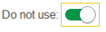
Fig. 51. Switch checkbox.
To toggle a checkbox, click it or alternatively select it with Tab and Shift+Tab, and then press Spacebar.
Also, you can toggle the two-states checkboxes with Plus Sign and Minus Sign.
2.2.3. Radio buttons
A group of Radio buttons is an interactive form element that allows users to choose one of a predefined set of mutually exclusive options. To select an option, click it or alternatively select a group of radio buttons with Tab and Shift + Tab, then select a button with the arrow keys and then press Enter. In the example below, a user can choose between two types of a merchandise item:

Fig. 52. Radio button.
2.3. Segmented button
A Segmented button is an interactive form element that allows users to toggle between two or more mutually exclusive options. In the example below, a user can choose between order statuses:

Fig. 53. Segmented button for order statuses.
To select an option, click it. A selected button gets a brighter background and its font turns green.
2.4. Progress bars
A progress bar is an interface element used to visualize the progression of a process.

Fig. 54. Progress bars
2.5. Sliders
A Slider is an interactive form element that allows users to pick a numeric value by dragging a thumb along a horizontal or vertical line.
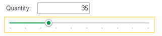
Fig. 55. Slider.
A Slider is defined by three values: the range minimum value, the range maximum value, and the user-selected value.
You can move the slider with the arrow keys or the cursor.
2.6. Hyperlinks
A Hyperlink is an interactive interface element that navigates a user to another application object, such as a form. When a user hovers over a hyperlink the cursor turns into a hand and the text becomes underlined. To activate a hyperlink, click it or press Tab, Shift + Tab, Right Arrow, Left Arrow, Down Arrow, or Up Arrow, and then press Enter. A hyperlink can be added to an image to make a clickable picture. When a user hovers over an image that has a hyperlink, the cursor turns into a hand.
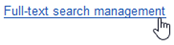
Fig. 56. Cursor over hyperlink.
2.7. Buttons
A button is an interactive interface element that starts a defined algorithm when activated.

Fig. 57. Button.
1C:Enterprise supports rectangular and rounded buttons. Buttons have the following appearance parameters: border, background color, and font.
To activate a button, click it, or alternatively select it with Tab and Shift + Tab and then press Enter.
A form can have one default button, which is activated with Ctrl + Enter.
Some buttons are associated with keyboard shortcuts.
A button can have the appearance of being pressed or released. This helps to see if is activated or idle.
If the action associated with a button is unavailable, the button is non-interactive.

Fig. 58. Non-interactive button.
Developers can customize buttons' appearance.

Fig. 59. Customized button.
2.8. Tables
A table is an arrangement of data in a grid-like form of rows and columns. The set of columns is defined by the developer and based on the form's purpose. Each row contains associated pieces of data. In the example below, a table in the Sales order document.
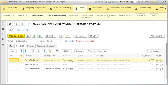
Fig. 60. Data composed in a table.
A table row can contain nested rows. This might improve the data readability for wide tables.
If the row height equals one cell and it contains several lines of text, only the first line of text is displayed. The hidden lines of text are displayed as three dots.
Forms that contain tables are usually provided with commands that allow users to add, remove, copy, sort, and otherwise manipulate the table data. Some of them are placed on the command bar, others are available from the "More..." menu or the context menu.
The available actions depend on the type of data stored and determined by the developer. To start editing a cell, press Enter, or select the cell and start typing. To go to the next cell in editing mode, press Tab. To finish editing a cell, press Shift + F2.
Browsing through a table. To browse through a table, you can use the mouse and the keyboard.
For better readability, you can resize the columns' width. The new column sizes are remembered. If you press the Ctrl key when changing the column width, only the width of the current column will change.
To see overflow text, hover over the cell.
You can change the order of columns. If you need to set the order of columns, use the form setting described on Customizing forms.
Some tables allow you to select multiple rows. To do it, hold Ctrl and select rows using the mouse or arrow keys.
Some table cells can contain multiple values.
To search for a cell's content in the infobase, open the cell's context menu, and click Search everywhere. For more information, see Global search.
Press Page Up and Page Down to scroll through a table.
To navigate to the first table row, press Ctrl+Home. To navigate to the last row, press
Editing cell values. To edit a cell, select it and begin editing. If a cell has a list of available values, press Ctrl + Down Arrow to expand the list and select a value. To finish editing, press Enter.
Adding rows. To add a row, press Insert. A cell in the new row switches to edit mode automatically. Once you type a value and press Enter, the cursor is moved to the next cell.
Some applications support navigation between cells with Enter and Tab.
Some applications add a new row when a user presses Down Arrow from the bottom row. If the new row has no entries, it is removed once you leave the form.
Deleting rows.
To delete a row, select it and press Delete.
Copying rows. To copy a row, select it and press F9. The new row is added below and repeats the values of the original row.
Row numbering. The row numbers are displayed in the row heading. When you add a row, it is automatically assigned the sequence number.
You can move rows up and down the table. To move a row, use the Move up and Move down commands. When you move a row, its number is adjusted automatically.
Sorting rows. You can customize the sorting of rows. To sort a table by a specific column, select a column and then click More – Sort descending or Sort ascending. Alternatively, you can drag-and-drop a table row.
If you need to specify a custom row sorting, use the form customization procedure (see Customizing forms).
2.9. Groups
Form items can be grouped. A group is manipulated as a single form item. Users can group fields, lists, columns, pages, and commands. Columns can be grouped into vertical or horizontal groups. In the example below, there is a group consisting of two columns:
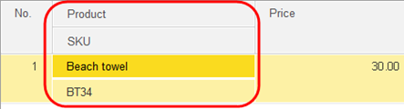
Fig. 61. Group of columns.
Form elements can be combined into groups. A group can be separated from neighboring elements with a line or border. In the example below, a group is set apart with a line.
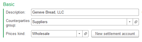
Fig. 62. Group of fields.
Some forms allow users to move elements between groups. When an element is moved to another group, 1C:Enterprise adjusts element properties automatically. For example, when a user moves a group of elements to a group with the Pages type, its Type changes from Regular group to Page. This might also change or delete properties of subordinate items.
Collapsible groups. A form can contain collapsible groups, which have a different appearance.
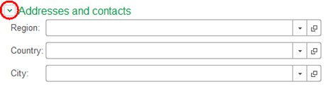
Fig. 63. Collapsible group.
To hide the collapsible group content, click its title.
To display the content, click the title again.
Pop-up groups. By default, such groups are displayed as titles. When a user clicks the title, the content of the group pops up in a new window.
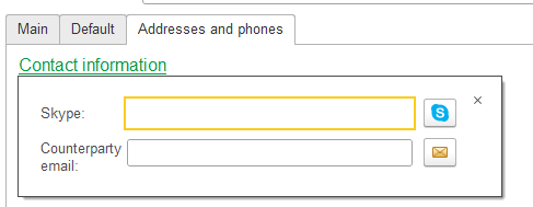
Fig. 64. Pop-up group.
If you disable title display for a pop-up group, it will be displayed as a regular group.
For information about form customization, see Customizing forms.
2.9.1. Command bar
A command bar is a group of controls used to perform actions only on the form or its separate part.
To activate a command bar, press Alt + F10. To move between the controls, press Tab or Shift + Tab. To activate a selected control, press Enter.
2.9.2. Pages
A page is an individual tab that can has its own controls, input fields and other interface elements. Tabs can be displayed vertically or horizontally. To navigate between pages, click them, or alternatively press Ctrl+Page Up or Ctrl+Page Down.
For example, a Sales order form can include the Products tab, which stores the list of goods the Others tab, which stores shipment details.
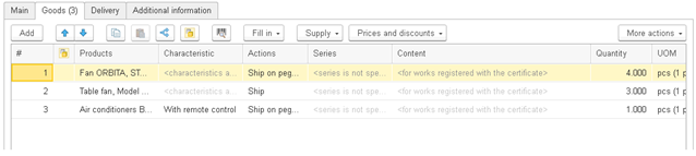
Fig. 65. Sales order form tabs.
2.10. Charts
A chart is a graphical representation of data. You can embed a chart on a form or a spreadsheet.
Users can customize charts. The set of customizable attributes is determined by the developer. For some charts, users can change the chart type. For more information about spreadsheet charts, see the spreadsheet document editor documentation, section "Managing charts".
2.11. Text document fields
A text document field is a part of the text processor where users type text. For more information, see the text editor documentation.
2.12. HTML document fields
HTML document fields are used to preview HTML documents. All hyperlinks are clickable. To search through the document, under the main menu, click Edit and then click Find, Find next, or Find previous. To navigate between HTML pages, open the context menu, and then click Forward or Back.
All HTML fields support the Print and Save as commands.
2.13. PDF document field
The PDF document field form item displays a PDF document on a form.
When you upload a document, the document signatures are verified (if any) and the used PDF standard is determined.
To zoom a page in or out, use scale change commands on the PDF document field tools panel. To apply a precise scale, click More – Scale. In the window that appears, select the required scale using the mouse wheel or arrow keys, and click OK.
Besides, you can use quick navigation functions available on the PDF document field tools panel: Go to beginning, Back, Forward, and Go to end.
To go to a certain page, click More – Go to page. In the opened dialog box, specify the page number and click OK.
To convert a color document to a black and white one, click Document – Convert to grayscale or click More – Document – Convert to grayscale in the document field.
To rotate a document clockwise or counterclockwise, use the respective commands on the field tools panel or in the form menu: Document – Rotate.
To view information about signatures used in the document, perform one of the following actions:
- Click the hyperlink with information about document signatures validity. It will open a dialog box with the check result of all used signatures.
- Double-click the signature or right-click the signature and then select Signature properties.... It will open a dialog box with the selected signature data (its validity status, signing date, and owner).
2.14. Graphical schema fields
A Graphical schema field is used to graphically represent application objects and how they are linked to each other.
For more information, see the graphical schema editor documentation.
To resize a schema, on the main menu, click Graphical schema – Scale, then select one of the options.
Alternatively, to zoom in and zoom out, hold down Ctrl and rotate the scroll wheel.
This field can display general flowcharts for business processes or flowcharts for specific instances of business processes based on completed steps and steps to be done.
In the example below, a schema depicts a sales process.
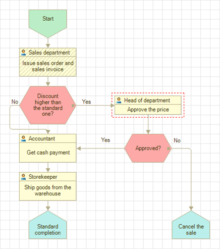
Fig. 66. Business process graphical schema.
The completed steps have the hatched background, like Issue sales order and sales invoice in the example. A step is considered completed if all the tasks associated with the step are completed.
Steps-to-do are framed with red dashed lines. A step is considered to be done when it has one or more unfinished tasks, like Approve the price in the example.
2.15. Picture fields
A Picture field is an interface element intended to display an image. Some images can be assigned with a hyperlink. For more information, see Hyperlinks.
If a picture does not fit the field, scroll bars are displayed when you select the field. To scroll a picture, use the arrow keys. Also, the following keyboard shortcuts are available: Home to move to the upper-left corner, End to move to the lower-right corner, Page Up to move one screen up, Page Down to move one screen down, Alt+Page Up to move one screen right, and Alt+Page Down to move one screen left.
Alternatively, you can scroll a picture with the mouse scroll wheel. Hold down Shift to scroll a picture right and left.
Picture fields have a context menu with the following commands: Copy, Save as, and View Image.
Click Copy to save the picture to the clipboard and paste it to another application.
Click Save as and save the picture of the hard drive. This command is available only for pictures imported from files.
Click View Image to open the picture in a new window. The window is resizable. To change the picture scale, use Zoom in, Zoom out, and Original Size. Alternatively, you can use the keypad: press + to zoom in and - to zoom out. Click Original Size to reset the picture to its actual size.
Before you start manipulating a picture, click the picture to activate it. Otherwise, your actions will have no effect on the picture. For example, if you clicked a button, the picture becomes inactive.
To zoom in and zoom out, hold down Ctrl and rotate the scroll wheel. Alternatively, you can use the keypad: press + to zoom in and - to zoom out.
2.16. Spreadsheet document fields
A Spreadsheet document field is used to operate on data entered in cells using mathematical, statistical, and other functions. For more information, see the spreadsheet document editor documentation.
Navigating a spreadsheet. To navigate a spreadsheet, use the scroll bars.
For faster scrolling, press down on the scroll wheel and move the cursor to the required direction. The further you move the cursor, the faster the screen scrolls.
To find a cell's value in other application objects, from the cell's context menu, click Search everywhere. For more information, see Global search.
Spreadsheet view. To set up the view of spreadsheet document areas and components, such as column and row headers, table grid, and others, go to Table – View.
On the main menu, click Table – View, and then select an item to show or hide it.
| Menu item | Action |
|---|---|
| Dock Table | Dock the top rows and left columns of a spreadsheet document so that they are always visible when the document is scrolled. |
| Show Grid | Show spreadsheet gridlines. |
| View Headers | Show row and column headers. |
| View Groups | Show row and column groups. |
| Edit | Allow document editing. |
| Show Comments | Show comments to cells. |
| Black and White View | Disable the document color scheme. When selected, spreadsheet colors are defined by the operating system settings. |
| Page view mode | Show the minimum number of rows, printing area, and page breaks. |
| Scale | The document scale. |
Header docking. You can dock the top rows and left columns of a spreadsheet document so that they are always visible when you scroll the spreadsheet.
To dock spreadsheet rows, select a row, and then, on the main menu, click Table – View – Dock Table. The rows above the selected row will be docked.
To dock spreadsheet columns, select a column. The columns left to the selected column will be docked.
To dock rows and columns, select a cell. The rows above the cell and the columns to the left of the cell will be docked.
To release the docked rows and columns, on the main menu, click Table – View – Dock Table.
Protect a spreadsheet from editing. To protect a spreadsheet from editing, on the main menu, click Table – View – Edit.
To see an overflow text, hover over the cell to reveal the text in a pop-up window. A text might be too big to fit the pop-up window.
2.17. Formatted document fields
A Formatted document field is a form element that allows users to enter formatted text, which has the styling information, such as text color and font, and can contain hyperlinks and images.
This field can be used to create HTML emails or edit HTML documents.
If a field is Read-only, users can follow the field hyperlinks. A hyperlink opens in a new browser tab.
Select a text and, from the context menu, click Search everywhere to find the text in the infobase. For more information, see Global search.
Click File – Save to save a formatted document as a plain text, PDF, or HTML file.
Formatted document fields have the following formatting options:
Font size and style. To change the font, use one of the methods:
- On the main menu, select Table — Format — Font and select the font type, font size, and style: Bold, Underline, Italic, and Strikethrough. To confirm the style, click
- Alternatively, select the text and change the style using the command bar buttons.
Text and background color. To change the text color or background color, select the text and on the command bar, click Change text color or
Hyperlinks. To add a hyperlink to a document, select text or picture and click Insert hyperlink. Enter a URL and click OK.
By default, hyperlinks appear blue with a blue underline.
Pictures. To add a picture to a document, click Insert picture and select an image file.
Special characters. To add a special character, click Insert symbol and select a character.
Lists. To create a list, click Bulleted list or Numbered list.
To add a next list item, press Enter.
To finish editing a list, press Enter twice, or press Backspace to delete the last item bullet or number.
Text alignment.
Select a text and click Left, Right, Center, or Justify.
Indentation.
To increase an indent, select a text, and click Increase indent. To decrease an indent, select a text and click Decrease indent. Alternatively, place the cursor at the beginning of a paragraph and use the keyboard:
- Press Tab to increase the indent.
- Press Shift + Tab to decrease the indent.
Line spacing. To change the space between adjacent lines, select the text, and click Line spacing. Then, enter the spacing value, and click OK.
2.18. Planner fields
A Planner field is a form element that allows users to create, edit, and view events, such as tasks, timetables, and meetings.
A time scale is required for all planner fields.
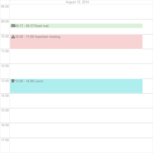
Fig. 67. Planner field configured to display a single day.
A planner field can display a number of intervals, interval groups, and tooltips.
The application can also have context menu commands for items, dimension items, timescale items, when you move timescale titles, and for empty areas.
The default time interval is defined by the developer.
To change the interval, go to the Planner menu and select an interval:
-
Go to beginning. Select the beginning of the time interval.
-
Back. Select the period one time interval earlier than the current period. For example, if the time interval is
-
Today. Select the current day.
-
Forward. Select the period one time interval later than the current period.
-
Go to end. Select the end of the time interval.
2.18.1. Adding planner elements
To create an event, right-click in the cell where you want to add it.
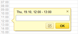
Fig. 68. Creating event.
To save the event, click OK.
2.18.2. Editing events
To view or edit the parameters of an event, go to the context menu or the quick edit window, and click Edit.
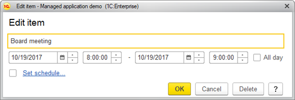
Fig. 69. Editing events.
An event has the following parameters:
-
Name. The name of the event.
-
Time interval. If you select All day, the time interval will automatically set to 00:00–23:59.
-
Schedule. To create a recurring event, click Set schedule, or select the checkbox. You can set the event schedule text-underline:none">in a separate window.
Set the schedule, and click OK.
To discard the changes, click Cancel.
To delete the event, click Delete.
2.18.2.1. Moving events
To change the time interval for an event, do one of the following:
- Drag-and-drop the event to another date and time.
- Edit the event from the context menu.
2.18.2.2. Creating recurring events.
A recurring event is an event that occurs on a regular basis. For example, every day, every Friday, or every 1st day of a month.
To make an event repeated, on the context menu or the edit window of an element, select Set schedule.
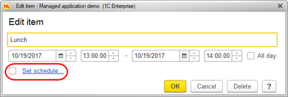
Fig. 70. Creating recurring event.
Set up the schedule parameters and click OK.
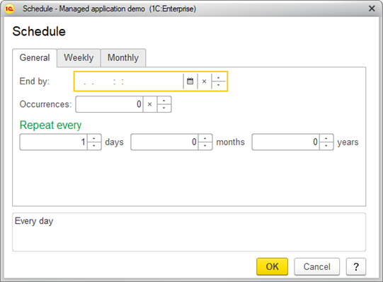
Fig. 71. Editing schedule.
On the General tab, specify the repetition end date in the Repeat until field. Specify the number of retries in the Number of retries field. Specify the repetition interval in days, months, and years in the Repeat every field.
You can review the schedule at the bottom of the dialog box.
On the Weekly tab, specify the weekly schedule:
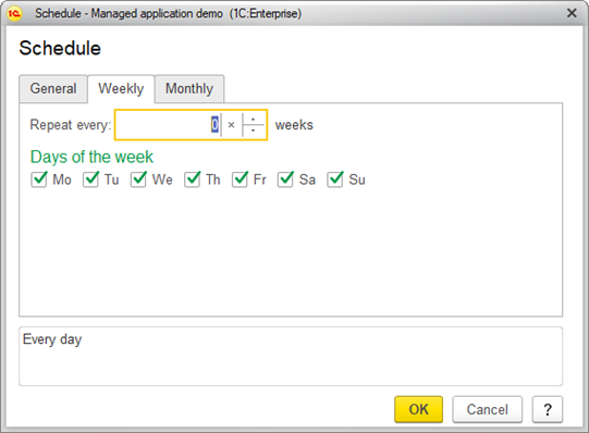
Fig. 72. Editing weekly schedule.
In the Repeat every field, specify the repeat period in weeks.
In Days of the week, select the days of the week when the event will repeat.
On the Monthly tab, specify the monthly schedule:
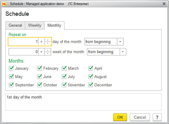
Fig. 73. Editing monthly schedule.
In Repeat on, specify the day of the month or day of the week from the beginning of/from the end of the period.
In Months, select the repeating months.
You can review the schedule at the bottom of the dialog box.

Fig. 74. Schedule preview.
2.18.3. Deleting events
Only users that have sufficient rights can delete events. To delete an event, right-click it and click Delete.

Fig. 75. Deleting event.
2.19. Saving field values
1C:Enterprise has a feature that allows users to save sets of values to later populate multiple fields with one click. To do so, use the Save settings and Select settings commands.
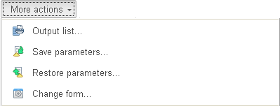
Fig. 76. Commands that save and paste values.
Enter values in the form's fields and click Save settings. Enter a name for the set of values and click Save.
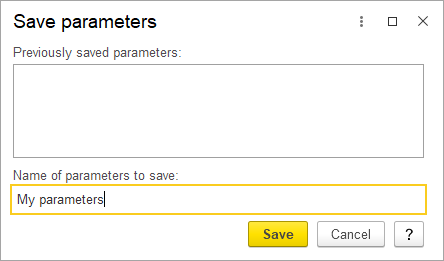
Fig. 77. Saving current values.
To populate the form with the previously saved values, click Select settings. Then, select a set of values and click Select.
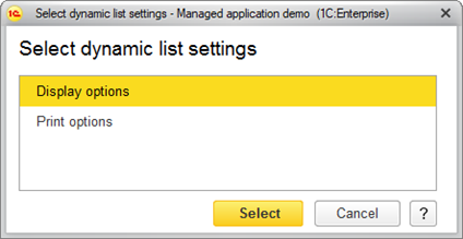
Fig. 78. Selecting saved set of values.
This fills the form fields with the restored values.
Chapter 3. Lists
1C:Enterprise uses a variety of lists to display data.
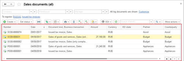
Fig. 79. A list of goods and its command bar
You can edit a list by adding, editing, or deleting its items, provided that the application supports these operations and you have sufficient rights.
You can encounter lists in two forms: list form and item selection form.
In most cases, you can navigate to a list form by clicking the respective link of the navigation panel.
To open an item selection list, in a form field, click the selection button or press F4. An application can have different forms for item selection and group selection.
In an item selection form, you can select an item by clicking it and then pressing Enter, or you can create an item. In a list form, pressing Enter normally opens the selected item for editing. Application developers have the option to change the behavior of the Enter key.
3.1. Viewing lists
Operations available in tables are also available in lists. For the list of operations, see Tables.
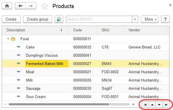
Fig. 80. A Products list form
A list form is usually a table displaying a list of items. The assortment of columns in this table is defined by application design.
An application can provide multiple views of a single list, differing by the assortment and order of columns.
To sort a table by column, click a column header.
If the list is too long and does not fit the height of the table, scroll buttons are displayed in the bottom right corner. The buttons have the following functions:
-
Go to beginning. Go to the beginning of the list.
-
Go to previous page. Go to the previous page of the list.
-
Go to next page. Go to the next page of the list.
-
Go to end. Go to the end of the list.
Using these buttons to navigate a list does not move the selection to another line.
To customize the assortment of displayed columns, click More – Change form. The form customization procedure is described in Customizing forms.
If a list contains many items (lines) and columns, only a part of the list is displayed in the form with scroll bars available at the bottom and to the right of the list.
Both list items and folders can be marked for deletion. They are usually marked with strikethrough icons in the leftmost column of the list.
You can resize the column width. The new width is saved and used next time the window is opened. If a list is opened in a separate window, the width of the columns is saved, as well as the size and location of that window.
3.1.1. Hierarchical lists
1C:Enterprise platform supports building hierarchical lists with an unlimited number of nested levels (however the application design can impose limitations on this).
Hierarchical lists include multiple item levels, with the items of the lower levels subordinated to those of the higher levels. There are two types of list hierarchy: hierarchy of folders and items and hierarchy of items. The application design determines the hierarchy type.
A list that has a hierarchy of folders and items includes two types of items: folders and items. A folder is a node that contains subordinate folders and items. An item is an individual object.
In the lists with hierarchy of items, any item can be both a node and an individual object. For example, a list of departments can have item hierarchy. Each department can contain other departments but all the departments have the same assortment of properties.
A hierarchical list has the following view modes: hierarchical list, list, and tree. To change a view mode, click More – View mode.
The selected view mode is highlighted in the menu.
List mode. If you select List view mode, the list displays all the items. Folders and items are displayed together without separation.
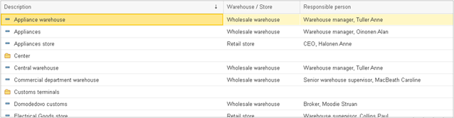
Fig. 81. A list view
Hierarchical list mode. If you select Hierarchical list view mode for a list having a hierarchy of folders and items, the list displays only top-level items, and when you open a folder, the list displays only items that are subordinate to that folder.
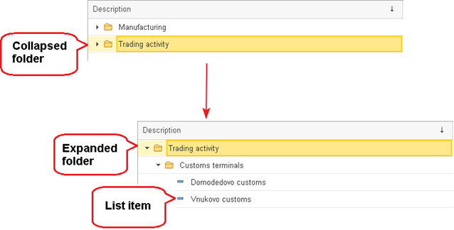
Fig. 82. A list of materials and services in hierarchical view mode
-
Collapsed folder. The line displays a folder. Double-clicking the folder expands it and displays the items available in that folder.
-
Expanded folder. The line displays a folder opened for viewing. This line is always located at the top of the table, right under the column headers. Double-clicking that line collapses the folder.
-
List item. The line is a subordinate item.
You can expand a folder using one of the following methods:
-
Double-click a folder line.
-
Click ▼ to the left of a folder icon.
-
Select a folder and press Ctrl + Down Arrow.
-
Select a folder and press + on the numeric keypad.
-
Select a folder and then click More – Down one level.
To return to the previous level, select an item and press Ctrl + Up Arrow, or click More – Up one level.
Tree mode. If you select Tree view mode, the list items are displayed as a tree.
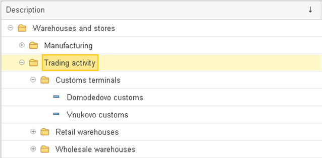
Fig. 83. A hierarchical list in tree view mode
You can expand and collapse tree branches. The + sign in a branch node indicates that this branch can be expanded. Clicking this sign expands the next tree level for viewing and changes the + sign to –. You can collapse a tree branch by clicking –.
When a tree has expanded branches, you can press Up Arrow and Down Arrow keys to move between the items.
To expand a folder and select the first item in that folder, press Ctrl + Down Arrow. To move to the parent folder, press Ctrl + Up Arrow.
To collapse a tree node and all its subordinate nodes, press Shift + Alt + Num-. To collapse all the tree nodes, press Ctrl + Shift + Alt + Num-. To expand a tree node and all its subordinate nodes, press Shift + Alt + Num+. To expand all the tree nodes, press Ctrl + Shift + Alt + Num+.
In the tree or hierarchical list mode, you can expand or collapse a node by pressing Num+ or Num-, respectively.
To quickly navigate to the beginning or to the end of a list, press Home or End, respectively.
Viewing lists with hierarchy of items in the Tree mode is similar to viewing lists with hierarchy of folders and items. Note that lists with hierarchy of items have identical icons for items and folders.
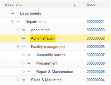
Fig. 84. A list with a hierarchy of items in tree view mode
3.2. Creating list items
To create an item, in a list form, click Create or press Insert.
To create an item in a specific folder of a hierarchical list, select the folder before creating the item. This option is available in the Hierarchical list and Tree view modes.
If an item form includes a Parent attribute, you can set a folder for the item regardless of the list view mode and the current folder.
When creating a list item, you enter its data in the item form window.
The appearance of this window, its properties, and behavior of the controls are application-specific.
When editing a list item, you can use the standard form field editing methods. For the list of operations, see Form element overview.
The application might check whether the data you enter is valid and complete. If invalid data is entered, the form displays an error message. When you are done entering the attributes, click Save and close, or another similar button used to save the item, or simply close the form. When you are prompted to save the changes, click Yes to save the item or No to discard the changes.
To cancel item creation, press Esc.
3.2.1. Creating list folders
To create a folder in a list with hierarchy of folders and items, in the list form, click More – Create group.
If you select a folder before creating a new one, the selected folder becomes its parent (in Hierarchical list or Tree view mode).
In some applications, you have the option to specify a Parent in the item creation form, irrespective of the mode and the current folder.
Similar to creating a list item, when you create a folder, you can edit its properties in the folder creation form.
1C:Enterprise does not differentiate between the codes of list items and folders, that is why folder codes and item codes cannot be identical.
Other operations related to creating and editing folders are identical to creating and editing items.
3.2.2. Copying list items
You can create a list item or folder by copying an existing item or folder. Put the cursor to an item or folder and then click More – Copy.
This opens an item creation form filled with attribute values taken from the source item. If the list does not feature automatic code assignment, the code of the new item is copied from the source item.
You can edit the values using the general rules described in Editing list items.
3.3. Editing list items
To edit an item, put the cursor to any cell of the line that you want to edit and press Enter, or double-click anywhere in the line, or press F2. This opens the list item editing form where you can edit the required attributes.
When a list item form is opened (or multiple forms are opened), you can perform any operations available in the list form: add items and folders, delete them, move items between folders, and more.
If a list is read-only, the data it the list item form cannot be edited.
3.3.1. Moving list items between folders
You might want to rearrange items in hierarchical lists, that is, move items or folders between folders.
To move an item or a folder to another folder:
-
Select an item or folder.
-
Click More – Move to folder.
-
In the dialog box that is opened, select the destination folder.
If an application checks the uniqueness of list item codes, the code of an item being moved must be different from the codes of items that already exist in the destination folder. If the codes match, the following message is displayed: <Field name> field value not unique. At that, you have to assign a unique code to the item being moved.
3.3.2. Selecting values from lists
To select an attribute value from a list, in the attribute input field, click the selection button or press F4.
When a list is opened to select a value, the list window may have a different look (the assortment and order of list columns may be different, a folder tree may be absent or located in a different position, and so on). A list can have different forms for different operating modes. As a rule, a selection form contains the minimum required information, it frequently consists only of the name and code columns.
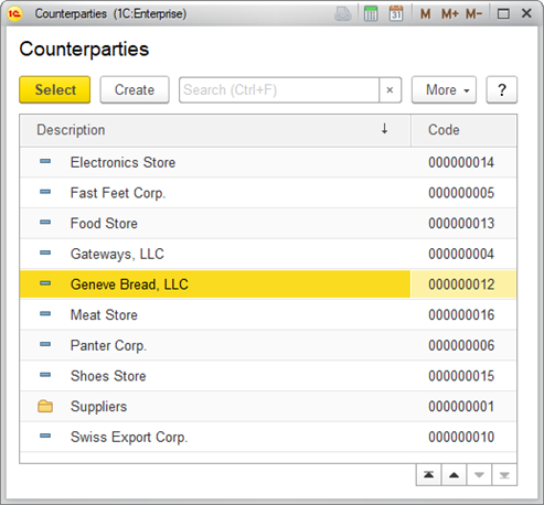
Fig. 85. Selecting an attribute value from a list
The item selection form supports the actions that are available in the list form: adding list items, editing list item attributes, moving items between folders (if the window contains a folder tree), and so on.
For example, if a list of companies does not include the company you need, you can add it in the item selection form and select it immediately. You can also edit some attributes of an existing company (provided that you have rights for editing them).
Data displayed in a selection form is synchronized with data displayed in a list form, so all the changes that you make in one of the windows are reflected in the other window.
To select a list item, put the cursor to the item line, and then press Enter or click Select on the command bar (if the application has that button).
For hierarchical lists, in an item form, you can specify a folder where the item belongs (if the application supports this option).
For some attributes, you can select both items and folders. To select a folder quickly, you can use the standard selection method while holding down Shift.
3.3.2.1. Predefined list items
A list can contain predefined items. These items are added during application development and cannot be deleted in 1C:Enterprise mode. You can only edit attributes of such items.
3.3.3. Searching in lists
If a form contains a search box, to search in a list, start typing the search string (switching to the search box is not required). As a result, the list is filtered to show only lines that contain the search string, and the matches are marked with color. You can also switch to the search box by pressing Ctrl+F.
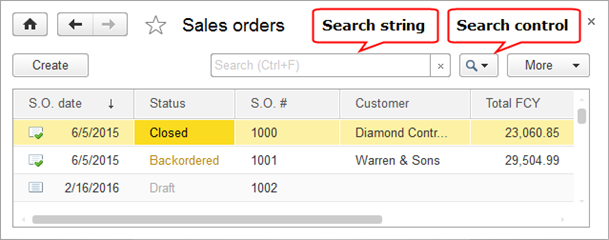
Fig. 86. A search box in a list form
The search is performed in all list columns, by multiple values. See the example below.
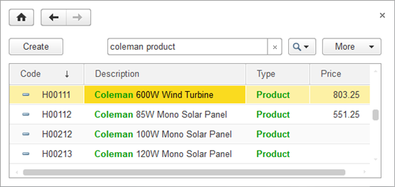
Fig. 87. Search in a list
The overall length of a search expression string must not exceed 1000 characters. The number of words in a search expression must not exceed 20.
You can use hashtags as search expressions if they are used in the configuration. To search for all hashtags starting with the specified sequence of characters, you can use the character after the hashtag. For example, by query #table , the items with #table, #tables, and #tables hashtags will be found.
The search string is split into parts. The lines that contain all of the parts are included in the search result.
- The application searches for lines by occurrences.
If full-text search is available in the list, the search is performed by the beginning of words. For example, to find all the documents related to the North Star customer, you can search for no st.
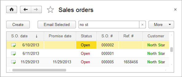
Fig. 88. Search for a line in the list
If full-text search in the list is unavailable, the search is performed anywhere in the line. For example, the search for no returns not only North, but also Gnome.
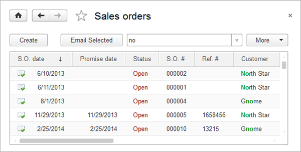
Fig. 89. Search for a line without full-text search
When searching for an object by number, you can omit leading zeros. For example, to find an Order with number 000010, it is enough to enter 10.
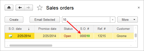
Fig. 90. Search for Order #000010
But if full-text search is available in the list, you cannot partially omit the zeros. For example, search for 010 does not return any results.
When searching for dates, specify the day, month, and year (for example, MM/DD/YYYY).
If full-text search in the list is unavailable, you can only search by date part:
-
If you specify the day and month without leading zeros and the year as a single digit, the search interprets it as the most recent year that ends with this digit. For example, if you search for 3/8/8, the search interprets it as 03/08/2018.
-
If you specify the year as 2 digits:
-
If the year value is less than 30, the search interprets it as a year that starts with 20. For example, if you search for 8/9/15, the search interprets it as 08/09/2015.
-
If the year value is greater than 30, the search interprets it as a year that starts with 19. For example, if you search for 04/15/45, the search interprets it as 04/15/1945.
The search returns all documents with the specified date, regardless of their time. For example, you can search for documents dated 2/25/2014:
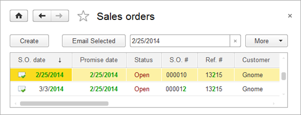
Fig. 91. Search for a date
For numbers, the search is performed by exact match (strict equality). For example, you can search for documents with total amount equal to USD 1200.
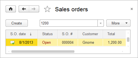
Fig. 92. Search for a number
To search for checkbox fields, if full-text search is not available in the list, enter Yes or No. For example, to find a location that has a selected checkbox in the Default location column, enter Yes in the search box. If full-text search is available in the list, you cannot search for selected or cleared checkboxes.
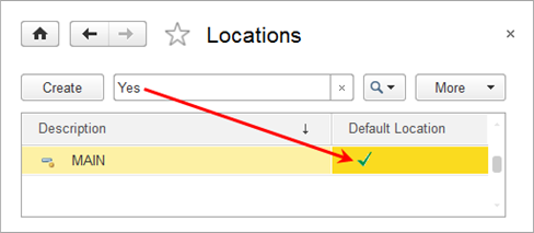
Fig. 93. Search for a selected checkbox
For references to objects, the search is performed in the key fields that form the reference presentation. For example, in a list of goods receipts and shipments, the search is performed in item code and/or description. And if you want to find register records of Warehouse receipt 000000009 dated 25/06/2012, the search is performed in document date and number, as shown in the figure below.
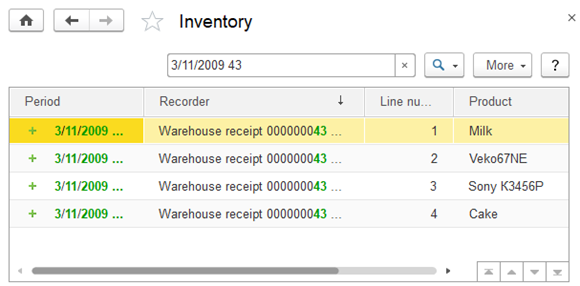
Fig. 94. Search by reference
Text fragments that match the search string are highlighted with color.
To cancel the search, click the Clear button in the search box, or press Esc.
To specify search settings, on the Search control menu, click Advanced search, or press Alt + F.
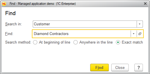
Fig. 95. Search form
If the search dialog box is opened using a keyboard shortcut, the Find box contains the value of the selected cell and the Exact match option is selected.
If the search dialog box is opened by typing a search string, the Find box contains the text that you type and the Anywhere in the line option is selected.
In the Search in box, enter or select a column. In the Find box, enter the search string or select it from the list.
For strings and data of the reference type, including sets of types, you can use one of the following search options: At beginning of line,
Search for numbers and logical expressions is always performed with the exact match option.
For values of Date type, the search returns the values for the entire day.
For values of NULL type, the search uses an empty value matching the column type (so the search does not return NULL).
If a dynamic list displays hierarchical data, you can search in the entire list or in the current folder.
To start the search, click Find. This applies a filter that only displays results matching the search criteria (column + value).
When search is performed in a hierarchical list, items that match the search criteria are displayed as a flat list. Once you cancel the search, the hierarchical view is restored.
For hierarchical lists, the dialog box displays the current folder name and the following checkboxes:
- Search in current group only. If the checkbox is selected, the search is only performed in the current folder and possibly in its subfolders (this depends on the state of the other checkbox).
- Do not search in subgroups (only available when the Search in current group only checkbox is selected). If this checkbox is selected, the search in subfolders is not performed.
If no items are found, a blank list is displayed.
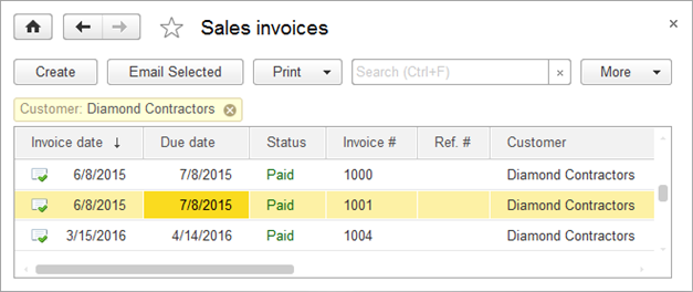
Fig. 96. Search by expression
You can refine a search result by applying another search to it.
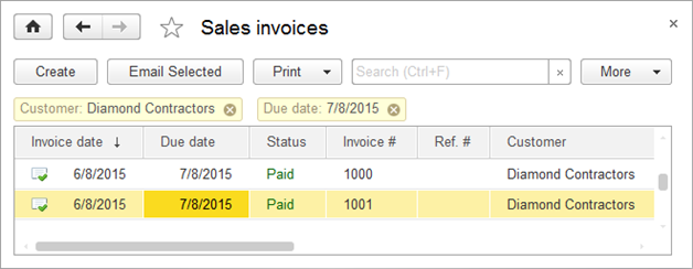
Fig. 97. Search after refining (two search expressions)
To edit the search, click the <Search in>: <Find> link in the search control.
The search history in the Search control menu stores the previous search strings.
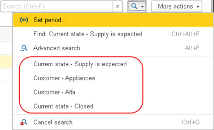
Fig. 98. Search history
You can use quick search by cell value. Right-click the cell and then click Find: <column name> - <cell value>.
Press the middle mouse button on the search expression or Х button to cancel the search by expression.
3.4. Customizing lists
You can customize the order of columns in a list, their visibility, and the behavior of the list when its data is viewed or edited in the Customize form dialog box. To open the dialog box, click More – Change form. For more information about form customization, see Customizing forms.
You can customize the displayed data, list order, list groupings, and list appearance in the List options dialog box. To open the dialog box, click More – Configure list.
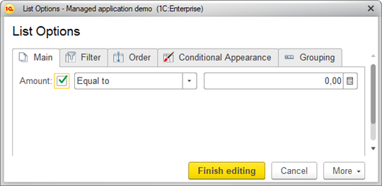
Fig. 99. A list customization form
This dialog box is intended to customize:
-
List filtering
-
Fields to order by
-
Conditional appearance
-
Fields to group by
-
Other developer-defined settings
The settings dialog box contains the following tabs: Main, Filter, Order, Conditional appearance, and
A settings item is only applied if you select the checkbox next to it. You can customize the order of restrictions applied within a single settings item.
Customizing list settings is similar to customizing report option settings in the data composition system.
To revert to the default list settings, click More – Set default settings.
To customize the list of settings available for editing in the main list form, click More – Customize displayed settings. This opens another dialog box where you can add or remove settings.
To apply the settings, click Finish editing.
Saved settings are carried over between sessions.
To save the settings for future use, click More – Save settings. Then specify a name for the assortment of settings and click Save.
To load a previously saved assortment of settings, click More – Select settings. Then select the assortment of settings for the list and click Select.
When you close the form using the Close command, if the current settings have been changed, the user will be prompted to save the changes made.
3.4.1. Filters
To filter a list, in the list customization dialog box, click Filter and add filter items.
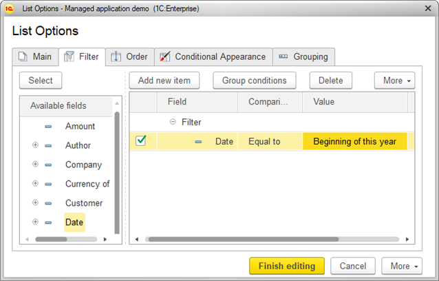
Fig. 100. Customizing list filter
To add a filter item, click Add new item or drag the required field from the Available fields list. In the
If you select the In list, Not in list, In list group, or
To change the order of filter items, select an item and then click More – Move up or Move down.
To apply a filter, click Finish editing.
For more information about filters and comparison, see Filters.
3.4.2. Sorting
To sort a list, in the list customization dialog box, click Order and then select a value for sorting or select a checkbox next to a value.
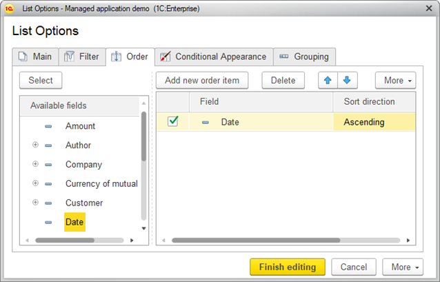
Fig. 101. Customizing sorting settings
To add a sorting item, click Add new order item or drag a field from the Available fields list, and then select Sort direction (Ascending or Descending).
To change the order of sorting items, select an item and then click Move up or Move down.
If multiple sorting fields are available, the list is sorted by the first field, then by the second field, and so on.
To apply the sorting, click Finish editing.
For more information about sorting, see Sorting.
3.4.3. Conditional appearance
To set conditional appearance, in the list customization dialog box, click Conditional appearance and then add conditional appearance items.
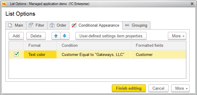
Fig. 102. Setting conditional appearance for a list
To create a conditional appearance item, click Add. This opens a window where you can edit the conditional appearance item. In this window, specify the following:
-
On the Format tab, specify the appearance for the records that will match the condition, such as background color and font color.
-
On the Condition tab, specify the condition to apply the format. It is similar to specifying filter conditions.
-
On the Formatted fields tab, select the fields to apply the appearance when the condition is met.
If required, define the order for the appearance items using the Move up and Move down commands.
If a record meets multiple conditions, the conditional appearance that is lower in the list is applied.
For more information about conditional appearance, see Conditional appearance.
To apply a conditional appearance item, click OK.
3.4.4. Grouping
To group list items, in the list customization dialog box, click Grouping and then select a grouping field. If you select multiple fields, list items are grouped based on the order that you specify for the grouping fields.
To apply grouping settings, click Finish editing.
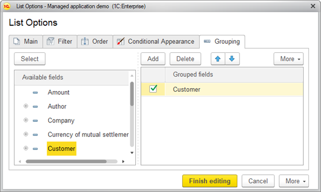
Fig. 103. Customizing list grouping settings
3.4.4.1. Saving list settings between sessions
Dynamic list settings are saved automatically when you close a form and they are loaded automatically when you open a form.
The list view mode (Hierarchical list, List, or Tree) is saved automatically.
3.4.5. Specifying time periods in lists
Some lists allow limiting the displayed data to a specific period.
To set a period in the Select period dialog box, click More – Set period.
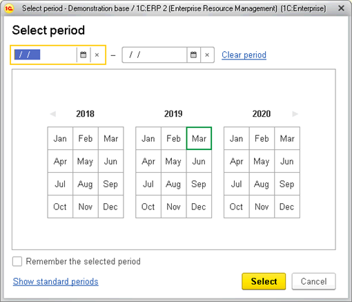
Fig. 104. Setting a period for a list
To set a period, you can use one of the following methods:
-
Select a period in the period selection field.
-
Select any of the standard periods.
-
Select the start and end dates in the calendar fields.
To clear the period, click Clear period.
To save the period and apply it next time the list is opened, select the Remember the selected period checkbox.
To apply the period, click Select. Pressing the Spacebar or Enter applies the period selected in the calendar field.
To discard the changes, click Cancel.
The selected period appears as a new button in the command bar of the list form. To change the period, click the link on the button.
To clear the period, click the cross on the button.
3.4.5.1. Selecting a custom period
To select a custom period in a calendar, use one of the following methods:
-
Click the first month of the period. Move the pointer to the last month while holding the mouse button. Release the mouse button. You can also select a period in the reverse direction (from the last to the first month).
-
Click the first month of the period. Click the last month. You can also select a period in the reverse direction (from the last to the first month).
-
To select a single month, double-click it.
3.4.5.2. Adding or removing months
To add months to a period, hold down Shift and click the months. Where:
-
If the selected month is later that the selected period, the months between the last month of the period and the selected month (including the selected month) are added to the period.
-
If the selected month is earlier that the selected period, the months between the selected month and the first month of the period (including the selected month) are added to the period.
-
If the selected month is inside the period, there is no effect.
-
If a period is not selected, it is the same as setting a period without holding down Shift.
If you hold down Ctrl while clicking a month, this has the following effect:
-
If the selected month is adjacent to the period, it is added to the period.
-
If the selected month is the first or the last month of the period, it is removed.
-
If a period is not selected, it is the same as setting a period without holding down Ctrl.
3.4.5.3. Selecting periods using arrow keys
During period selection, pressing Up Arrow, Down Arrow, Left Arrow, or Right Arrow has the following result:
-
If the selected period is the first line in the year, pressing Up Arrow has no effect.
-
If the selected period is the last line in the year, pressing Down Arrow has no effect.
-
Otherwise, the period is set to the month where the cursor is moved (one cell up, down, left, or right from the selected one).
If you hold down Shift while pressing an arrow key, the selected period is not cleared and the selected months are added to the period.
3.4.5.4. Selecting a standard period
To start selecting a standard period, in the period selection form, click Show standard periods.
The left part of the form displays the list of options for each selected period.
In the right part of the form, select a period by clicking the respective button. Then, in the left part, select the period option.
To return to the custom period selection, click Show custom period or select a custom date in the From or To field above.
3.5. Exporting lists
To export a list to a text or spreadsheet document, click More – Output list.
In the dialog box that is opened, select the document type and the required columns.
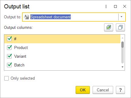
Fig. 105. List export customization dialog box
If the list supports multiple line selection, you can export the selected lines only (use the Selected items only checkbox).
If the list is hierarchical, you can specify whether subordinate folders and items are also exported (use the Include subordinate items checkbox).
Chapter 4. Data management
This chapter covers operations with documents and document journals, as well as specific properties of infobase objects.
4.1. Numbering items
Code. A code (for documents, a number) is a mandatory configuration object attribute.
Depending on the application, an item code can be assigned automatically or manually when an item is created.
If automatic numbering is defined for a specific object, once an item of this type is saved, the code or number field is filled with an automatically generated code or number. You can edit the assigned codes and numbers. Codes or numbers must be unique within a single object type.
If you attempt to enter a duplicate code or number, the application displays a warning.
Prefix. Codes or numbers of configuration objects can have prefixes. When an item is created, the code or number assigned to it includes a prefix. However, you can completely change the suggested code or number, including its prefix.
4.2. Generating objects based on other objects
1C:Enterprise supports creation of objects based on existing object data.
For example, an application can feature generation of a sales invoice based on a previously created sales order.
The rules for filling the target object based on the attributes of the source object are defined by application design.
To learn whether you can generate objects based on other objects, consult the application documentation.
To generate an object based on another object, select a source object in a list. Then, on the command bar, click Generate and select the object type that you want generated.
This opens the object creation form for the selected object type, with attributes filled based on the source object.
Once a document is created, it is assigned the next sequence number. The current date is used as the document date.
4.3. Deleting items or folders (setting deletion marks)
In 1C:Enterprise, an item can be deleted permanently or marked as deleted. The availability of deletion modes depends on user privileges. Permanent deletion might compromise the referential integrity and lead to the application malfunction. So, the Administrator should choose carefully whom to give the right to delete objects permanently.
1C:Enterprise guarantees the referential integrity of infobases: regular users can only mark objects for deletion, while the records are retained in the infobase. For example, if a user marks a document for deletion, the document's data is ignored everywhere in the UI, but you can still find and view the document. To permanently delete marked objects, on the main menu, click All functions and then select Standard — Delete marked objects. This feature is available only to the users granted the respective right.
To set a deletion mark, select a record and then click More – Mark for deletion.
To clear a deletion mark, select a record marked for deletion and click More – Unmark for deletion. Records marked for deletion are also marked with a special icon in the leftmost column. The Mark/Unmark for deletion commands are also available from the More menu of the object forms.
For more information about deletion methods (direct deletion, setting and removing deletion marks), see 1C:Enterprise 8.3. Administrator Guide.
4.4. Managing external source data
1C:Enterprise supports operations with data stored in external databases. Depending on the application settings, you can view external source data, use this data in reports, and perform operations with this data using the web client.
The system administrator specifies the general parameters for connecting to an external data source.
An attempt to access data stored in an external source initiates a connection to that data source, unless the connection was established earlier. Once a connection is established, the operation continues. If the connection parameters have not been specified, the user is prompted to enter the parameters.
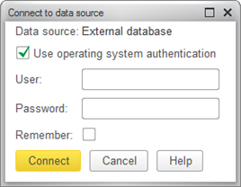
Fig. 106. External data source connection dialog box
You can save the username and password for future use, provided that you have enough rights. To save the parameters, select the Remember checkbox. After you have entered the data, the application connects to the external source and displays the following message: Connected to external data source successfully. Try again. Then you can continue working with data from the external source.
4.5. Using print forms
In addition to screen forms, print forms are available for some objects. In this case, the object form has usually a button that opens the print form. The button is usually labeled Print, though it may have any similar label.
When you click Print, a print form is generated. An application might also provide other methods for opening that form.
The generated print form can be opened in a new window of the standard 1C:Enterprise spreadsheet editor. If only a part of the form is visible in the window, you can view the rest using the arrow keys and scroll bars.
To edit an automatically generated print form, on the main menu, click Table – View – Edit.
To save an edited print form to a file, click Service and settings – File and then click Save or Save as.
For more information about operations available in the 1C:Enterprise spreadsheet editor, see the spreadsheet document editor documentation in the 1C:Enterprise User Manual.
To print a form, on the main menu, click File – Print. For more information, see the spreadsheet document editor documentation, section "Specifying print settings".
4.6. Understanding access conflicts
When multiple users work in a single application, they might attempt to edit the same object at the same time. Only the user who began editing the object before everyone else is allowed to complete the editing. When other users attempt to edit the object, they get a warning featuring the session number and name of computer that locked this object. See an example in the figure below.
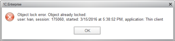
Fig. 107. An object lock error
An object is unlocked a minute after the changes are saved.
To edit a released object, you have to reopen it. The following dialog box will be displayed if a form of an object changed or deleted by another user is opened:
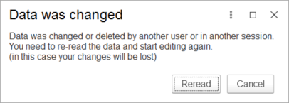
Fig. 108. Data difference report
To reread the data displayed on the form from the infobase, click Reread.
If the infobase is connected to a collaboration system, in the lock error dialog box, the Send message link will become available. You can use the link to send a message to the user currently editing the data by means of a collaboration system.
4.7. Managing documents and document journals
In 1C:Enterprise, information about company business operations is recorded in documents. Documents can be displayed in lists of documents of the same type or in journals. A journal is a list of documents of multiple types.
Generally, a document journal table includes a Document type column.
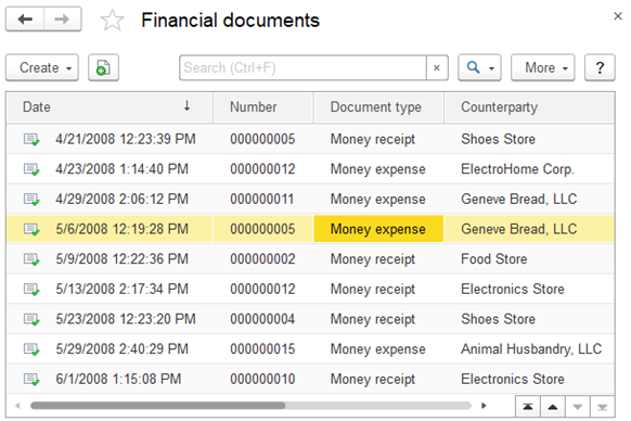
Fig. 109. "Financial documents" document journal
As a rule, the leftmost column in a document list or a journal is a service one. It displays the icons that show document status:

Fig. 110. Status of a document in a journal
-
Saved. The document is saved but not posted yet.
-
Posted. The document is posted, or it does not support posting.
-
Marked for deletion. The document is marked for deletion.
4.7.1. Viewing document journals
Viewing document journals is identical to viewing lists. For the list of operations, see Viewing lists.
If a document journal is sorted by date, the following rules apply:
- Documents are sorted by date.
- Documents having the same date are sorted by time.
If sorting by date is disabled, the documents are displayed in the order they were entered.
4.7.2. Adding documents from document journals
If a journal contains documents of multiple types, the Create command opens a menu where you can select a document type.
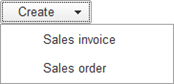
Fig. 111. Selecting document type
The menu lists the document types that are displayed in the journal.
You can add documents without opening journals or document lists, provided that this function is available on the Create menu.
In the list of document types, select the required type and click OK. This opens the document creation form where you can enter the document attributes.
If a journal stores documents of a single type, the list of document types is skipped and the window where you can enter the document attributes is displayed.
4.7.3. Specifying document date and time
An absolute majority of documents have fields for entering their dates and numbers.
Specifying the document time is an important feature of 1C:Enterprise. Documents are arranged chronologically and often they are processed in the chronological order governed by the document date and time. Thus, document time is used not only to display the time when the document was entered, but also to assign clear order for documents of the same date.
You can change the date suggested by the system. When a document is recorded, it is normally assigned the current time.
4.7.4. Posting documents
Document posting is an operation that reflects document data in accounting records. Whether a document can be posted is a predefined property of the document. When a document is posted, the data stored in the document is recorded to registers (register records are created). Register records describe how the register state changes after document posting.
When you click the document posting button (which is usually labeled Post and close or Post), the document is posted and closed. Posted documents have icons with check marks in document journals.
An attempt to post a document can be unsuccessful. For example, an invoice cannot be posted if the requested quantity of items is not available in the warehouse. In this event, a message informing that the document cannot be posted is displayed and the document is not closed automatically. You can edit the document and retry the posting.
To clear document posting, click More – Clear posting and confirm the operation. This changes the document icon.
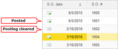
Fig. 112. Document posting status
When document posting is cleared, all the operations performed during the posting are rolled back, unless the application has custom rules for clearing posting.
Commands for document posting and posting cancellation are also available in the context menu of a document list.
You can edit, save, post (or choose not to post) an unposted document. The icon in the leftmost column reflects the current status of the document.
4.7.5. Understanding unpostable documents
Documents that are not intended to be posted are never posted but they are marked with the icon that is used for posted documents in document lists. You cannot clear posting of documents that cannot be posted.

Fig. 113. A list of documents that cannot be posted
4.7.6. Viewing document register records
Viewing register records might be available in the application for users to be able to analyze changes made in registers by posting a document. For more information about viewing register records, see the application documentation.
The assortment of columns in the list of register records depends on the register structure.
The form for viewing accumulation register records can look as follows:
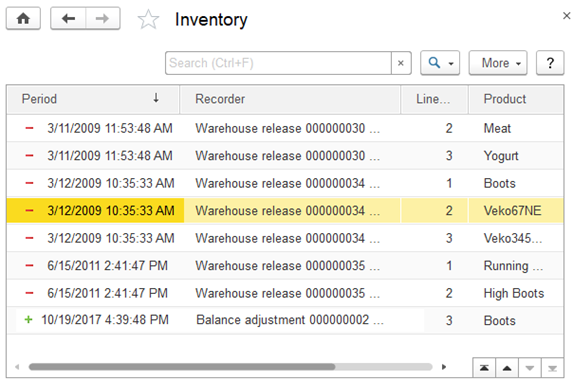
Fig. 114. An accumulation register
The register list form has two mandatory columns.
The Line number column can contain the number of the record in the register record set generated by this document.
The Period column contains icons that describe the nature of the register changes. + (plus sign) denotes an increase of the absolute value of the register dimension, while – (minus sign) denotes a decrease. In the above example, + (plus sign) shows that the amount of money has increased.
4.8. Business processes
Business processes in 1C:Enterprise are intended to combine individual operations into chains of interrelated actions that lead to accomplishment of specific goals. For example, issuing an invoice, accepting a cash payment, and shipping goods from a warehouse can be combined into the Sale business process.
Such chains of interrelated operations within a business process are presented in the business process flowchart. A flowchart describes the logic of the business process and its entire lifecycle, from start to finish, as a sequence of route points.
A route point reflects a stage in the lifecycle of a business process, normally involving the completion of a single automatic or manual operation.
Tasks in 1C:Enterprise allow you to keep record of tasks broken down by performer. The progress of a business process through its route points is actually the progress of task completion. In addition to business processes, tasks can be created by other infobase objects or directly by users.
When a business process reaches a route point where actions of a specific performer are required, a task is generated (or multiple tasks for multiple performers). When a performer marks a task completed, a business process automatically proceeds to the next route point in compliance with the flowchart. Thus, tasks are the driving force for business processes.
Specific business processes and their interconnection with tasks are described in the application documentation.
The general principles of working with business processes and tasks are similar to working with other objects (for example, documents and lists), therefore we will only cover the differences.
4.8.1. Viewing business process lists
By default, a list of business processes displays the following information:
-
Date. The date and time of business process creation.
-
Number. A unique business process number.
-
Started. Shows whether a business process has been started.
-
Completed. Shows whether a business process is completed, which means that all the tasks generated by the business process have been completed.
-
Head task. The task that generated the business process.
The list of Sale business processes may look as follows:
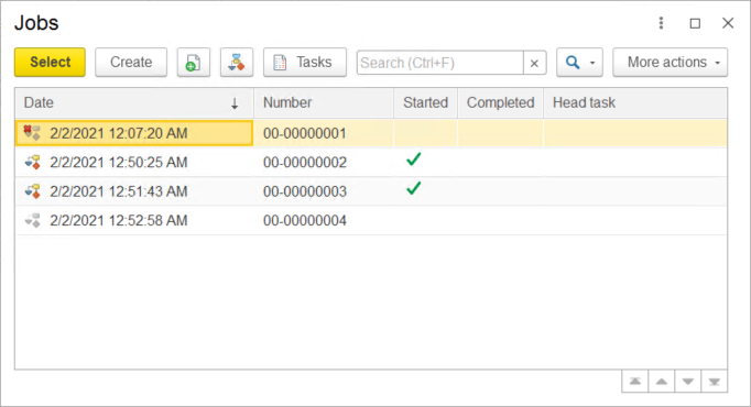
Fig. 115. List of Sale business processes
Business process states are displayed with the following icons:
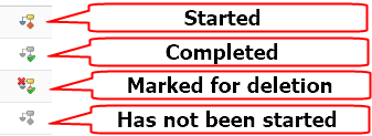
Fig. 116. Business process states
If a business process has not been started (there are no tasks associated with this process and the Started mark is not set), it is marked with a black-and-white icon.
A business process is completed when it reaches the end point on the flowchart, with all its tasks completed.
4.8.2. Viewing task lists
By default, a list of tasks displays the following information:
-
Number. A unique task number.
-
Description. A task description.
-
Date. The date and time of task creation.
-
Completed. Shows whether the task is completed.
-
Business process. The business process that generated the task.
-
Route point. The business process route point where the task was generated.
In addition to that, a list of tasks can have custom columns that contain other business process or task properties.
Task states are marked with icons:
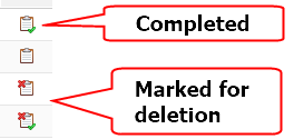
Fig. 117. Task states
4.8.3. Completing tasks
Task completion is an important stage of a business process lifecycle. When a task is completed, its business process proceeds to the next route point in compliance with the flowchart, which results in generation of new tasks within this business process.
To complete a task, in the task form, click More – Completed.
The application can open additional windows for task completion, for example, it can display warnings or prompt to enter additional information. An application can also check whether certain conditions required for task completion are met (for example, whether a document is approved or whether a discount is applied).
The completed tasks are marked with a special icon and have the Completed checkbox selected.
Chapter 5. Reports
In 1C:Enterprise, a report is a metadata object that retrieves data from an infobase and composes it in a human-readable form.
You can generate a report with the default settings or customize them to your needs. Experienced users can develop custom report options.
Below, you can see an example of a typical report form.
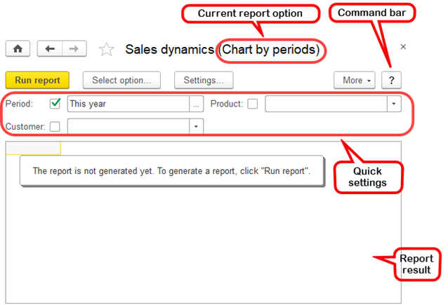
Fig. 118. Report form
To generate a report with the default settings, on the report command bar, click Generate.
Some reports have multiple variants of the output design called "report options." To choose between options, click Report options. For more information about report options, see Report options.
To customize a report, you can use the Quick settings bar or click Set up... on the command bar. For more information about report settings, see Quick settings and Settings.
A generated report is basically a spreadsheet document. Some reports might have cells supporting the drill-down feature. You can access it from the cell's context menu. For more information, see Drilling down.
Depending on the report settings, you can find some of the following commands in a report's More menu:
-
Settings. Open report settings.
-
Select settings. Load previously saved report settings.
-
Save settings. Save current report settings.
-
Set standard settings. Restore report settings to the default values.
-
Delete saved chart colors. Restore chart colors to the default values. It is hidden, unless the report option contains at least one chart.
-
Change option. Open report option settings editor.
-
Select option. Open report option selection dialog box.
-
Save option. Save a report option.
-
Open a new window. Open the report with the current settings in a new window.
-
Change form. Open the report form settings form.
For more information about report settings, see Quick settings and Report options.
For more information, see Drilling down.
5.1. Customizing reports
Some report settings are available only in the settings editor. These settings are applied to the report when it is being generated.
To open the Settings editor, in the report form, click Settings....
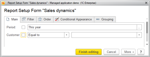
Fig. 119. Settings editor
To save the settings, click Finish editing.
To remove settings from or add to the report form, click More – Change settings assortment. This opens a list of report settings.
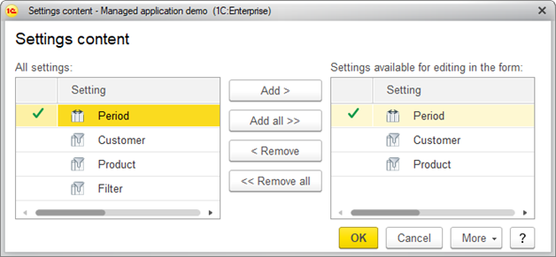
Fig. 120. Editing list of report settings.
The left frame of the form contains the list of all report settings, while the right one contains the list of settings accessible directly from the report form.
You can manage the right list with the following commands:
-
Add. Add a setting from the left list to the right list.
-
Add all. Add all settings from the left list to the right list.
-
Remove. Remove a setting from the right list.
-
Remove all. Remove all settings from the right list.
To restore to the defaults, click More – Set default settings.
If available settings are not enough to get the report you need, you can create a custom report option. This requires some experience in 1C:Enterprise report management. For more information about report options, see Report options.
When you close a report form or select a different report option, the changed settings are saved automatically. Each report option stores its own set of settings.
Some settings are used more often than others. For example, when you generate Sales dynamics, you are using Filter by product a lot. You can place such settings on the report form for quick access.
If you set a filter in the Settings editor, the filter will be added to the Settings list and to the Quick settings.
To show a setting on a report form, specify its value
Depending on the setting type, do one of the following:
- In the setting field, click Select and select a value from the drop-down list.
- In the setting field, click Select and select a value in the list that opens in a dialog box.
The second option is illustrated on the figure:
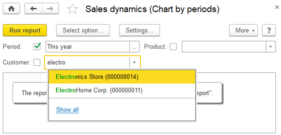
Fig. 121. Selecting a quick setting value from a list.
A report is not generated automatically after you change its settings.
To generate a report with the specified settings, click Generate.
To disable a report setting, clear the checkbox.
5.2. Report options
A report can have multiple options. Each option represents the report data in a different way. For example, Sales dynamics report can have two options: one to display product sales in a chart and another to display the sales in a table. Each report option has its own list of settings.
For more information about report options, see Report options. Report options are saved to the infobase.
Each report can have multiple options.
For more information about report options, see Report options.
5.3. Choosing between report options
Let's see how we can choose between the different options of the Sales dynamics report. First, open the report on the actions panel.
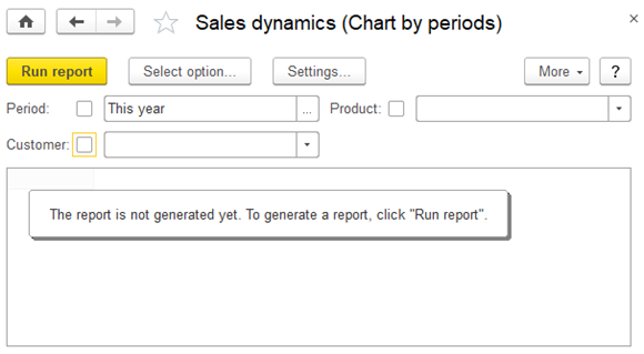
Fig. 122. Sales dynamics report
When you open the report, it has the default option Chart by periods. To view another option,
click Select option and then select Sales by customer.
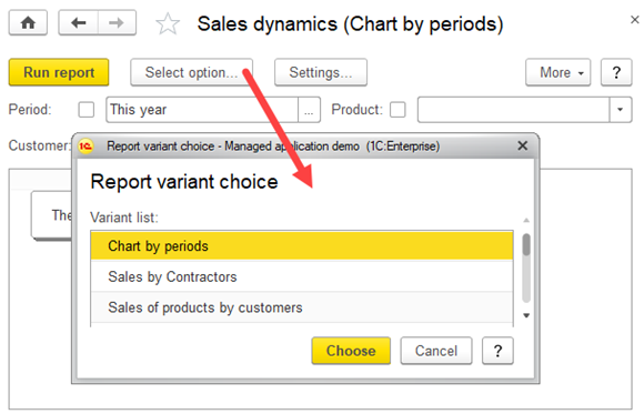
Fig. 123. Choosing between the options of the Sales dynamics report
The report has the following default settings: Period: This year and grouping by Product and Customer fields.
To generate the report, click Generate.
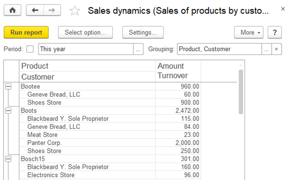
Fig. 124. Sales by customer option of Sales dynamics report.
5.3.1. Quick settings
For example, to generate a report for a custom period, change the Period and click Create.
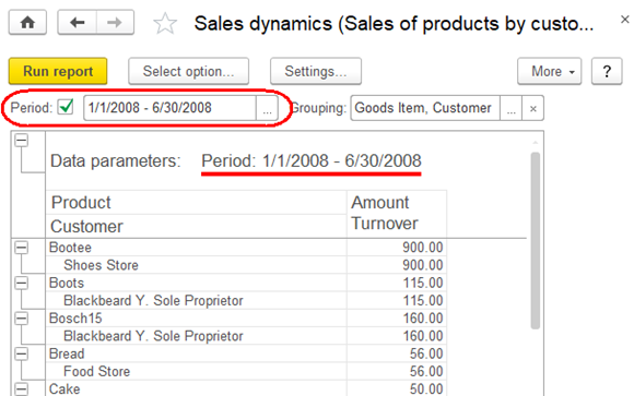
Fig. 125. Sales dynamics report for the first half of 2008.
5.3.2. Settings
If you want to change settings other than Period and Grouping, click Settings. The Settings editor opens. All settings are grouped in tabs.
Fig. 126. Settings editor
5.3.2.1. Filters
On the Filter tab, you can apply filters to the report records.
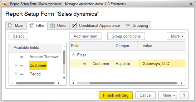
Fig. 127. Filter settings.
-
On the command bar, click Add new item or drag-and-drop an item from the
-
Then, Select a Comparison type.
-
Finally, Select the filter value.
-
To change the priority of the applied filters, click More and then click Move up or Move down. Click Group conditions to group the selected filter conditions.
-
Click Finish editing.
For more information about filters and comparison, see Filters.
5.3.2.2. Sorting
On the Order tab, you can specify the sorting preferences of the report records.
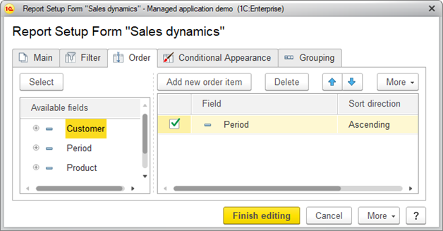
Fig. 128. Sorting preferences
Click Add new item or drag-and-drop a field from the".
-
Select Sort direction (Ascending / Descending).
-
To change the priority of the applied orders, click More and then click Move up or Move down.
-
Click Finish editing.
The first field has the highest sort priority, the last field has the lowest priority.
For more information about sorting, see Sorting.
5.3.2.2.1. Sorting example
To sort the Payments report by supplier, and then, for each supplier, sort payments by document date, set up the following sorting settings:
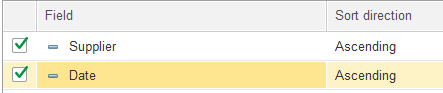
Fig. 129. Sorting settings
Then click Finish editing. The resulting report looks as follows:
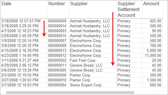
Fig. 130. Report with sorted records.
5.3.2.3. Conditional appearance
On the Conditional Appearance tab, you can set up the conditional appearance of the report records. Click Add and select the condition.
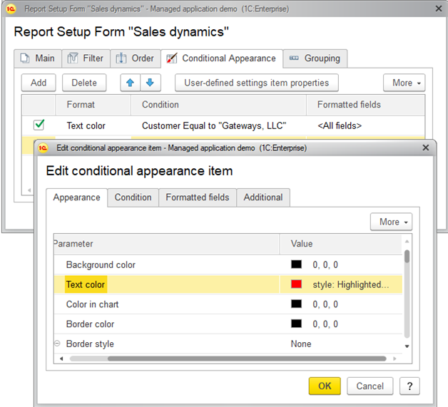
Fig. 131. Conditional appearance settings
-
On the Format tab, specify the appearance for the records that will match the condition, such as background color and font color.
-
On the Condition tab, specify the condition to apply the format. It is similar to specifying filter conditions.
-
On the Formatted fields tab, select the fields to apply the appearance when the condition is met.
-
To change the priority of the applied conditional appearance, click More and then click Move up or Move down. The order of appearance items defines the order of applying them to report items. If a record meets multiple conditions, the conditional appearance that is lower in the list is applied.
-
On the Additional tab, select the area to apply the conditional appearance.
-
Click Finish editing.
For more information about conditional appearance, see Using conditional appearance in reports.
5.3.2.3.1.1. Applied conditional appearance.
In the Payments report, let's highlight transactions with the Electronics store company.
To do so, do the following:
-
Go to the Conditional appearance tab and add a conditional appearance item.
-
Go to the Format tab. In the list, select Font, and click Select or press F4. In the Font dialog box, select Bold.
-
Go to the Condition tab, and add the following condition: Company Equal to Electronics Store.
-
Click OK and ensure that the value in the Formatted fields column is
Now, the conditional appearance item is set up:

Fig. 132. Applied conditional appearance
Then, click Finish editing. The report will be formatted as follows:
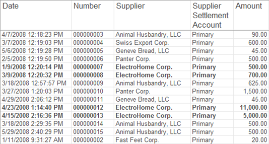
Fig. 133. Conditional appearance settings
5.3.2.4. Grouping
On the Grouping tab, you can specify the grouping conditions of the report records.
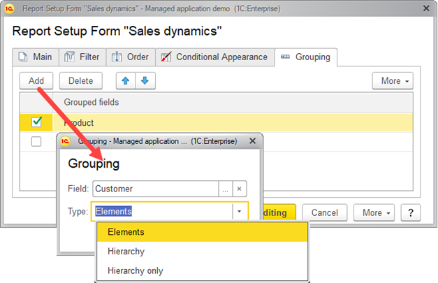
Fig. 134. Grouping settings
-
Click Add.
-
Select Field for grouping and specify the grouping type:
-
Elements. The group only includes nonhierarchical records (items).
-
Hierarchy. The group includes both hierarchical and nonhierarchical records (items and folders).
-
Hierarchy only. The group only includes hierarchical records (folders).
-
Click Finish editing.
-
To change the priority of the applied groupings, click Move up or Move down.
-
In the report grouping settings dialog box, click Finish editing.
For more information about groupings, see Grouped fields.
5.3.2.4.1. Grouping example
For example, to group the Payments report by supplier, select the Supplier field with the Hierarchy type.
The resulting report looks as follows:
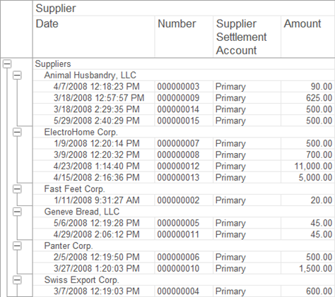
Fig. 135. Payments report grouped by Supplier field
5.4. Drilling down
When the mouse pointer is over a drill-down report cell, the pointer changes (see the figure). Double-clicking that cell opens the cell value in a new window while double-clicking a cell with resources prompts you to select a field for drilling down and then displays the result.
Right-clicking the cell displays its drill-down menu.
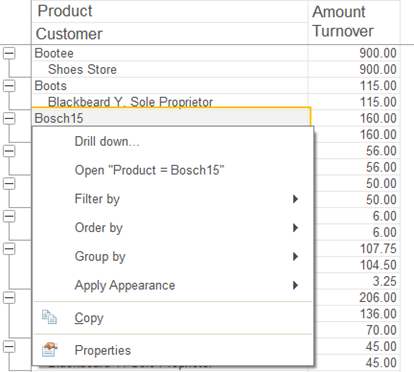
Fig. 136. Drill-down menu.
Drill down displays detailed information about the field value. All drill-down details are displayed in a new window.
For example, to find out when Bosch15 kettles have been sold, generate a Sales dynamics report, right-click the Bosch15 cell, and select Drill down. In the window that opens, select
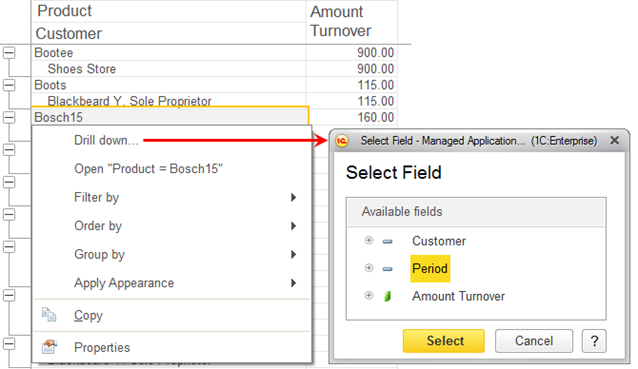
Fig. 137. Selecting drill-down field.
Click Select.
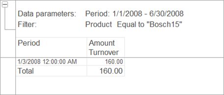
Fig. 138. Drill-down result.
The Open "..." command opens a form with the cell data. For example, a list item form.
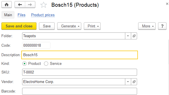
Fig. 139. List item form
The Filter by command filters the current report structure item by the value of the selected field. To filter by another field, click
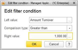
Fig. 140. "Edit filter condition" dialog box.
The result is displayed in a new window.
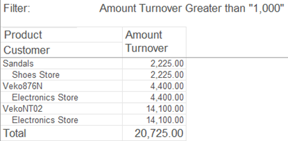
Fig. 141. Filtering result.
The Order by command orders the current report structure item by the value of the selected field. To order by another field, click Other field and specify a field. For example, you can order a report by the Product field.
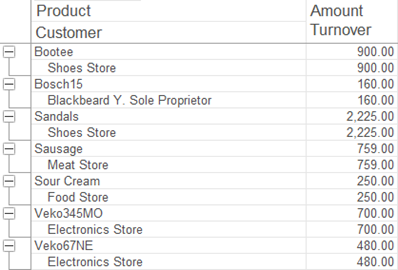
Fig. 142. Ordering result.
The Group by command groups report items by the value of the selected attribute. For example, in the Inventory Balance report, to view the available stock by warehouse, you can group all items by the Warehouse field.
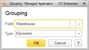
Fig. 143. Selecting grouping field.
Now, let's filter the report by Product In group "Footwear". The resulting report looks as follows:
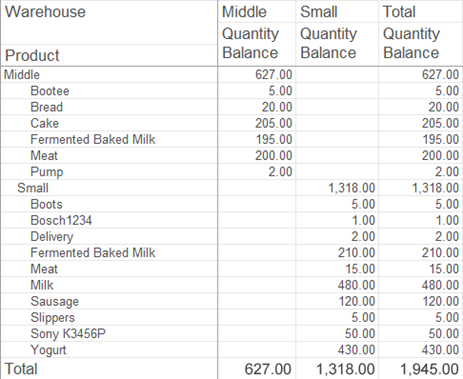
Fig. 144. Filtered report view.
The Apply Appearance command sets a conditional appearance for the current report item. For example, you can highlight the items that meet the condition Quantity Balance < 10.
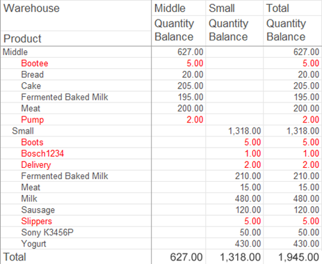
Fig. 145. Conditional appearance.
Search everywhere searches for data by the value in the selected cell. To alternatively start global search, press Alt + F. For more information, see Global search.
Chapter 6. Report options
Editing report options is only recommended for experienced users who are familiar with the data composition system used for report customization. To edit a report option, on the More menu, click Change option. This opens a report option form.
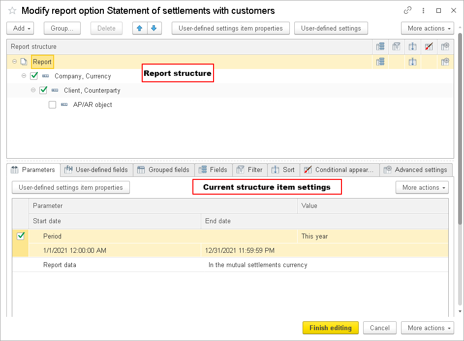
Fig. 146. A report option customization form
Report option customization includes changing report structure, specifying report parameters, creating custom fields, and specifying grouping fields, filter, and order for each report item.
To revert to the default option settings, in the report option command bar, click More – Default settings.
To save report option settings to a file, click More – Save settings.
To load report option settings from a file, click More – Load settings. Settings are loaded to the extent allowed by your access rights.
To customize the report option form, click More – Change form. For more information about form customization, see Customizing forms.
6.1. Customizing report options
To customize the settings that apply to the entire report, in the report structure tree, click the Report node. The assortment of available tabs and settings depends on the item that you select for customization and on the field availability.
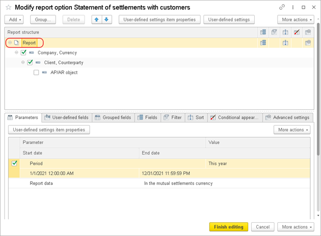
Fig. 147. Grouping settings
6.2. Customizing report structure
In the data composition system, report items can include groupings, tables, charts, and nested reports.
Grouping displays data as a list. To add a grouping to the report structure, click Add – New Grouping, or press Insert . In the window that is opened, select a grouping field and type, as shown in the figure below.
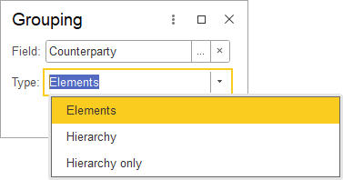
Fig. 148. A grouping customization form
To add detailed records to the report, leave the grouping field blank. Detailed records are obtained from the database and ordered in the database order.
In the simplest scenario, with the grouping by the Product field, the report looks as follows:
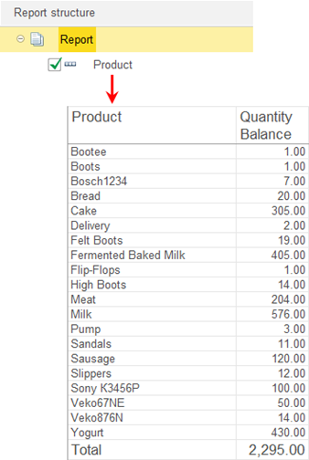
Fig. 149. A grouping in a report
To remove a grouping but keep its content, click Ungroup.
Table displays data as a table. To add a table to the report structure, click Add – New table. The table rows and columns are defined by groupings.
For example, a report structure can include a table where the rows display a list of goods, while the columns display inventory balances (see the figure below).
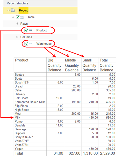
Fig. 150. A table in a report structure
Chart displays data as a chart. To add a chart to the report structure, click Add – New chart, and then add points and series, which may vary depending on the chart type. The selected resources are used as chart values.
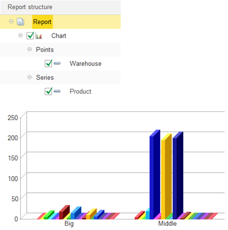
Fig. 151. A chart in a report structure
If the application has a Nested report for the report being edited, you can use the nested report as a report structure item.
To remove an item from a report structure, select it in the structure field and then click Delete or press Delete.
6.2.1. Customizing report structure items
To customize a specific report structure item, select the item, click the tab with the setting that you want to customize, and select the Current item has its own <setting description> checkbox.
Note that the customization scope depends on the item type:
- For a Grouping item, you can customize Grouping fields, Selected fields, Filter, Sorting, Conditional appearance, and
- For a Table or Chart item, you can customize Selected fields, Conditional appearance, and
6.2.2. Customizing settings items
6.2.2.1. Available fields
The list of available fields allows you to select available fields and drag them to the list of fields used for grouping, selection, filtering, or sorting. You can use the commands on the More menu of the available fields list to select the current field or all available fields for adding to another list (the Select all command selects all fields that have the same level as the current node in the tree of available fields, it does not select folders). The list of available fields includes: fields, resource fields, and field folders.
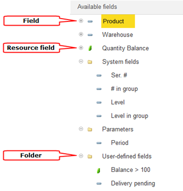
Fig. 152. A list of available report fields
Resource field. Field whose value is calculated based on the detail records included in the grouping.
You can use the following nested fields for each numeric resource in a report:
-
% in grouping. Contains the ratio of the resource value in the current cell to the resource total value in the current grouping when displayed in a table. It is 100% in nontable output.
-
% in hierarchy group. In table output, contains the percentage of the value of the resource in the current hierarchical group. It is 100% in nontable output.
-
% in row or series. In table output, stores the ratio of the resource value in the current cell to the row total resource value. In nontable output, it is always 100%.
-
% in column or point. In table output, stores the ratio of the resource value in the current cell to the column total resource value. In nontable output, it is equal to the % total field value.
-
% in row or series grouping. In table output, stores the ratio of the resource value in the current cell to the total resource value in the current grouping by row. In nontable output, it is always 100%.
-
% in column or point grouping. In table output, stores the ratio of the resource value in the current cell to the total resource value in the current grouping by column, which is equal to the % in group field value. In nontable output, it is equal to the % in group field value.
-
% in row or series hierarchy group. In table output, stores the ratio of the resource value in the current cell to the total resource value at the current hierarchy level in the current grouping by row or series (percentage). In nontable output, it is always 100%.
-
% in column or point group. In table output, stores the ratio of the resource value in the current cell to the total resource value at the current hierarchy level in the current grouping by column or point (percentage). In nontable output, it is equal to the % in hierarchy group field value.
When these fields are displayed in a chart, the field headers contain no references to rows or columns. For example, in a chart, the % in row or series field has the % in series header.
When these fields are displayed in a nonchart report, the field headers contain no references to series or points. For example, in a table, the % in row or series field has the % in row header.
Fields of Date type have subordinate fields that are divided between three groups: Beginning dates, End dates, and Date parts. Use them to define the exact date and time. For example, Beginning of day, Beginning of week, or End of week.
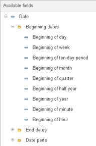
Fig. 153. Defining the exact date and time
For fields that include a date:
-
Beginning of day. Date and time of the beginning of the day.
-
Beginning of week. Date and time of the beginning of the week.
-
Beginning of ten days. Date and time of the beginning of the 10-day period.
-
Beginning of month. Date and time of the beginning of the month.
-
Beginning of quarter. Date and time of the beginning of the quarter.
-
Beginning of half year. Date and time of the beginning of the half year.
-
Beginning of year. Date and time of the beginning of the year.
-
End of day. Date and time of the end of the day.
-
End of week. Date and time of the end of the week.
-
End of ten days. Date and time of the end of the 10-day period.
-
End of month. Date and time of the end of the month.
-
End of quarter. Date and time of the end of the quarter.
-
End of half year. Date and time of the end of the half year.
-
End of year. Date and time of the end of the year.
-
Day. Number of the day in the month.
-
Day of the week. Number of the day of the week (by default the week starts on Monday).
-
Day of the week name. Presentation of the day of the week.
-
Day of the year. Number of the day in the year.
-
Week of the year. Number of the week in the year.
-
Month. Number of the month in the year.
-
Month name. Presentation of the month.
-
Quarter. Quarter number.
-
Year. 4-digit year number.
For dates that include time:
-
Beginning of minute. Date and time of the beginning of the minute.
-
Beginning of hour. Date and time of the beginning of the hour.
-
End of minute. Date and time of the end of the minute.
-
End of hour. Date and time of the end of the hour.
-
Minute. The number of the minute.
-
Hour. The number of the hour.
6.2.2.2. Parameters
If a report has customizable parameters, they are displayed in the list of available fields in the Parameters folder. You can add them to a report, remove them, and select their values (if multiple values are assigned to a parameter) on the Parameters tab. For example, if your report can be generated for a period, you need to specify the period.
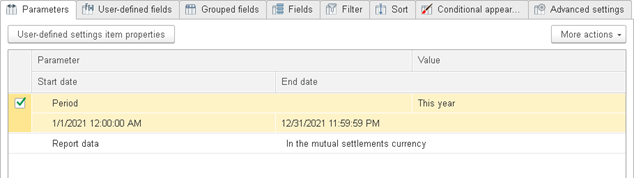
Fig. 154. Report parameters in the option customization form
You can use parameters as fields in report settings. When a report is generated, the parameters are replaced with their values.
For example, if a report includes Company as a parameter, the Parameters.Company field is available in the filter. When this field is selected as a filter value, the value of the Company parameter is used.
For a Date parameter, you can use both a specific date and any of the standard dates as its value: beginning of this day, beginning of next day, and so on.
6.2.2.3. Custom fields
You can create new report fields on the User-defined fields tab. To add a user-defined field to a report, add it to the list of selected fields. The application automatically determines whether the field can be added to a specific report item.
There are two types of user-defined fields: selection field and expression field.
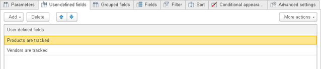
Fig. 155. User-defined fields in report option settings
A selection field can have multiple values. The first value that satisfies the filter condition is included in the report. Specify a title and an expression, a value, and an optional short filter presentation.
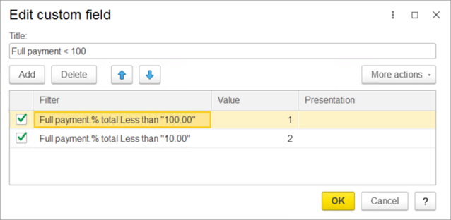
Fig. 156. Customizing reports. A user-defined selection field
Filter conditions are defined in a new window. To add a filter condition, click Add. Then select a field from the list of available ones, select a comparison type, and specify a value for comparison.
To define the order of filter items, use the arrows on the command bar or arrange the items by dragging them.
A user-defined expression field is displayed in a report as an expression result. You can compose expressions using available report fields and the expressions of the data composition system language. You can use user-defined fields anywhere in a report. You cannot use user-defined resource fields as grouping fields.
In the Edit user field dialog box, select a title and expressions for detailed and total records.
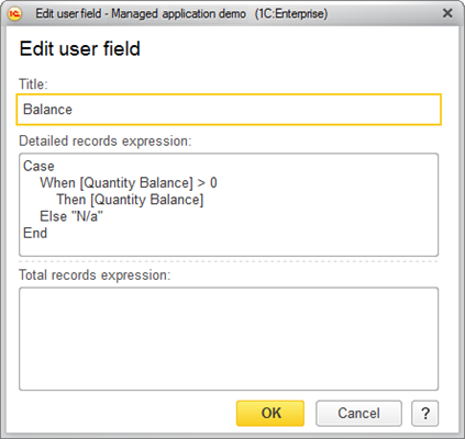
Fig. 157. A user-defined expression field
If a field name contains spaces or special characters, enclose them in brackets [ ].
Use aggregate functions to write expressions for total records, for example: SUM (Field) * 2.
For more information about data composition language expressions, see Chapter 12. Search expressions form.
6.2.2.4. Grouped fields
On the Grouped fields tab, you can select grouping fields and grouping type.
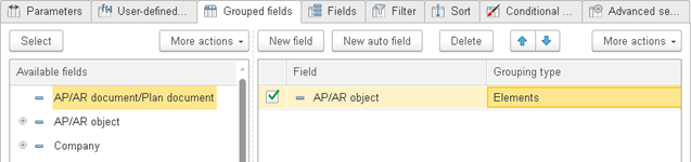
Fig. 158. Grouped fields in a report item
A grouping can have one of the following types:
-
Elements. The group only includes nonhierarchical records (items).
-
Hierarchy. The group includes both hierarchical and nonhierarchical records (items and folders).
-
Hierarchy only. The group only includes hierarchical records (folders).
You can use the menu to add a new field or a new auto field.
6.2.2.4.1. Grouped auto fields
A grouped auto field is a set of fields that is generated automatically. It contains the fields that match the following conditions:
-
They are available for use in grouping fields.
-
They are not resources.
-
They are not attributes of other selected fields.
-
They are not attributes of existing grouping fields.
To view the set of fields that replace a grouped auto field when a report is generated, click More – Expand.
If a field is already included in the data of the grouping field, it is not added again.
If available types of a grouping field include date, you can customize the period addition (add the dates that are not in the report results). For example, if you want the data for all the weeks to be included in a report, select Week as an addition type and select the start and end dates of the period, as shown in the figure below.
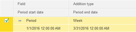
Fig. 159. Grouping customization by period
Let us illustrate this with an example. Suppose the Mutual Settlements report displays data on mutual settlements with contractors named "Animal Husbandry, LLC" and "Blackbeard Y. Sole Proprietor."
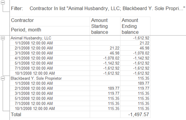
Fig. 160. A report without an addition
You now need to display data by month. To do so, on the Grouping tab, specify an Addition for Period, month.
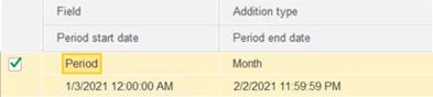
Fig. 161. Setting report addition
This changes the Mutual Settlements report as follows:
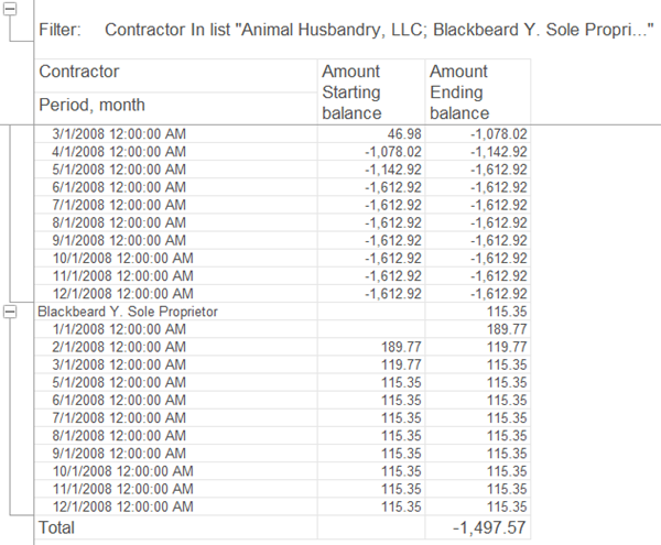
Fig. 162. A report with an addition
6.2.2.5. Fields
On the Fields tab, you can select the fields to be displayed in a report. If you do not select any fields, the report displays a blank item. You can use the menu or the context menu to add a field, a field group, or an auto field. You can name a field group and specify the field positions in the current report item.
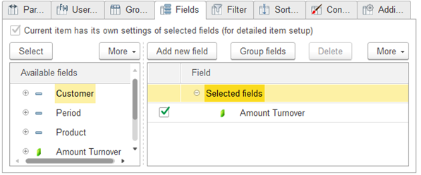
Fig. 163. Customizing reports. Fields
6.2.2.6. Selection auto field
You can use auto field sets as fields during report customization. When creating report structure items, the system automatically adds an <Auto> field as a selection field. A selection auto field represents a set of fields, it is converted to individual fields during the report generation. To view a set of fields, click More – Expand. To add an auto field, click More – Add new auto field.
The assortment of fields in a set depends on the structure item where the auto field belongs and on the structure part where the item is located. For each item, 1C:Enterprise iterates through all the parent items of the report structure and selects the resources and fields from the selected fields of these items using the following rules:
- For a grouping or a table grouping, an auto field is replaced with all used fields of the grouping that are available for use in the selected fields, fields that are attributes of its grouping fields, and resources of parent items.
-
For a chart grouping, resources are not selected. Instead, 1C:Enterprise iterates through all the parent items of the report structure and selects the grouping fields from the selected fields of these items, provided that this grouping has Hierarchy only type.
-
For groupings of Detailed records type (grouping, table grouping, or chart grouping), all the used fields except for the fields that are included in higher-level groupings and attributes of those fields are selected from the main selected fields of the setting where the grouping belongs. If the grouping has Hierarchy only type, its fields and attributes are used in the generation of a selection field set. For a chart grouping, resources are not selected.
-
For a chart, a selection auto field is replaced with all the resources specified for the chart. Depending on the application settings, the selection auto field can be replaced with the resource that is found first during the iteration.
-
For a table, a selection auto field is converted to a set of resources used by the parent items.
At that, the fields are added into a set in the following order: first the fields of the grouping’s own fields (for groupings), next fields of the global settings (for Detailed records groupings), and finally the resources and fields of the parent items.
You can combine the selected fields into groups that are added using the Group command. The command is available when all the selected table rows have the same parent. To delete groups while preserving the nested fields, use the Ungroup command. You can define a group location within the current report structure item by selecting a value in the Location column.
6.2.2.7. Filters
On the Filter tab, you can select the fields to filter records of the report result. To add an item or a group of items to the list of selected fields, use the menu or the context menu, or double-click an item. You can select a filter from a list of predefined ones, or add a new filter.
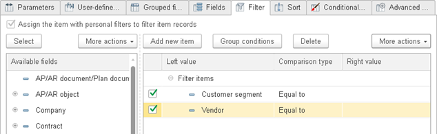
Fig. 164. Report item customization. Filter presentation
To display filter conditions with their presentations, click More – Detailed.

Fig. 165. Report item customization. Filters
Use this tab to specify the values for filtering the report result.
Presentation. To set a presentation for a filter item or group, use the Set presentation context menu command. If the list view is not Detailed, a presentation is displayed instead of a filter item condition. If a filter item has no presentation, the filter item is always displayed as a filter condition on the Filter tab.

Fig. 166. Specifying Application for a filter item
If Application is set to Hierarchy, the filter condition is checked after the hierarchy is composed. If it is set to Hierarchy only, the filter condition is only checked for hierarchical records. Filtered records still affect the resulting values of the resources of the superior hierarchical records. The nested groups of records that are filtered by these properties are also included in the report.
Comparison types. The following comparison types are available for filters:
-
Equal to. The result includes the records where the field value is equal to the specified value.
-
Not equal. The result includes the records where the field value is not equal to the specified value.
-
Less than. The result includes the records where the field value is less than the specified value.
-
Less than or equal to. The result includes the records where the field value is less than or equal to the specified value.
-
Greater than. The result includes the records where the field value is greater than the specified value.
-
Greater than or equal to. The result includes the records where the field value is greater than or equal to the specified value.
-
In list. The result includes the records where the field value is in the specified list. To create a list, click the selection button in the Value column.
-
In list group. The result includes the records where the field value is in the specified list or in a group in the specified list. To create a list, click the selection button in the Value column.
-
In group. The result includes the records where the field value is in a group in the specified list.
-
Not in list. The result includes the records where the field value is not in the specified list. To create a list, click the selection button in the Value column.
-
Not in list group. The result includes the records where the field value is not in the specified list or in a group in the specified list.
-
Contains. The result includes the records that contain the field value as a substring.
-
Does not contain. The result includes the records that do not contain the field value as a substring.
-
Filled. The result includes the records where the field is filled.
-
Not filled. The result includes the records where the field is blank.
-
Begins with. The result includes the records where the field value begins with the specified string.
-
Does not begin with. The result includes the records where the field value does not begin with the specified string.
-
Like. The result includes the records where the field value matches the specified template.
-
Not like. The result includes the records where the field value does not match the specified template.
The templates use the following syntax:
-
/ (slash mark) designates that the following character is a regular character.
-
% (percent) stands for any number (possibly zero) of any characters.
-
_ (underscore) stands for any single character.
Combining filter conditions. You can combine filter conditions into logical groups using AND, NOT, and OR operators. To combine conditions, select them and click Group conditions:
-
If the conditions are combined with AND, the report includes the records that satisfy all the conditions in the group.
-
If the conditions are combined with NOT, the report does not include the records that satisfy all the conditions in the group.
-
If the conditions are combined with OR, the report includes the records that satisfy at least one of the conditions. You can define group presentations using the context menu. If a group has a presentation, the nested folders are hidden when in the brief view.
6.2.2.8. Sorting
On the Sorting tab, you can select the fields used for sorting the report. You can add an order item or an auto order item. When a report is generated, an auto order item is converted to a set of fields used for sorting.
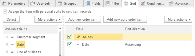
Fig. 167. Fields used for sorting a report item
For an auto order item, the More menu includes the Expand command, which shows the resulting set of fields. When an auto order item is expanded, resource fields are unconditionally added from the global sorting. Nonresource fields that are the attributes of grouping fields and grouping fields themselves are also added (for detailed records, all the fields are added). The grouping fields that are not specified in the global sorting are added to the end of the list.
6.2.2.9. Using conditional appearance in reports
On the Conditional appearance tab, you can define report item formatting that depends on the data displayed in the report. For example, you can highlight negative values. You can apply formatting to multiple structure items. You can specify the formatted areas for each item.
Conditional appearance can include multiple items. Each item describes an area to be formatted.
An area is a list of fields that are selected from the list of available fields. If no area is specified, the conditional appearance is applied to the entire report item.
For each area, you can specify the conditions when the selected formatting is applied.
The conditions for selecting fields are specified in a new window that is similar to the filter window of the user selection field. For details on filters, see Filters.
If two different appearances are applicable to an area, the one that is the last in the list of conditional appearance items is applied.
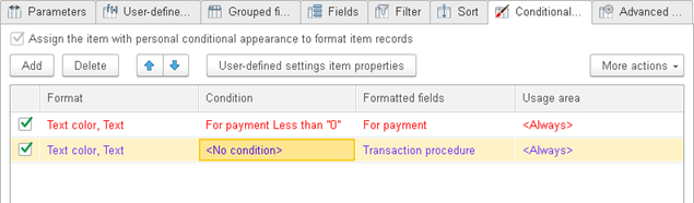
Fig. 168. Conditional appearance items in the detailed mode
The Presentation column defines the name of the conditional appearance item that is displayed in the list when the Detailed command of the More menu is not checked.
You can specify the conditional appearance parameters in a new window. You can select background color, text color, cell border style, font in specific cells, and more.
-
Background color. The background color.
-
Text color. The text color.
-
Color in chart. The color of data series in a chart.
-
Border color. The color of a data item border.
-
Border style. The style of a data item border. You can define the style of each border independently.
-
Font. The font style.
-
Indents. The indent measured in characters.
-
Autoindent. If this value is positive, the grouping indent size is calculated as a product of the grouping level and this value.
-
Horizontal position. The horizontal text alignment.
-
Vertical position. The vertical text alignment.
-
Placement. Specifies how text is displayed if it does not fit a cell.
-
Text orientation. A number that defines text tilt angle in grouping cells and table cells.
-
Format. Data display format.
-
Mark negatives. If this property is set to Yes, negative values are highlighted.
-
Unfilled mark. If this property is set to Yes, blank values are highlighted.
-
Minimum width. The minimum width of displayed data items (in characters).
-
Maximum width. The maximum width of displayed data items (in characters).
-
Minimum height. The minimum height of displayed data items (in characters).
-
Maximum height. The maximum height of displayed data items (in characters).
-
Text. Custom text describing the data. After clearing the field by clicking Clear, you can select the text string type: Multilanguage string, Multilanguage formatted string or
To define the application area of an appearance item, double-click a cell in the Usage area column. This opens the Additional tab in the conditional appearance editor dialog box. Select the checkboxes next to the areas where you want to apply the appearance item.
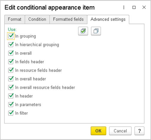
Fig. 169. Selecting the appearance item usage area
All the checkboxes are selected by default. You can use the Select all and Clear all buttons for quick editing.
6.2.2.10. Additional settings
On the Additional settings tab, you can define display parameters for a selected structure item. For example, if a grouping is selected, the tab has the following content:
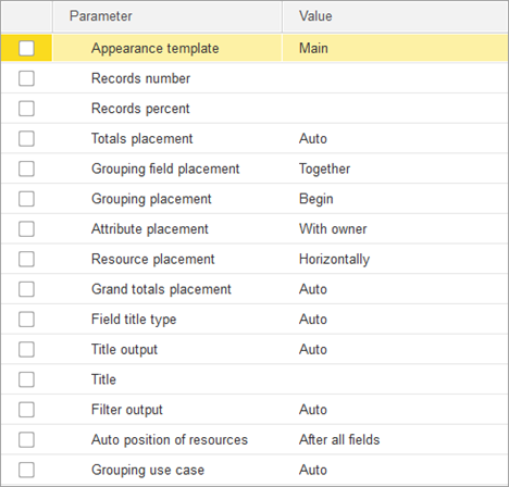
Fig. 170. Additional settings of a report item
6.3. Customizing settings item visibility
To make a settings item available in the report customization window, use the User-defined settings item properties command in the item customization window.
Then you can specify that this is a custom item and also specify a presentation for the item and its edit mode (ordinary, quick access, or unavailable).
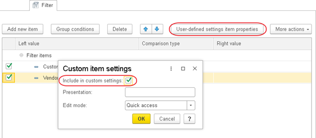
Fig. 171. Adding a custom settings item
In the settings structure list, you can use the User-defined settings item properties command to specify custom settings for the current structure item.
Each structure item has its own customizable items.
Object
Customizable items
Report
Selected fields, order, filter, conditional appearance, content of groupings
Grouping/table grouping/chart grouping
Grouping, selected fields, filter, order, conditional appearance, content of nested groupings
Charts
Chart, selected fields, conditional appearance, content of series groupings, content of point groupings
Tables
Table, selected fields, conditional appearance, content of row groupings, content of column groupings
Nested schema
Nested report, selected fields, filter, order, conditional appearance, content of groupings
Use the User-defined settings item properties command to change the following settings:
-
In a filter list: settings for the current filter item or filter item groups.
-
In a list of output parameters and data parameters: settings for the current parameter.
-
In a conditional appearance list: settings for the current conditional appearance item.
Besides, the User-defined settings command available on the report structure command bar (see the figure) opens a window that displays the settings along with their default values.
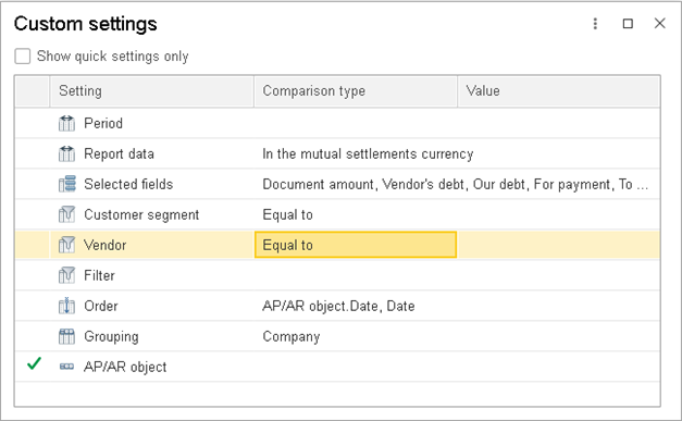
Fig. 172. User-defined settings preview
Chapter 7. Collaboration system
1C:Enterprise includes the collaboration system.
This component supports interactions between users, client applications, and the 1C:Enterprise server within a single infobase.
This simplifies business process automation and provides application users with convenient means of communication. You can use the collaboration system to implement interaction between application objects, as well as user interaction with the application. For example, you can develop a bot that responds to certain requests.
To interact with each other, infobase users do not need to register in the collaboration system because it uses 1C:Enterprise authentication.
7.1. Collaboration system architecture
The collaboration system features client/server architecture and consists of the following two parts:
-
The client is an integral part of 1C:Enterprise, it connects an infobase to the collaboration system.
-
The server is an independent software product "1C:Enterprise collaboration server", which can be deployed both on an Internet server and in a company's local network.
The message exchange between the client and the collaboration server is performed over WebSocket protocol. This protocol supports both open and secure data transfer, which ensures secure message delivery both within the local area network and over the Internet.
The collaboration server stores all user messages, receives messages, sends messages to client applications, and so on. Client applications display messages in 1C:Enterprise interface.
7.2. 1C:Dialog server
1C:Dialog is an instance of the collaboration server deployed in a 1C data center in order to demonstrate the conversation features.
The server address is wss://1cdialog.com:443.
An Internet connection is required.
If collaboration system is connected through 1C:Dialog, a file transfer functionality is enabled. For valid service use conditions and restrictions applicable to the size of files to be transferred (including storage period), see https://1cdialog.com/ru/pricing/.
7.3. Collaboration System menu
If collaboration system is available, the collaboration system menu will be displayed in header of the application main window.
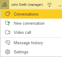
Fig. 173. Collaboration system menu
This menu includes the following:
-
Conversations. Open the list of existing noncontext conversations.
-
New conversation. Create a new noncontext conversation.
-
Video call. Start a new video call or a video conference. Available only if video calls are enabled on current Collaboration System server.
-
Message history. Open the message history form of the Collaboration System.
-
Settings. Open the collaboration system settings dialog box.
When performing a video call or sharing screen, this menu has another icon ad command set.
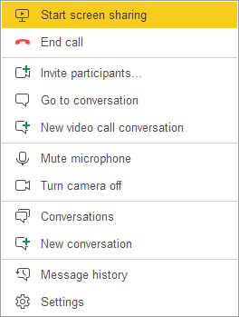
Fig. 174. Collaboration system menu when performing a video call
Commands from the video call window are added to this menu. For more information, see Options available during a video call.
7.4. Conversations
The collaboration system allows users of an infobase to join in conversations. There are two conversation types:
- A context conversation is an exchange of text messages related to an application object. For example, a conversation about a document or a product description. Each context conversation is displayed in a respective infobase object form.
- A noncontext conversation is an exchange of text messages not related to any application object. Noncontext conversations are displayed on the Conversations panel.
1C:Enterprise 8 conversation functions are available in the thin client, web client, and the managed mode of the thick client.
7.4.1. Noncontext conversations
You can start any number of noncontext conversations.
These conversations are displayed on the Conversations tab and are available only to the participants of the respective conversation. The number of conversation participants is not limited.
To switch to the Conversations panel, you can click Conversations in the Collaboration System menu.
Fig. 175. Menu item - Conversations
7.4.1.1. Conversation participants
Noncontext conversations support an unlimited number of participants. The list of conversation participants includes the user who started the conversation and the users they added to the conversation. In the application, any conversation participant can:
-
View conversation messages and get links to them.
-
Add messages to a conversation and attach files to own messages.
-
Change the conversation topic.
-
Add participants (any infobase users).
-
Delete any user from conversation participants.
-
Leave conversation.
Click Conversation participants button to view the list of conversation participants.
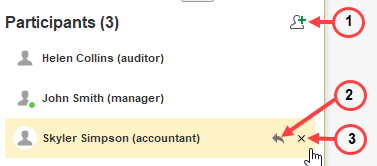
Fig. 176. Conversation participant list
The following actions are available in the list:
Action
Description
Open a participant profile
Right-click the participant and then click User details.
Add participants
Click Add participants (1).
Invite an external participant
If the application allows you to invite external participants to the conversation, you can click More actions – Invite participants by link or by email to invite an external user to the conversation. An invitation link is sent to the email address specified in the invitation dialog box. To join the conversation, the recipient must follow the link.
Find a participant in the list
Enter a part of the name of the participant you are searching for in the Search for participants field. The participant list will display only participants whose names satisfy the search condition (their names contain all the "words" and each "word" is the beginning of a word in the participant's name). The found substrings in participant names are highlighted.
Reply to user
Click Write to user (2). In the
Delete a user from the conversation participant list (the command is available to all users)
Click Delete participant (3).
Leave the conversation
Click Leave conversation in a user line with corresponding name.
If there are more than 100 participants in the conversation, the Show participants link will be displayed instead of the participant list when you select a conversation. Clicking this link will display a list of all participants.
When the last participant leaves, the conversation is deleted.
7.4.1.2. Default conversation form
Noncontext conversations are displayed in the Conversations form. To open this form, do one of the following:
- Click Conversations in the Collaboration System menu.
Fig. 177. Menu item - Conversations
- In the open items panel, click the Conversations tab.

Fig. 178. The Conversations tab in the open items panel
The Conversations default form contains the following:
-
The list of your conversations is displayed on the left. Conversations with unread messages are highlighted in bold. The selected conversation is highlighted with gray background. When a user gets a new message, the conversation goes to the top of the conversation list in all used application clients.
-
If a conversation is created by an external user with a business account in WhatsApp, under the conversation title you can see how much time you have to send a message. Once this period ends, you can send a template message only.
-
The messages of the selected conversation are displayed on the right side.
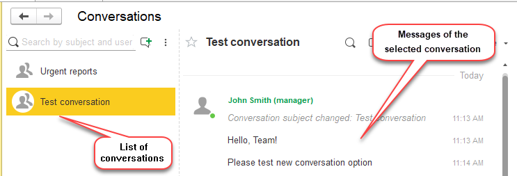
Fig. 179. Default Conversations form
The list of conversations displays all of your noncontext conversations that have new messages. If there are less than 50 conversations with new messages, the list also includes your noncontext conversations that do not have new messages. These conversations are added to the list based on their update time (the most recent ones first) until there are 50 list items total.
7.4.1.3. List of conversations
The conversations list is displayed on the left side of the main Conversations form. In this list, you can do the following:
-
Open a conversation by clicking it.
-
Start a conversation.
-
Search for a conversation.
-
Configure message sending and sound notification settings.
For better visual representation, conversations have different icons.
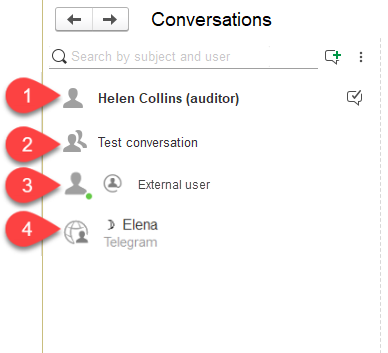
Fig. 180. Conversation kinds
The following conversations are numbered:
-
1:1 conversation with a user. A user picture is used as a conversation icon.
-
Conversation with multiple users.
-
Conversation with an external user invited from the application.
-
Conversation with a user created by integrating the Collaboration System with an external instant messaging system (a bot, a group, and so on).
7.4.1.3.1. Starting noncontext conversations
To start a noncontext conversation, click New conversation above the list of conversations in the main collaboration system form.
Fig. 181. Starting a noncontext conversation
You can also use the system communication menu command:
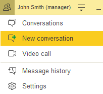
Fig. 182. Menu item - New conversation
On the New conversation panel:
-
Specify the conversation topic to be displayed in the list of conversations.
-
Select the conversation participants. To add a participant, under Participants, type a part of their name, and then click the appropriate user.
-
Once you add all participants, click OK.
If you select the Create invitation link for other participants checkbox, when creating a conversation, there will be a message with a link using which other users can join the conversation. You can restrict access to video calls only (Only video calls (cannot read and write messages)).
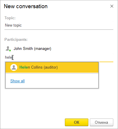
Fig. 183. Adding noncontext conversation participants
Only participants can send and receive messages in a conversation. To send a message, enter the message text and press Enter. You can use emoticons in the message text. The built-in help includes the list of emoticons.
All noncontext conversations are available on the Conversations tab of the open items panel. You can also open a conversation by clicking Conversations in the notification center.
7.4.1.3.2. Searching for conversations
To search for a conversation, in the field above the list of conversations, enter a search string.
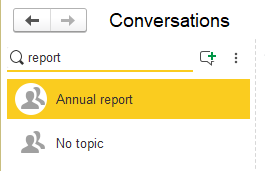
Fig. 184. Searching for conversations
The search displays all your noncontext conversations whose topics (names) contain the search string you entered. If you enter a username, you can find common conversations with the specified user.
Also, you can use the search result to start a one-on-one conversation. To do it, select a conversation from the results and send a message.
The search runs on the collaboration system server.
7.4.2. List of noncontext conversation messages
To display the list of messages in a noncontext conversation, do the following:
-
Open the Conversations form.
-
On the left side of the main Conversations form, click a conversation.
The list of conversation messages is displayed on the right side of the Conversations form.
7.4.2.1.1. Message list format
The upper part of the message list displays the following:
- Conversation topic
conversation buttons.
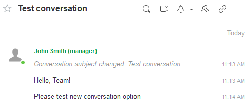
Fig. 185. Conversation messages
The conversation messages are displayed below. They are grouped by date, 50 items per page.
If the list includes more than 50 messages, to load the next 50 messages, above the list, click Show more.
Messages of other participants have the following differences from your messages:
- Username is specified before the message text
- Avatar (picture) is displayed to the left of the message. The circle next to the picture indicates the current user status. For more information, see User profile settings.
NOTE. If the conversation is in Read only mode, the following interactive actions are not available in such conversation: creating messages, editing messages, deleting messages, editing the message subject, exiting the conversation, and editing the list of conversation participants.
7.4.2.1.2. Adding messages
To add a message to a noncontext conversation:
- Below the dashed line under the messages, enter your message.
-
If there are more than 2 participants in a conversation, in the Who to be notified field, you can select users who will be notified of a message. To start searching for a user, type a part of the username. Select a user from the pop-up list by clicking them or pressing Enter. Repeat this step for each user that you want to add. To delete a recipient of the message, press the middle mouse button on their name or the X button.
-
To add an attachment to a message, click Attach file, select one or more files, and click Open. The size of each uploaded file and the total size of uploaded and received files can be limited on the collaboration system server. To view an attached file while editing, click its link.
-
To remove an attachment from the message, press the X button near the attachment or the middle mouse button. You can attach an image from the clipboard (press Ctrl + V or Shift + Ins in the message input field).
- Press Enter or click Send.
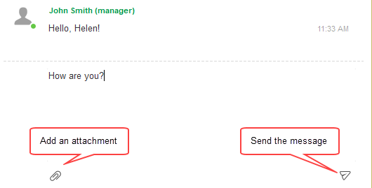
Fig. 186. Adding a message to a conversation
In some conversations, you can connect a bot that can respond to text messages or clicks on one of the suggested links or buttons.
7.4.2.1.3. Adding messages in WhatsApp
If a noncontext conversation is created in interaction with WhatsApp (it is available only for WhatsApp business accounts using an authorized service provider), you can use the messenger to perform the following actions in your conversations:
- Respond to a user message. Enter a response text and press Enter/Ctrl+Enter to send it to the user. You can send an arbitrary message only within 24 hours since the last user message in the conversation. Under the conversation title in the list, you can see the timer for an arbitrary response.
- Send template message. Click Send template message. In the Message template form, select a template, fill the substitution texts, and send the message.
7.4.2.1.4. Message read status
The read status is displayed to the left of the message time. It shows which participants/message recipients read the message.
Hover the mouse pointer over the status to see a tooltip with general information:
-
Read by everyone. All participants/message recipients read the message. It is indicated by two blue check marks.
-
Read by <N1>; not read by <N2>. Some participants read the message. It is indicated by blue and gray check marks.
-
Read by nobody. No participants read the message. It is indicated by two gray check marks.
Click the icon to open the list of conversation participants (or message recipients) and see who read the message.
You can see the read status in context conversations with less than 100 participants and noncontext conversations where:
-
There is no "All users" participant.
-
There are other participants besides the current user.
-
There are less than 100 participants in total.
7.4.2.1.5. Searching conversations for messages
To search noncontext conversations for messages containing specific text, Click Search in conversation (or press Ctrl + F) and enter the search string. This highlights the messages containing the search string in the list of messages. The search runs in the client application.
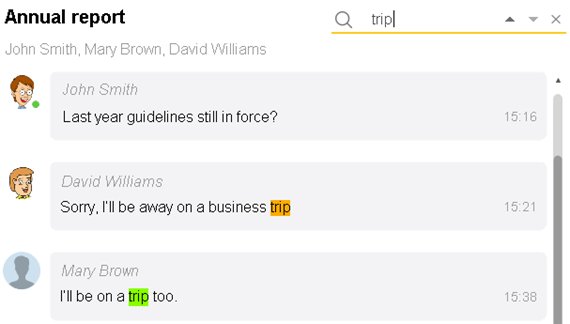
Fig. 187. Search in conversation
You can specify multiple search strings separated by spaces. In this case, the text is highlighted only in messages that contain all of the search strings.
To switch between the search results, click Find next (a triangle pointing down) or Find previous (a triangle pointing up) to the right of the search field. When you switch between the search results, more messages are loaded if necessary.
To cancel the search, press Esc or click Cancel search to the right of the search field.

Fig. 188. Buttons for switching between search results and canceling the search
7.4.2.1.6. Notifications settings
If the user wishes to "keep up with" a noncontext conversation, they can enable notifications of new messages in the conversations. To do it, click Notify of new messages in the top right corner of the conversation panel.
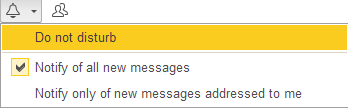
Fig. 189. Notifications of all new messages are enabled for a noncontext conversation.
The following modes are available:
- Notify of all new messages. Notifications of all new messages will be displayed on the user screen, in the notification list of the client application agent, and as push notifications in case the mobile version is used.
- Notify only of new messages addressed to me. Notifications from the current conversation will be sent only if a user is specified in the To field.
If the Do not disturb mode is enabled, the notifications will not be displayed but will be saved in the Notification center.
7.4.2.1.7. Other actions
In the list of noncontext conversation messages, you can do the following:
Action
Description
Change your message
Edit command in the message context menu.
Change your last message
Press Up Arrow.
Quote message text
Select a message or its part and do one of the following actions:
- In the context menu, click Quote.
- Click Reply/Reply to all. All users specified as message recipients will receive a notification about a message with a quote.
The text will be added to the beginning of the message, and the > character will be added before each line.
All attachments of the quoted message will be added to the current one.
You can also utilize nested quoting.
Search selected message text in the infobase data.
In the context menu, select Search Everywhere (or press Alt + F).
Copy a message to clipboard
Select the message and click Copy in a context menu (or press Ctrl + C or Ctrl + Ins).
If there is an attachment, the message will be copied along with the attachments list.
Copy a link from a message to clipboard
Right-click a hyperlink and then click Copy link.
Open attached file
Right-click a file link and then click Open.
Copy attached file
Right-click a file link and then click Copy.
Save attached file
Right-click a file link and then click Save.
Delete message
Right-click a message and then click Delete.
Make a video call
Click Video call or click a conversation participant in the list and then, in the new window, click Video call.
Show participants list
Click Conversation participants.
Get participant details
Click the participant name in the participants list.
Add participants
In the list of participants, click Add participants.
Invite an external participant
If the application allows you to invite external participants to the conversation, you can click More actions – Invite participants by link or by email to invite an external user to the conversation. An invitation link is sent to the email address specified in the invitation dialog box. To join the conversation, the recipient must follow the link.
Change conversation topic
More - Change topic... (or
Get link to a conversation
(noncontext conversations only)
Click Get link in the conversation menu.
Get a URL to a message
Right-click a message, and then select Get link...
Mark a conversation as read
If the Mark as read parameter in the conversation settings is set to Manually or On reply or manually, to mark a conversation as read, click Read.
You can also right-click the conversation in the conversation list and then click "Mark as read", or open the conversation and click More — Mark as read. The conversation will be considered read.
Leave conversation
More — Leave conversation.
Click Leave conversation next to your name in the participants list.
Revoke invitations
If the application allows you to invite external participants to the conversation, you can click More actions – Revoke invitations to prohibit connecting to a conversation/video call using a previously generated invitation link.
Other commands may also be available as hyperlinks in the message dialog box.
Commands for video calls, adding participants and leaving conversations are not available if all users (All) participate in a conversation.
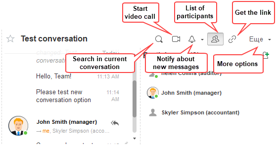
Fig. 190. Noncontext conversation commands
7.4.3. Message history
On the Conversations form, next to the New conversation button, click ⋮ – Message history.
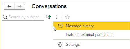
Fig. 191. Opening conversation history
The message history form appears.
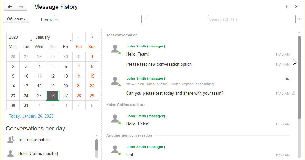
Fig. 192. Message history
This form displays all messages of the Collaboration System for the selected date:
- All messages of noncontext conversations the current user participates in.
- All messages of context conversations whose recipients included the user.
Messages are grouped by conversations and sorted in ascending order of creation time.
The context menu of messages contains the same commands as when displaying a message in a conversation: Copy, Quote, Edit, and so on.
Use the calendar field to select the date for which you want to view messages.
In the From: field, you can sort messages by author.
In the Search field, you can specify a string to search for in the message text. The search will display only messages that contain the search string.
The Conversations per day list contains a list of all conversations for the selected day.
To go to a conversation, you can:
- Click a conversation title in the message list.
Select a conversation in the Conversations per day list.
7.4.4. Context conversations
You can start a conversation related to a document, a list item, or another object. The conversation will be displayed in the form of that object. It will be available to all users that have the right to access the object. If a conversation is not displayed, to open the conversation, in the object form, click Conversation.
To start a context conversation:
-
In the object form header, click Conversation.
-
In the Who should be notified field, select the user or users who will receive a notification about the message. To start searching for a user, type a part of the username. In the pop-up list, click the username.
Repeat this step for each user that you want to add. To delete a user from the list of the current message recipients, press the middle mouse button on his name or X button.
If you select No notification, the message will be added to the conversation without notifying any users.
- Enter the message in the Message field and press Enter. To add an attachment to a message, click Attach file, select one or more files, and click To remove an attachment from the message, press the X button near the attachment or the middle mouse button. You can attach an image from the clipboard (press Ctrl + V or Shift + Ins in the message input field). To change the Message field size, drag the separator between the field and the conversation messages list.
You can search the list of context conversation messages in the way similar to the search in noncontext conversations.
7.4.4.1. Context conversation specifics
Context conversations have the following distinguishing features:
- They are displayed in the form of the related infobase object (not in the Conversations form).
- They are public: all users with the right to view an infobase object can view and participate in the context conversation related to this object.
Each infobase object can have a single context conversation. Therefore, context conversations have no names (topics), and it is not necessary to create a context conversation or select it from a list.
7.4.4.2. "Conversation" command
To view a context conversation, in the object form, click Conversation:
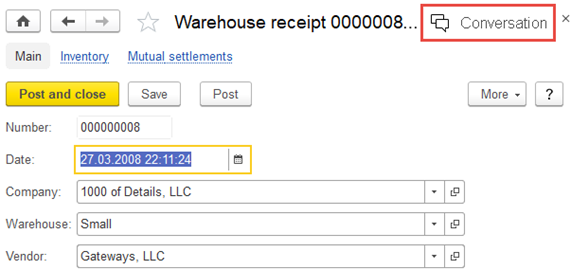
Fig. 193. Conversation command in an object form
Command icon changes its color if there are new messages in the conversation.

Fig. 194. New messages in the context conversation icon.
This opens the context conversation panel. The panel displays the list of messages related to the object (if any). To close the context conversation panel, click Conversation again.
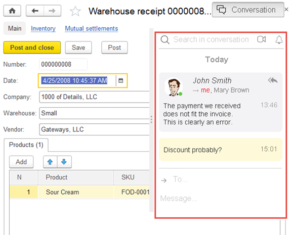
Fig. 195. A context conversation panel
7.4.4.3. Adding messages
To add a message to a context conversation:
-
In the object form, click Conversation to open the context conversation panel.
-
If you want to notify a user about the message, do one of the following:
- Type a part of the username in Who to be notified field, and then, in the pop-up list, click the username.
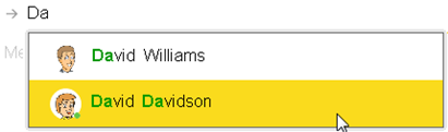
Fig. 196. Choosing a user to notify about the message
- To reply to the users listed in the message header (the author of the message and the users that receive notifications), in the upper right corner of the message, click Reply or Reply to all.
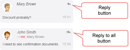
Fig. 197. Reply and Reply to all buttons
You can notify any number of users about the message. The names of users that will be notified about the message are listed above Who to be notified field. To delete a recipient of the message, press the middle mouse button on their name or the X button.
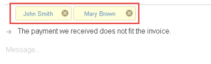
Fig. 198. Users to be notified about the message
-
In the Message field, enter the message and click Send or press Enter. You can use emoticons in the message text. The built-in help includes the list of emoticons.
-
The message will appear in the context conversation panel.

Fig. 199. A message in the context conversation panel
If you try to send a message without specifying the recipient, Who to be notified field will be activated automatically. When you select a recipient, the message text input field will be activated automatically.
The message author and the users to be notified are listed at the top of each message.
7.4.4.4. Searching conversations for messages
You can search the list of context conversation messages for a specific string or multiple strings in the way similar to the search in noncontext conversations (see Searching conversations for messages).
7.4.4.5. Notifications settings
If the user wishes to "keep up with" a context conversation, they can enable notifications of new messages in the conversations. To do it, use the More menu in the upper right corner of the conversation panel.
Fig. 200. Notifications of new messages addressed to the current user are enabled for the context conversation
The following modes are available:
- Notify of all new messages. Notifications of all new messages will be displayed on the user screen, in the notification list of the client application agent, and as push notifications in case the mobile version is used.
- Notify only of new messages addressed to me. Notifications will be sent only if the current user receives a message.
If the Do not disturb mode is enabled, the notifications will not be displayed but will be saved in the Notification center.
7.4.4.6. Other actions
In the context conversation panel, you can do the following:
Action
Description
View user details
Click a username at the top of a message.
Change my message text
Right-click a message and then click Edit.
Get a URL to a message
Right-click a message, and then select Get link...
Make a video call
Click Video call or click a conversation participant and then, in the new window, click Video call.
Close the context conversation panel
Click Conversation.
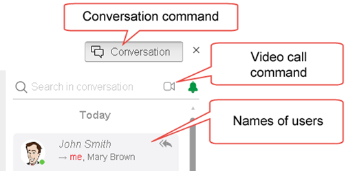
Fig. 201. Actions in the context conversation panel
The message actions are the same as for context conversations. For more information, see "Other actions".
7.4.5. Setting up conversations
On the Conversations form, next to the New conversation button, click ⋮ – Settings. This will open the dialog box with the Collaboration System parameter settings.
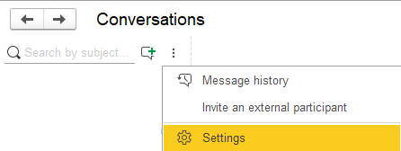
Fig. 202. Opening conversations settings
The command is also available in the Collaboration System menu.
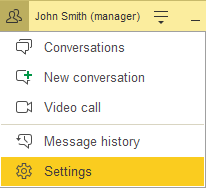
Fig. 203. Menu command – Settings
To open the dialog box for setting up the Collaboration System, click Settings.
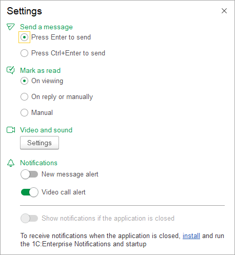
Fig. 204. Conversation settings
In the dialog box, you can set the following parameters:
-
Send a message. Keyboard shortcut for sending messages in conversations.
-
Mark as read. Mark messages as read in conversations:
-
When viewed. A conversation is considered read when it is viewed.
-
On reply or manually. A conversation is considered read after you click the Read hyperlink or send a message in this conversation.
-
Manually. A conversation is considered read only after you click the Read hyperlink.
This setting is saved for the user and applied in all started applications and application clients, on all devices of the same user.
-
Video and sound. Select the used devices in a separate dialog box.
-
Notifications. Enable or disable sound alerts for notifications and video calls.
-
Notifications when client application closed. Get notifications when the application is closed. See below for more information.
-
Select how to display messages when sharing the screen during a video call (Upon screen sharing). The default value is Show messages in full. If the Hide messages option is selected, the sound of new message notifications is preserved and new message notifications are displayed.
7.4.5.1. Getting notifications when the client application is closed
To receive notifications when the application is closed, install and run the 1C:Enterprise. Notifications and startup. To start installation, click the install link in the settings dialog box. You can edit the application name in 1C:Enterprise. Notifications and startup.
When enabled, sound alerts are played when you receive a new message or an incoming call, or when you start or end a video call.
In the Application name field, you can edit the application name to be displayed in 1C:Enterprise – Notifications and startup. To save the name, press Enter.
7.4.5.2. Setting up video and sound
To open a form for setting up video and sound parameters, click Settings in the Video and sound group.
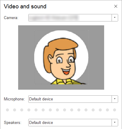
Fig. 205. Video and sound settings
In the form, you can configure the following video and audio parameters:
Camera. Select a connected camera. In the preview field, you can see a picture from the selected camera.
Microphone. Select a connected microphone. The indicator shows the selected microphone sound level.
Speakers. Select a connected audio output device.
The selected settings will be applied immediately.
If there are any issues with audio recording or playback, you can enable the Support more audio devices... parameter.
7.5. External users
When you work with the application, you may need to include external users in conversations. For example, to discuss orders with customers, delivery terms with suppliers, and so on. You can organize such interaction using email, third-party messengers, or the Collaboration System.
To do this, send an external user an external website link. After following the link, the external user will be able to exchange messages and participate in video calls with application users.
1C can provide a website for communication (https://dialog.1c.com), or you can deploy it on a native Collaboration System server.
The Collaboration System website has features for external users similar to noncontext conversation features. However, there are some restrictions:
-
External users can access only noncontext conversations.
-
Actions within messages are not available. For example, external users cannot get a link.
-
Features of "1C:Enterprise – Notifications and startup" are not available.
-
External users can see the application users who participate in the conversations where they were invited to.
-
If external users stop participating in a conversation, they cannot see the conversation participants with whom they do not have common conversations.
-
External users cannot see certain video call users if they do not have common conversations.
-
External users can leave conversations but cannot invite new conversation participants or delete existing ones.
-
The website is displayed only in Russian and English. The language is selected among the available ones and depends on the browser settings. If the language selection fails, English is used.
-
The progressive web application is not supported on iOS.
-
Push notifications are not supported on iOS when the website is not running.
-
Video calls are supported in the following browsers:
-
Google Chrome version 64 or later (except for iOS).
-
Microsoft Edge version 64 Chromium or later.
-
Mozilla Firefox version 52 or later (except for iOS).
-
Safari version 13 or later.
7.5.1. Inviting external users
If the application supports access for external users, you can take the following actions to start a conversation with an external user:
- Right-click the conversation list and then click ⋮ – Invite an external participant. This creates a one-on-one conversation.
- Right-click an existing conversation and then click More actions – Invite an external participant. An external user will become a conversation participant.
Any of these commands will open the dialog box for inviting an external participant.
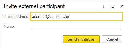
Fig. 206. Inviting an external participant
In the dialog box, enter the email address of the external user you want to invite and their name, if required.
If the username is not specified, their email will be displayed as the name.
To create an external Collaboration System user in the application, click Send invitation.
An invitation link will be sent to specified email of the user.
If an external user with the specified email already exists, you will see a warning. When you click Send invitation, the participant is added to the list of conversation participants (if you open the dialog box from the conversation), or you switch to a previously created one-on-one conversation with this participant.
7.6. Video calls
Depending on the settings of the conversation service, users can make audio and video calls, provided that microphones and cameras are available.
Video calls are available if the following requirements are met:
-
The collaboration server allows making video calls.
-
Computers of the video call participants have microphones. If a video call participant has a camera, their video feed is displayed to the other participant.
-
Video calls are supported:
-
In thin and thick clients on Windows 7 and later.
-
In thin and thick clients on macOS.
-
In thin client on Linux
-
If the client application is running on a remote desktop (RDP), ensure that the microphone and camera are available on the remote desktop of the computer where you are running the remote desktop connection.
-
In web client in the following browsers:
-
Google Chrome version 64 or later (except for iOS).
-
Microsoft Edge version 64 Chromium or later.
-
Mozilla Firefox version 52 or later (except for iOS).
-
Safari version 13 or later.
-
Google Chrome supports video calls only when the infobase is accessed using a secure (HTTPS) protocol.
7.6.1. Starting a video call
There are several ways to start video calls in the application.
To start a one-on-one video call, in the list of conversation participants, click the username and then click Video call:
Fig. 207. Starting a video call
To start a video call with multiple users:
-
Click Video call in the Collaboration System menu or on the context/noncontext conversation panel.
-
Add participants of the video call. If the name of the required user is in the Video call window, select the checkbox to the left of it. If the user is not in the Video call window, the application makes suggestions when you start typing a name in the Add user field. Then click Join.
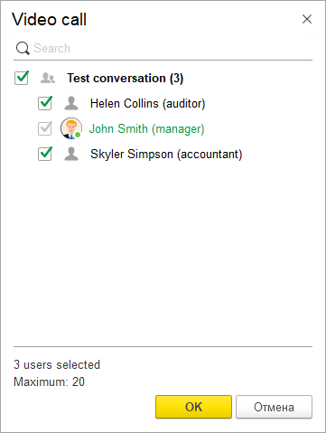
Fig. 208. Selecting video call participants
If new participants were added when selecting participants for a video call, the title of the Join button will change to Call.
If a participant was added during an active video call, clicking Call will connect them to this call.
If the user you are calling is online, they will see the Incoming call window and can either accept or decline the video call.
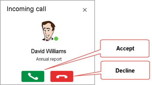
Fig. 209. Incoming call window
The Incoming call window displays the caller name, their picture (avatar), the call topic (the noncontext conversation topic or the name of the document linked to the context conversation) can be specified as well.
If the user you are calling is not online, you will see The user is offline message. To close this window, click Close.
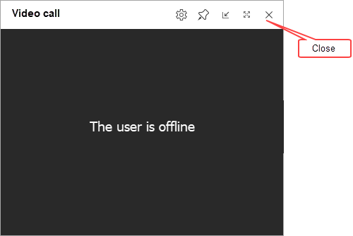
Fig. 210. Calling a user that is offline
If the caller or the recipient doesn't have a microphone, the video call will be canceled. The recipient of the video call will receive a Missed call notification.
7.6.2. Options available during a video call
If the user you are calling accepts the call, the participants see the video call window. This window displays:
-
Name(s) of other video call participants.
-
Feed from the cameras of other users if they have a camera, or their picture if they do not have a camera.
-
Call topic can be displayed in some cases. For example, if the video call was started from a noncontext conversation.
-
Video call controls
In general, a video call window looks as follows:
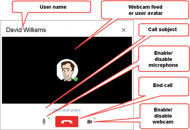
Fig. 211. A video call window
The following actions are available in the video call window title:
Action
Description
Open the dialog box for video and sound settings. For more information, see Setting up video and sound.
Click Settings (1).
Dock/undock the video call window.
A docked window is displayed on top of other application windows.
Click Dock (2).
Switch to compact mode. For more information, see Compact mode.
Click Compact mode (3).
Open video call window in full-screen mode
Click Expand to full view (4) or double-click the video call window title.
To return to the default video call window, click Exit full screen or press Esc.
End video call
Click Close (5).
Select a display mode
Click the View (6) menu and select the required display mode. For more information, see.
The buttons to the left and to the right from the end call button display the microphone and camera status:
Button
Status

The microphone is on

The microphone is off

The camera is on

The camera is off
When microphone or camera is not available at the start of a video call, the buttons will change into:
Button
Description

Microphone is not found or is used by another application.

Camera is not found or is being used by another application.
The following actions are available on the video call panel:
Action
Description
Add or remove participants
Click Add participants (7). This will open a list of video call participants. For more information about the list of participants, see "Video call participants".
Start screen sharing.
Click Start screen sharing.
Select the screen or an application window to share and click Start screen sharing. The main screen is selected by default.
To stop sharing the screen:
- Expand the video call window. In the video call window title, click Restore, or double-click the window title and then click End screen sharing.
- Right-click the application header and then click Video call – End screen sharing
Turn the microphone on or off.
Click the button with the microphone picture.
When you click the microphone mute button, the device will continue its operation, but it will stop sending data.
Turn the camera on or off
Click the button with the camera picture.
End video call
Click End call
These video call commands are also displayed in the Video call (Conversations, video calls, screen sharing) menu.
Some buttons are hidden in the More menu.
The More menu includes the following:
Action
Description
Switch a call to another device
Click More – Continue your call on another device.
Switch to the conversation where the video call was started
Click More – Go to conversation.
Raise hand/Lower hand
Click More actions and select Raise hand/Lower hand.
Create a conversation from a video call
Click More and then select New video call conversation.
In the dialog box for creating a new conversation, edit the name of the conversation you create or leave the default Video call <Date and time> name and select the participants of the new conversation.
When you click OK, all video call participants who have access to the conversation navigate to the new conversation.
If the connection quality is insufficient for a video call, the video thread quality indicator is shown in the top left corner of the camera image:
Icon
Description

Medium video thread quality

Low video thread quality
During a video call, you can switch between the selected user view, speaker view, and grid view.
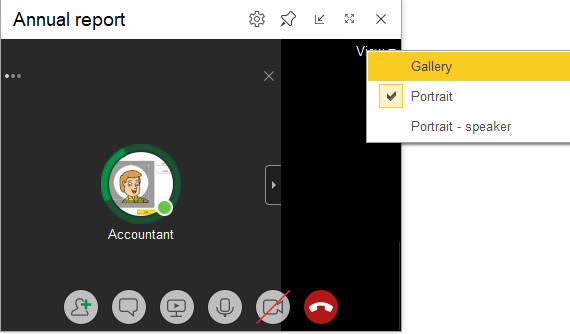
Fig. 212. Selecting a video call display mode
To switch the display mode in the View menu, select the desired mode:
-
Gallery. No more than 16 participants are displayed on the screen at the same time. If there are more participants, use the right and left buttons to move the video feeds. The current user's video is displayed last on the first page. The other participants including those who have not joined, rejected the call, lost the connection, or turned their cameras off are displayed together. When you click on a participant's video, the display mode switches to Portrait. If this participant is sharing their screen at the moment, their screen will be displayed.
-
Portrait. A video of the selected participant is displayed large on the left. The other participants' videos are displayed in the feed on the right. You can hide the participant feed. If a participant is sharing their screen, the screen is displayed and the pointer form in the participant feed is changed.
Portrait (speaker). A video of the speaking participant is displayed large on the left. The other participants' videos are displayed in the feed on the right. You can hide the participant feed. If a participant is sharing their screen, the screen is displayed and the pointer form in the participant feed is changed. If you click a participant in the feed, the display mode switches to Portrait.
7.6.2.1. Video call participants
To add participants at the beginning or during a video call, click Add participants.
Fig. 213. List of video call participants
To add a conversation participant:
-
Enter the username fragment in the field Search and select the required user with the help of the mouse.
-
Select the checkbox opposite the username. If the video call is started from a conversation, the checkboxes opposite all the participants with whom you want to start the video call shall be selected. Then click Call.
If a user is offline, you can remove them from a video call by clearing the checkbox next to their name.
When you add participants during a call, the Copy link to invite participants link appears. When clicked, an invitation link for an external participant will be copied to the clipboard.
If an external user who was not previously authenticated on the website for external users using email follows such link, they will have a number of restrictions:
-
Have access to only one conversation unless the Video calls only restriction is set.
-
Cannot create new conversations.
-
Cannot be added to other conversations by user selection.
-
Cannot write personal messages or make calls outside the available conversation.
-
When following this link, the user is automatically added to the list of conversation participants unless the Video calls only checkbox is selected.
7.6.2.2. Compact mode and video call window position
The window in which the video call is performed can be scaled down during the video call. To switch to compact mode, click Compact mode.
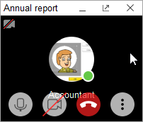
Fig. 214. Video call compact mode (the cursor is on the window)
In this mode, the user's video feed and other participants' video feed are not displayed if there are more than 2 participants. Video call control buttons are displayed only if the pointer is inside the window.
Commands for inviting participants, going to the conversation, and others are hidden in the More menu.
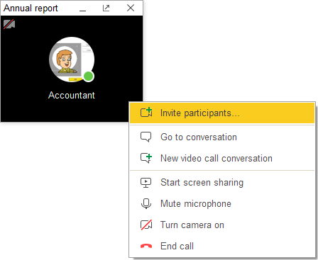
Fig. 215. Menu in compact video call mode
If more than 2 users participate in a video call, clicking the picture of the current participant switches to the video feed of the next participant.
If the other party cancelled screen sharing, in the top left corner a dedicated icon is displayed.
To cancel compact mode, click Restore. Also, you can double-click the window title in compact mode to switch to normal mode.
You can collapse the compact video call window so that only the title is displayed. To do it, click Collapse ( _) in the title bar. The collapsed window will look as follows:

Fig. 216. Video call window as a title
To return the previous window state, click Restore or double-click the title.
7.6.2.3. Switching a call to another device
You can switch an active call to another device if you need to use another computer or continue the call on a mobile device.
Switch to another device. To switch an active call to another device, click Continue your call on another device in the application title or in the More menu.
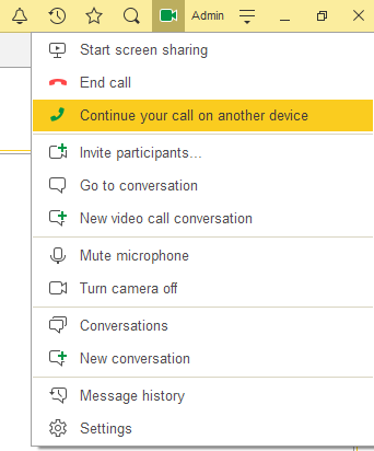
Fig. 217. Continue your call on another device command
The call will be finished for the current client application, and an incoming call will be received on all client applications where you are authenticated. So, you will be able to continue the call in the required application or on a convenient device.
Continue the call. In your client applications that are not involved in the current video call, you will see the Continue your call here command in the collaboration system menu.
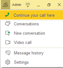
Fig. 218. Calling the Continue your call here command
If you use this command, the call will be finished in another client application or device and will be switched to the active client application. In the client application where the call is finished, you will see a message that the video call has been switched to another device.
7.7. 1C:Enterprise – Notifications and startup
If the application is connected to the collaboration server, application users can receive notifications when the application is closed.
To do so, install and run the 1C:Enterprise – Notifications and startup.
7.7.1. Installing application
To install the 1C:Enterprise – Notifications and startup, perform the following actions:
-
On the Conversations form, above the conversation list, next to the New conversation button, click Settings.
-
In the window that appears, in the Show notifications if the application is closed group, click Install.
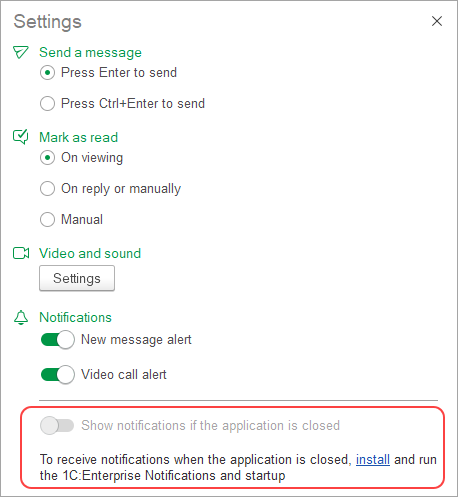
Fig. 219. Conversation settings: 1C:Enterprise – Notifications and Startup is not installed.
- Select components and parameters.
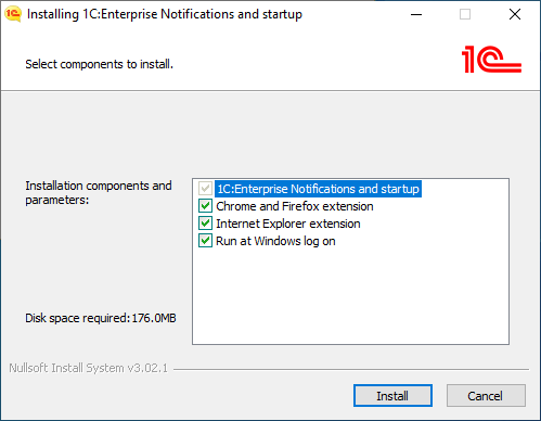
Fig. 220. Installing 1C:Enterprise – Notifications and startup Selecting components
The installer will install the web client extension for Chrome, Firefox, and Internet Explorer by default.
You can disable any components by clearing the appropriate checkboxes.
Click Install to begin installation procedure that:
-
Creates required directories.
-
Copies files for selected components.
-
Creates 1C:Enterprise – Notifications and startup icon in the operating system:
-
For Windows OS – in the 1C Enterprise 8 – Advanced menu group.
-
For Linux OS – in the Office:Finance category.
- Click Finish to complete the installation.
Fig. 221. 1C:Enterprise – Notifications and startup Installation completion
Check the Run application checkbox to automatically start it after installation.
7.7.2. Managing application
Click 1C:Enterprise – Notifications and startup to open the following menu:
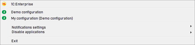
Fig. 222. 1C:Enterprise – Notifications and startup
Click 1C:Enterprise to open the 1C:Enterprise startup dialog box with the list of infobases.
The list of compatible applications is displayed below. The number of new notifications is displayed to the left of the application name in the row. Click the row to open the selected application.
Click Notification settings to temporarily disable notifications. However, the application remains registered in the 1C:Enterprise Notifications and startup list:
- For a specific application: clear the application checkbox.
- For all registered applications: clear the Display notifications checkbox.
Disable notifications when an application is closed in the Disable applications menu (the same as when the Show notifications when application is closed parameter is set to Disabled). Select the application to disable it.
7.8. Unavailability of the collaboration system server
If you attempt to use the collaboration system while the collaboration system server is unavailable (for example, due to its failure or connectivity issues), you will see a message that there is no connection to the collaboration system server.
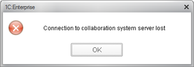
Fig. 223. The message about unavailability of the collaboration system server
Also, the Conversations tab in the open items panel will be marked with a red triangle:

Fig. 224. The Conversations tab while the collaboration system server is unavailable
Chapter 8. Service features
1C:Enterprise provides a variety of service features for navigation within the application: links, history, and favorites.
It also offers a built-in calculator, a calendar, file comparison options, and more.
This chapter covers these features.
8.1. Global search
The users can use global search in 1C:Enterprise. This mechanism allows searching by the data in the information base and also performing other actions necessary in the application.
To start data search, enter the text in the global search field in the application main panel.

Fig. 225. Global search field
The search starts after pressing Enter or after a small pause.
By default, the global search searches in various areas of information base, makes arithmetic calculations, and allows following the navigation links (both to the configuration objects and different resources on the Internet).
You can see search results (up to 30) in the drop-down list of results. If there are less than 30 results, the data is searched by string in which an asterisk (*) is added to each word in the entered string, which means a fuzzy search. The total number of search results does not exceed 30. More relevant results are displayed at the top of the list.
Depending on the information you enter, one of the following can happen:
-
If you enter the text of a query, the application will search for it in the data, favorites, user history, application functions, conversations and messages of the collaboration system (if the application is connected to the collaboration system server), and also in the built-in help. For a message found in the collaboration system, a group conversation icon will be displayed in a search result. If the application uses hashtags (sequences of characters after the " #" sign), you can search by hashtags. As such, all objects with this hash tags will be found and inter alia with hash tags with initial symbols similar to those available in a hash tag being searched.
-
If you insert a navigation link or an external hyperlink the link opens.
-
If you enter an expression for calculation (as in the formal calculator) the calculation will be performed. All functions of work with numerals set in the embedded language are supported. The following actions are available for the calculation result:
-
Copy. Copy the result to the clipboard.
-
Calculator. Open 1C:Enterprise Calculator to which the calculation result is copied.
If an error occurs while searching, depending on the configuration, the search result displays error details or Search error.
You can define the actions to be performed when you enter certain data in the search field. For example, you can create objects if you add + at the beginning of the text in the search field.
The global search field can be used for quick starting of the application standard functions. To do it enter the following text in the field:
-
favorites. Opens the user favorites panel. For more information, see Favorites.
-
zoom. Opens the interface scale change form (Service and settings – Zoom). For more information, see Scaling forms and documents.
-
history. Opens the user history panel. For more information, see history.
-
message history. Opens the message history panel of the Collaboration System.
-
calendar. Opens the calendar form (Service and settings – Calendar). For more information, see Calendar.
-
calculator. Opens the calculator form (Service and settings – Calculator). For more information, see Using calculator.
-
<run1>home page settings. Opens the home page settings form (Service and settings – Settings – Home page settings). For more information, see Home page.
-
panel settings. Opens the panel setup form (Service and settings – Settings – Panel settings). For more information, see Customizing panel view.
-
sections panel settings. Opens the sections panel setup form (Service and settings – Settings – Sections panel settings). For more information, see Sections panel.
-
about. Opens the About form (Service and settings – About). For more information, see The "About 1C:Enterprise" window.
-
conversations. Opens the Conversations panel if the Collaboration System is enabled. For more information, see Conversations.
-
notifications. Opens Notification center. For more information, see Notifications.
-
parameters. Opens the editing form of client application parameters (Service and settings – Settings – Parameters). For more information, see Customizing system options.
-
help content. Opens the help content tree (Service and settings – Help – Help content).
-
help. Opens the current form help (Service and settings – Help – Help).
-
functions for technician. Opens the Functions for technician dialog box (Service and settings Functions for technician…) if this feature is enabled in the client application settings. For more information, see Functions for technician.
The Search everywhere <string> command may be available in the context menu of some form elements. This command is available for a form table, a spreadsheet document form field extension, a formatted document form field extension, and an input field (including a collaboration system message input field). When this command is selected, the selected text or the text where the cursor is located will be placed in the global search field and the global search will be started. To alternatively start global search, press Alt + F.
8.2. Using links
In 1C:Enterprise applications, users can get links to interface elements, reports, data processors, and metadata objects, such as documents and list items.
You can save a link or share it with other users to refer to a certain application object. Links are plain text, which can be seamlessly shared over email, instant messengers, or cloud services.
8.2.1. Getting a link
To get a link, on the top right of the form, click Get link.... Alternatively, in the top right corner, click Service and settings — Get link or press Ctrl+F11. If the focus is set to a list row, you can receive a link to the list row object. To do this, right-click the list item and then click Get link...
The figure below shows how to get a link to Milk in the product list:
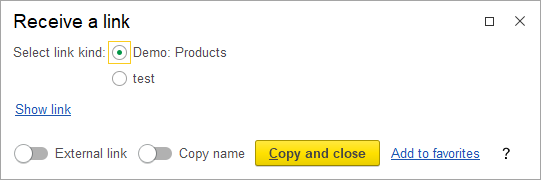
Fig. 226. Getting a link to the "Milk" product
When you click Show link, the dialog box looks as follows:
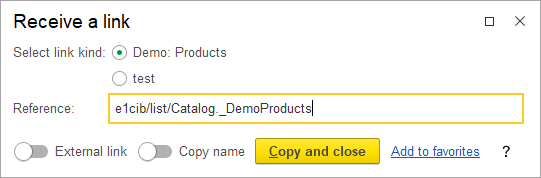
Fig. 227. Show link
In the Link to field, you will see the name of the object whose link you want to get. In the dialog box, you can:
-
Show link. Click the hyperlink to display an object URL in the dialog box.
-
Click External to convert a URL to an external link. For example, when you start a web client, you can pass an external link to open the specified item.
-
Click Copy name to add the data object name to the link to be copied.
-
Click Copy and close to copy the link text to the clipboard and close the dialog box.
-
Click Add to favorites to add the link to favorites. The link is displayed if the user has the Save user data access right.
For some objects, you can get several URLs. You can select the kind of the link you want to get in the dialog box:
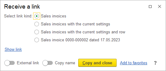
Fig. 228. Getting multiple URL types
If a link type that requires a presentation is selected, the Enter link name field appears in the dialog box. In this field, you can edit the link presentation.
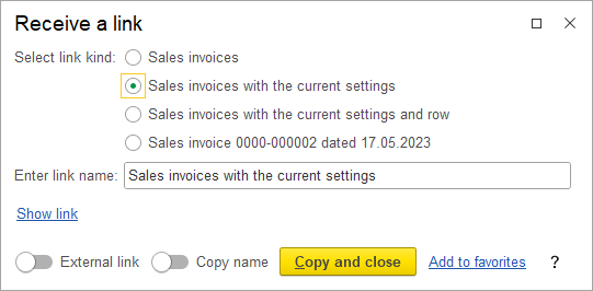
Fig. 229. Getting a link prompts you to enter its name
8.2.2. Navigating to objects
To navigate to an application object, insert the link to the Full-text search bar and press Enter. Alternatively, go to Service and settings — Go to link... or press Shift+F11. Paste the link to the search bar and click
If you paste an external link created in another 1C:Enterprise infobase, the application first attempts to navigate the internal link, that is, the part that follows e1c. If it fails, the application attempts to navigate the external link.
If a link contains spaces at the beginning or at the end, the spaces are ignored.
8.3. Favorites
In 1C:Enterprise, favorites is a user-created list of links used for quick access to specific configuration sections, infobase object forms, reports, or data processors.
If a Favorites panel is not displayed, to open the list of favorites, click Favorites in the main panel.

Fig. 230. The Favorites button
If several link options are available for a form, the following dialog box will appear when you try to add this form to favorites:
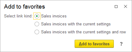
Fig. 231. Adding a link to the Sales list to favorites
In this case, select the link type, edit Link name if necessary, and click Add to favorites.
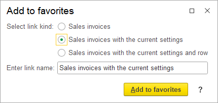
Fig. 232. Adding a link to favorites prompts you to enter its name
When you add a link to favorites, the application displays a notification.
The favorites panel contains links to the commands and data that have been added to the Favorites list. Links are displayed in the order of importance: the most important items are shown at the top of the list.
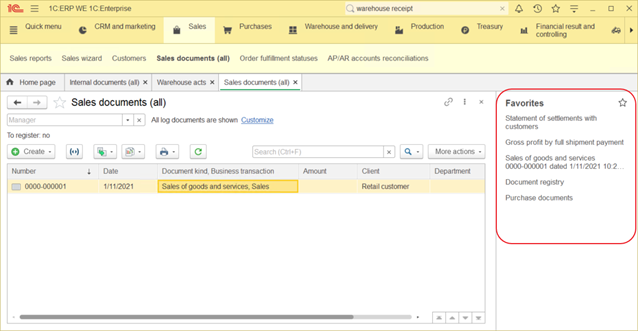
Fig. 233. The favorites panel
Clicking a favorites item opens an object form or executes a function. When you click the panel title or Favorites on the main panel, the favorites form opens.
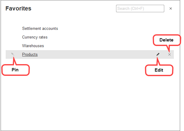
Fig. 234. Favorites form
Adding links to Favorites To add a link to your list of favorites, use any of the following methods:
- Select Add to favorites in the object form header.
- When you get a link, click Add to favorites in the Go to dialog box. For more information about links, see Using links.
When you add a link to favorites, the application displays a notification. If a link is not related to the current application (it is invalid, it points to a deleted or unavailable object, or it is an external link), a navigation link will be shown in the favorites list.
Pinning a link. To pin or unpin an item, click the pin button to the left of the item name. Pinned items are always displayed at the top of the list.
Changing a link name. To rename an item, select it and click the Edit (pencil) button or press F2.
To change the order of items, drag them up or down.
Deleting a link. To remove an item from the list, click the Remove (cross) button.
To undo removing a favorites item, click the Undo delete "<item name>" link.
Searching favorites. To search a list of favorites, use the search field, or click Ctrl + F, or start typing the search string (this moves the cursor to the search field). As a result, the favorites will display only items containing the search string (the search string will be highlighted). To clear the search and return to the full favorites list, clear the search field.
8.4. User work history
1C:Enterprise stores the history of your work. You can use the history for quick access to infobase objects that you recently created or updated (such as documents or list items).
Once you create or update an object, 1C:Enterprise displays a notification about this event and adds the event to the history. For more information about notifications, see the Notifications section in this chapter.
The history panel contains hyperlinks to forms ordered by their opening time (except the home page). Clicking a list item opens the respective object form.
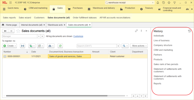
Fig. 235. The history panel
To go to the history form, click the history icon in the main panel or history panel title.
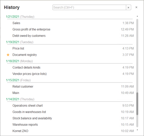
Fig. 236. History form
History items are grouped by date. If a form was opened multiple times on different dates, each date contains a link to that form. If a form was opened several times within a single day, only the latest form opening is displayed in that day's history.
If a history item is included in the list of favorites, a star is displayed beside it. Clicking the star adds or removes the item to or from the list of favorites. If the application is connected to 1C:Dialog or to the collaboration system server, messages from context conversations in the history are marked as a dialog box icon.
Searching history. To search the history, use the search field, or click Ctrl + F, or start typing the search string (this moves the cursor to the search field). This applies a filter to the list, displaying only the items that contain the search string. Item parts that match the search string are highlighted. The items are not grouped by date during the search; the last time/date the item was opened is displayed next to the item. To cancel the search and return to the full history, clear the search box.
8.5. Data history
1C:Enterprise supports storing object change logs. This capability is set up during the configuration step and can be applied to a limited list of object types. Users can also enable it manually if allowed by the developer.
If the object change log is stored, the More menu of the object form and list form will contain Change log command.
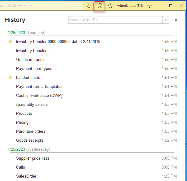
Fig. 237. Opening a change log in the object form
The command displays a list of object versions. To keep the list updated, configure the data update.
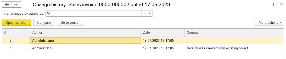
Fig. 238. Document change log
For each version, the following data is displayed in the list:
-
. Version number and icon of a data change type:
-
Add (+). An object was created.
-
Change ("a pencil"). An object was edited.
-
Delete (a red "cross"). An object was deleted.
-
Date. Version creation date.
-
Author. Full name or name of the user who created the version.
-
Change source. Presentation of the data exchange node from which the version is received. The column is displayed if the application has data exchange with other applications enabled. If the version was generated during the data exchange, the presentation contains the string of the following format: <Node>(<exchange plan>), where
-
Comment. Version comment. To edit a comment to a version, click the version row, press F2, and enter the comment. To perform this action, you need the related access rights.
When viewing the object versions list, the following commands are available in the context menu or More menu:
-
Refresh. Update the list of data object versions.
-
Filter. Set version filter parameters to limit the number of versions displayed to the user.
-
Open version. Open the item or record form. The form contains the current state of infobase data. If you save this data, it will be restored. This command is available if you have the corresponding access right.
-
Compare with previous version. Open a report on differences between the selected version and the previous one.
-
Compare with current version. Open a report on differences between the selected version and the current one. If the selected version is the current one, a warning is shown.
-
Compare versions. Open a report on differences between the selected versions. If two versions are not selected, an error message is displayed.
-
Switch to version. Open the item or record form. The form contains the current state of infobase data. If you save this data, it will be restored. This command is available if you have the corresponding access right.
-
Change form. Open the report form settings form.
8.5.1. Filtering version list
To customize the list of displayed versions, click Filter.
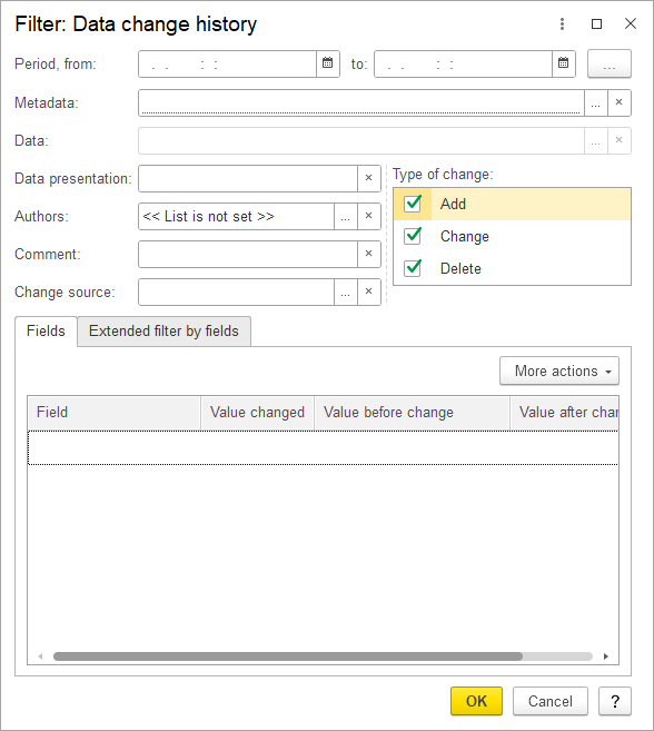
Fig. 239. Filtering data history
The dialog box includes the following parameters:
- Period. The range of dates that includes version creation date.
To specify the period, do one of the following:
-
Specify the period in the From and to fields, or select it using the calendar.
-
Click [... ] and select the standard period. For more information, see Selecting a standard period.
-
Authors. The list of users who created versions. To configure this list, click the selection button.
-
Comment. Text of the version comment.
-
Type of change. The list contains available types of data change options.
-
Source. This parameter is available if an exchange plan is configured in the application. Contains presentation of the node that is the source of the version. If the version was generated during data exchange, the presentation contains the string of the following format: <Node>(<exchange plan>), where <Node> is the exchange plan node presentation and <exchange plan> is the exchange plan presentation. Otherwise, it contains the Application string.
-
Fields. Contains the list of data fields. Available options include:
-
Value changed. Select versions where the field value was changed.
-
Value after change. Select versions where the field after change contains the specified value.
-
Value before change. Select versions where the field before change contains the specified value.
If user has insufficient rights to view the field, it is not displayed in the list.
When clicking Extended filter by fields, a filter list with values of the child form fields is opened.
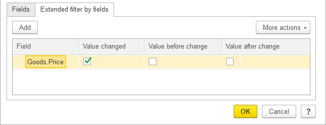
Fig. 240. Configuring extended filters by fields
The Field column contains a full name of a child field. Example:
Price. The Price field of the Order object.
Goods.Price. The Price field of the Goods table.
Available settings variants are identical to the Fields list.
8.5.2. Comparing versions
This report displays the differences between two selected data versions. The report contains the following sections: header, fields, and tables.
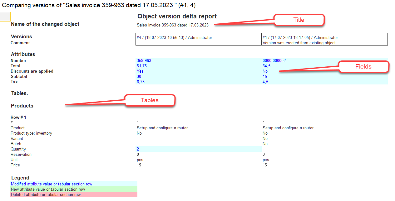
Fig. 241. Comparing object versions
The header contains the object presentation on the moment when the version was created. It also contains version number, creation date, and the name of the author for each selected version.
A list of modified fields is displayed below the header. The fields order is the same as the fields order in the object. If no object fields were modified, this section is not displayed.
If a field is deleted in the latest version, it is not displayed. If a field is added in the latest version and it contains a non-default value, this value is displayed.
The report displays presentations and changes for each table of the object. If no tables were modified, this section is not displayed. Each table row is displayed as a section.
Fields, tables, and table attributes are displayed only if the user has the right to view their parent object.
8.5.2.1. Legend
Adding a row. A subtitle displays the Row added string. The version-after-change column displays the version-after-change row number. For each table attribute, a row containing attribute value and presentation in the version-after-change column is displayed.
Editing a row. A subtitle displays the Row edited string, the version-after-change column displays the version-after-change row number, and the version-before-change column displays the version-before-change row number. For each edited table attribute, a row containing attribute values and presentations in the corresponding columns is displayed.
Deleting a row. A subtitle displays the Row deleted string, and the version-before-change column displays the version-before-change row number. For each table attribute, a row containing attribute value and presentation in the version-before-change column is displayed.
Moving a row. A subtitle displays the Row moved string, the version-after-change column displays the version-after-change row number, and the version-before-change column displays the version-before-change row number.
8.6. Functions for technician
This menu provides access to all forms available in the application. To access it, click Service and settings – Functions for technician… on the main panel. This menu is available only when allowed by application design and only to users who have enough rights. For more information, see Customizing system options.
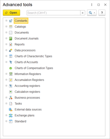
Fig. 242. Functions for technician
This list does not include the objects that you do not have rights to view.
The Standard folder includes standard functions (list of active users, event log, and so on). For more information about the standard functions, see 1C:Enterprise 8.3. Administrator Guide.
To open an object, double-click it in the object tree, or select it in the tree and click Open.
You can use the search for quick access to an object or a function from the list.
8.6.1. Searching the Functions for technician list
Objects are searched when you start typing the text. The cursor will be moved to the search string and the text being typed will be shown there.
To start search, you can also press Ctrl + F.
Search is performed by the beginning of a word:
- If a word contains both letters and digits, a sequence of letters or a sequence of digits is a separate word.
- If a word contains digits, leading zeros can be both significant and insignificant.
An object is considered to be found (if it contains subordinate objects as well) in one of the following cases:
- It contains all searched words.
- If it contains at least one searched word and its parents contain the remaining words.
When you reopen the Functions for technician form during the same session, the last line of the list and the list of open nodes are restored.
To cancel the search, click Clear in the search box or press Ctrl + Q.
8.7. Notifications
Notifications inform users that an application performed an operation (for example, an object was saved or modified). In addition to standard notifications, applications can have custom ones.
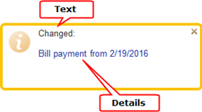
Fig. 243. Notification of Sale document modification
- Text. Notification reason.
- Details. Notification details.
The conversations generate the following notifications:
-
When a message is added to a noncontext conversation, notifications are sent to all conversation participants except the author of the message.
-
When a message is added to a context conversation, a notification is sent to all users subscribed to this context conversation and, additionally, to any users specified by the author of the message.
-
When a video call is missed, a notification is sent to the user who missed the call.
If you miss a video call, you will be notified:
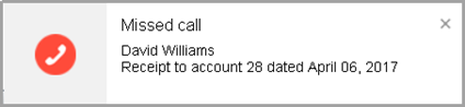
Fig. 244. A missed call notification
Click the notification text to open the conversation where the video call was started.
If the application is connected to the Collaboration System and "1C:Enterprise – Notifications and startup" is installed and running on the user's computer, then when three or more important notifications appear, the Hide all button appears above them. For more information about the Collaboration System, see chapter Collaboration system. For details, see 1C:Enterprise – Notifications and startup.
Fig. 245. Button "Hide all" above notifications
8.7.1. Understanding notification badges
If you have unread notifications, you will see the following:
-
The Notifications button on the main application panel is highlighted. It shows the number of received notifications.
-
In the thin client for Windows, in the Windows notification bar, the 1C:Enterprise icon is marked with a red circle.
-
In a browser, the number of notifications is displayed in the browser icon and in the browser tab header.

Fig. 246. Changed Notifications icon on the main panel shows the number of received notifications
If there are unread messages in conversations, on the open items panel, the color of the Conversations icon also changes. For more information about notifications, see Conversations.

Fig. 247. New message indication
8.7.2. Notification center
Notifications that require user actions are available on the notifications panel (hereinafter referred to as the Notification center). These include notifications about new messages and missed video calls, as well as application-specific notifications.
To open the Notification center, click Notifications on the main panel.

Fig. 248. Calling the notification center
In the open Notification center, notifications are displayed in the order they were received. The newest items appear at the top of the list.
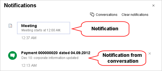
Fig. 249. Notifications
The conversation notifications are marked with the following icon on the left:
| Icon | Notification type |
|---|---|
| <User picture> | A new message |
 | A missed call notification |
On the Notifications panel, you can do the following:
| Action | Description |
|---|---|
| Go to the conversation linked to the notification | Click on the notification text or notification |
| Delete a notification | Click the Delete button next to the notification, or click the notification link (this also initiates the action specified for the notification). The messages in the conversation are deemed read upon the deletion of the notification received from the interaction system conversation. |
| Clear all notifications | Click Clear. If notifications being deleted imply user actions, these actions are not performed |
| Display a list of noncontext conversations | Click Conversations. |
| Close the Notifications panel | Click the X button in the upper right corner of the Notifications panel. |
8.8. Viewing messages
When a situation requires your attention, the messages panel is displayed in the lower part of the window.
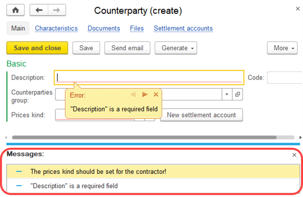
Fig. 250. Messages panel
Message functionality in Taxi interface is similar to Version 8.2 interface. Up to 5 messages can be displayed simultaneously. To view the messages that do not fit the message panel, scroll through the list using the mouse or Up Arrow and Down Arrow keys.
8.9. Understanding progress indicators
Some operations, such as posting a large number of documents or performing resource-consuming calculations, can take a significant time. In this situation, an application can display a message with a progress indicator.
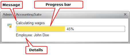
Fig. 251. A progress bar
The message fades after some time. When you move a pointer over a fading message, it reappears. Depending on the application settings, you can interrupt some operations by pressing Ctrl + Break or Ctrl + Alt + E.
8.10. Using calculator
1C:Enterprise features a built-in calculator. You can open it in any application mode, except when the application is waiting for a response to a request. To open the calculator, on the main panel, click Service and settings – Calculator.
You can resize the calculator or drag it to any part of the screen. All calculator controls change their size in proportion to the calculator window size.
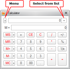
Fig. 252. Calculator
You can use the calculator to perform any arithmetic operations, calculate percentages and reciprocal values, store numbers and add or subtract stored values. You can edit any digits of the numbers that you enter.
The calculator supports both mouse and keyboard control.
The calculator stores the last 15 calculations. To view the result of a stored calculation, to the right of the input field, click Select from list, and then select the required calculation.
The calculator has 10 memory registers for storing numbers. To access the first register, use the MR, M+, M-, and MC buttons.
To store a calculation result to the first register, click MS.
The M= field displays the number stored in the clipboard.
To paste the stored value from the first register to the calculator field, click MR. To add the number stored in the first register to the calculation result, click M+. To subtract the number stored in the first register from the calculation result, click M-. To clear the first register, click MC.
To store a number from the calculator field in another register, click Save number to specific memory cell. This button is located near the MS button.
This opens the list of registers.
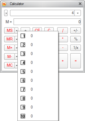
Fig. 253. The list of available registers
To store a number in a register, click the button of this register.
To get a number from a register, click the button located next to the MR, M+, or M- button (depending on the calculation that you want to make), and then select the register. Use a similar procedure to clear the register (MC button).
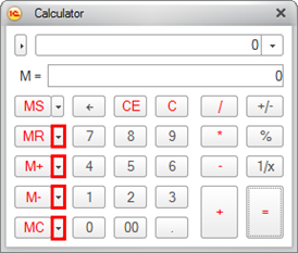
Fig. 254. Buttons for operations with registers
The calculator has several modes. You can select a mode by clicking the Menu button and selecting the required menu item. Formula calculator and Microcalculator items toggle the respective calculator modes.
To set the calculator precision, on the calculator menu, click Setup. In the dialog box that is opened, specify the number of decimal digits.
In the Microcalculator mode, the calculator has a very basic view.
Fig. 255. Microcalculator mode
Use the keyboard to perform calculations in this mode. Press C to clear the calculator field.
Formula calculator. In this mode, operations are entered sequentially. You can use parentheses to specify the operation order.
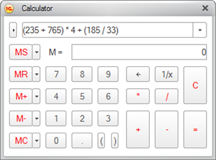
Fig. 256. Formula calculator
You can open the calculator to select an attribute value of Number type in an input field by clicking the selection button or pressing F4. The calculator allows entering more digits after the decimal point than defined for an attribute. When you click OK, the number that you specify is rounded up. To adjust calculator precision, click Menu, and then click Setup. In the dialog box that is opened, specify the number of decimal digits.
8.10.1. Using the clipboard for calculations
1C:Enterprise provides extended functionality for storing numbers in the clipboard. In addition to simply copying a number to the clipboard, you can add numbers to values stored in the clipboard or subtract numbers from these values.
To do it, use the M, M+, and M- buttons of the system command bar.
To copy a number to the clipboard, select the number, and then click M (or press Shift + Num *).
To add a number to a value stored in the clipboard, select it and then click M+ (or press Shift + Num+).
To subtract a number from a value stored in the clipboard, select it and then click M- (or press Shift + Num-).
These operations are available in all forms, and they can also be performed in tables. In a spreadsheet document, you can perform an operation on multiple cells. For example, you can select multiple cells and then copy or add their sum to the clipboard.
You can use the result stored in the clipboard in any form, for example, you can paste it by pressing Shift + Insert or by clicking the corresponding menu items.
You can view a number stored in the clipboard in the formula calculator mode, in the M= field.
If you want to paste a number from a 1C:Enterprise application to the Windows calculator or to a Microsoft Office Excel cell, store it to the clipboard using M, M+, or M- command instead of the regular commands that copy a value to the clipboard.
When you paste a number to a formula calculator, it is pasted in the format defined by the regional infobase settings but without group separators and without replacing decimal separators with decimal points.
When you paste a number to any other target, it is pasted in the format defined by the regional infobase settings but without group separators.
8.11. Calendar
1C:Enterprise features a built-in calendar. You can open it in any application mode. To open the calendar, in the main menu, click Service and settings – Calendar. The calendar is also used to enter dates.
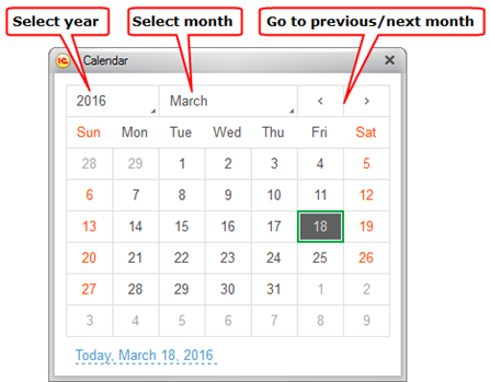
Fig. 257. Calendar window
The calendar window displays the current month. The first row displays the month name and the year. The second row displays days of the week. The current date has green border.
To change year, click the year number.
You can select the current date by clicking the Today, <date> hyperlink at the bottom of the calendar window.
To switch between months, use the arrow buttons in the top right corner. To switch to a specific month, click the month name and then select a month from the list.
You can also switch between the months by pressing Page Up or Page Down.
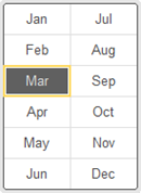
Fig. 258. Calendar. A list of months
You can resize the calendar or drag it to any place on the screen. If you increase the calendar window size, more months are displayed in it.
8.12. Analytics system
1C:Analytics is an integrated solution that allows you to quickly build reports and analyze data.
To support this feature, the application must be published on the web server together with the analytics system. Use HTTP protocol to connect to the application. A user must also have the right to start the analytics system client.
To access the analytics system, click Service and settings –
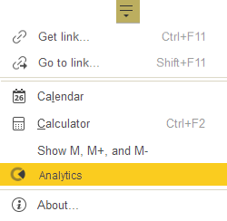
Fig. 259. Analytics command in Service and settings
1C:Analytics documentation is published separately.
8.13. Using the clipboard for calculations
In addition to standard clipboard features supported by all applications running Microsoft Windows, 1C:Enterprise supports an extra service intended to process values stored in the clipboard.
Generally, use M, M+, and M- buttons available in the window header for that purpose.
When you perform operations in an auxiliary window, these buttons can be displayed in the form header.
To enable this feature, in Service and settings activate
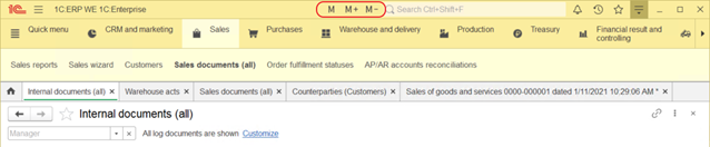
Fig. 260. Clipboard
Use of M button (you can alternatively press Shift + Num *) is similar to standard operation when you save a value in the clipboard. However, it can be saved as a numerical value only.
When you paste a number to a formula calculator, it is saved with regional infobase settings, but without group separators and without replacing decimal separators with decimal points. When you paste a number to any other target, it is pasted in the format defined by the regional infobase settings but without group separators. Thus, you can insert a value saved in the clipboard both in the formula calculator and 1C:Enterprise 8 immediate window and system or office applications (Windows calculator, Microsoft Office Excel, and so on).
Click M+ or press Shift + Num+ to add the current value to the one saved in the clipboard. Click M– or press Shift + Num– to deduct the current value from the one saved in the clipboard. Although a value saved in the clipboard is stored as a string, all defined actions are performed, as if it is a numerical value.
These actions are available, first of all, in all forms for attribute values and further when you use a spreadsheet document. In a spreadsheet document, you can perform an operation on multiple cells. For example, you can select multiple cells and then copy or add their sum to the clipboard.
The resulting values stored in the clipboard can be used in an ordinary way and in any mode, for instance, to insert the value by pressing Shift+Ins or selecting respective menu items or toolbar buttons. The values stored in the clipboard can definitely be used in any other application.
The current value stored in the clipboard can be viewed in numerical terms in a formula calculator mode in M= field.
8.14. Scaling forms and documents
You can change the scale of the active form or document.
To open the scaling dialog box, click Change scale in the form menu.
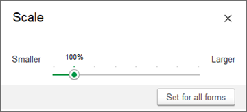
Fig. 261. Scaling dialog box
The scale can range from 50% to 400%, as indicated by the slider.
When opened, the dialog box shows the current scale of the active form.
To change the scale, move the slider with the mouse.
You can also use the arrow keys or press Page Up or Page Down.
Changing the scale of the active form does not affect the size of the main application window.
To apply the selected scale to all open forms and documents, click Set for all forms.
8.15. Using temporary locks
Temporary locks protect your data when you are away from your computer.
Important. Temporary locks are only available in the thick client.
Many 1C:Enterprise applications do not require entering document author names because they acquire this information directly from the user accounts. In general, application users are responsible for all actions performed while they are logged on to the application. That is why preventing unauthorized access to 1C:Enterprise applications is important.
You can use temporary locks to prevent unauthorized access. This only makes sense if you use a password to access an application.
To set a temporary lock, in the system command area, click Service and settings – Settings – Temporary lock. This minimizes the application window.
and displays the dialog box where you can enter the password.
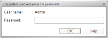
Fig. 262. The dialog box for entering the password
To continue working, you have to re-enter the password you used to log on to the application.
8.16. Comparing files
You can compare any two files. To compare files, click Service and settings – File – Compare files. This opens the file selection dialog box.
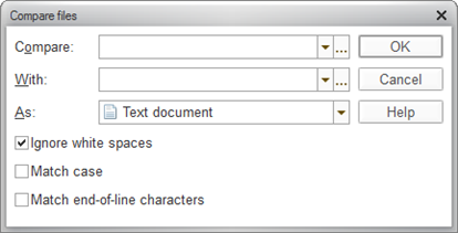
Fig. 263. Selecting files for comparison
In the Compare and To fields, specify the names of the files to be compared. You can enter the file names, select them from the list, or click Select to select the files in the standard file opening dialog box. You can select any type of the source file in a drop-down list.
In the As field, specify the file comparison method. The comparison method determines the algorithm to be used to compare the selected files. Binary comparison is available. If you choose binary comparison, the comparison returns a message whether the files are identical or different.
If you specify files of different types in the Compare and To fields, the selected files are converted to the type specified in the As field for comparison purposes.
To include line break characters in the comparison, select the Match end-of-line characters checkbox.
Click OK to compare the files.
If you select Text document as a comparison type, the selected files are interpreted as text documents for comparison purposes, although the Compare and To fields can contain nontext files. They can have extensions that are not suitable for text files. If one or both of the specified files cannot be interpreted as text files, binary comparison is performed.
8.16.1. Comparing text files
To ignore spaces when comparing text files, select the Ignore white spaces checkbox.
To make the comparison case-sensitive, select the Match case checkbox. If this checkbox is selected, uppercase and lowercase letters are considered to be different characters.
To include the line break characters in the comparison, select the Match end-of-line characters checkbox.
Before comparing, the application sequentially attempts to read the files in UTF-8, UTF-16, and ANSI encodings. If the files can be read and do not contain 0 when read in ANSI encoding, the application compares them as text documents. If the files cannot be read or 0 is read in ANSI encoding, the application compares them as binary data.
Once the files are compared, the application displays the list of differences. The compared texts are displayed side by side. Added, modified, or deleted strings are highlighted with different colors. The window contains a toolbar with the standard 1C:Enterprise text editor search and bookmark buttons, and two more buttons that are specific to this window.
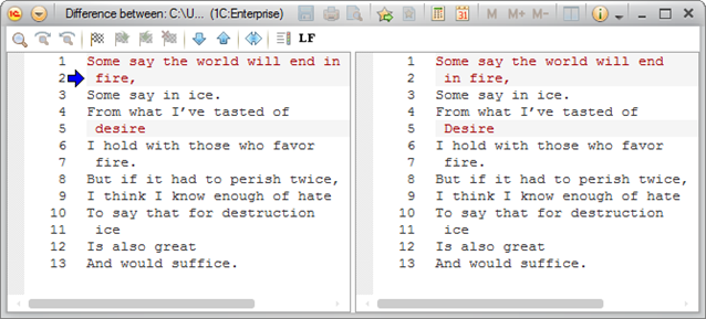
Fig. 264. Text file comparison dialog box
These buttons are large arrows pointing up and down. The arrows navigate to the beginning of the previous or next difference.

Fig. 265. File comparison toolbar
To display line breaks as LF and CR, click LF.
Differences in the text of compared files are highlighted with color. To customize colors used for highlighting added, modified, or deleted lines, click Set. By default, the added text is green, the modified text is red, and the deleted text is blue.
The left part of the window displays the file specified in the Compare field, and the right part displays the file specified in the To field. To swap the files, click Change comparison order. This changes the highlighting colors. If the left part originally contained deleted text, after swapping it is shown in the right part as added text.
8.16.2. Comparing spreadsheet documents
You can compare two spreadsheet documents. The comparison window displays the differences between the documents.
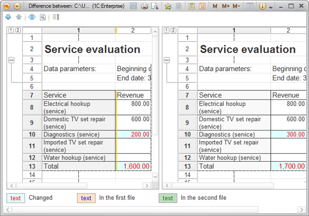
Fig. 266. Spreadsheet document comparison window
This window consists of the left and right parts. The source documents are displayed in both parts of the window. You can use the command bar buttons to navigate through the documents and customize the highlighting colors.
Use the Next difference and
The differences are highlighted with colors. The color legend is shown at the bottom.
To customize colors for highlighting the differences, click Set comparison view parameters.
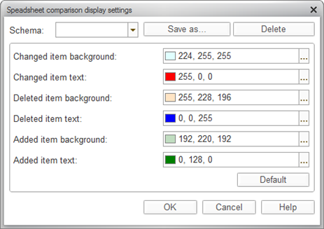
Fig. 267. Customization of difference highlighting
To save an assortment of display settings as a schema, click Save as, enter the schema name, and click OK.
You can select a settings schema in the Schema field.
To restore the default comparison display settings, click Default.
Differences in cells, rows, and properties of rows and columns are highlighted with background color and text color.
Differences in merged cells are highlighted with a text-colored border.
Differences in groupings and named areas are highlighted with text color.
Differences in pictures are highlighted with a text-colored border, except for rectangles, lines, and ovals, which are displayed in text color.
Added, modified, and deleted rows are highlighted with different colors.
For selected cells, you can get a detailed report on invisible differences: text, font, format, merging, names, and so on. To do this, click Details….
8.17. Error messages
If an error occurs, an application displays a dialog box with an error message. The exact number of buttons in the dialog box may vary, as well as their purposes.
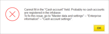
Fig. 268. Error example
To close the dialog box, click OK.
If you need to contact the application administrator or technician, click Generate error report. This opens the following dialog box:
Fig. 269. Error report form
In the text field, a user can provide free-form error description. They can also use checkboxes to specify which additional information to attach to a report:
-
Error information.
-
Screenshot on the error.
-
Name of a user who runs the application.
-
Some general information about the operating system of the client computer.
-
Crash dump (if it was generated due to error).
-
Click Attach file to attach additional files.
Depending on the application used, the report can be generated automatically as well.
8.18. Features specific to Windows 7 and Linux Unity
Windows 7 (or later) and Linux Unity will automatically add recently started 1C:Enterprise applications to their jump lists. You can pin a frequently used link by clicking Pin to this list in the context menu of 1C:Enterprise taskbar shortcut.
If 1C:Enterprise is pinned to the taskbar, you can also start recent applications right from its context menu.
8.19. Using nonvisual access
Visually impaired people can use 1C:Enterprise applications by means of screen reader software. You can work with any application without using the mouse or looking at the screen. The screen reader will narrate the contents of user interface elements such as tabs or form fields.
We recommend that you use the free NVDA screen reader. It is available for Windows 7 or later. For more information about the program, see http://www.nvaccess.org/ and http://nvda.ru (in Russian).
8.20. Using a touchscreen
You can navigate 1C:Enterprise thin client on Windows using touchscreen gestures.
| Action | Applies to | Gesture |
|---|---|---|
| Case | Anywhere | Tap an item. |
| Open context menu | Everywhere | Long tap an item. |
| Drag and drop | Input fields, graphical schemas, planner, and formatted documents | Touch and drag as needed. NOTE. In text documents, the same gesture selects a text range. |
| Scroll | Forms, tables, spreadsheet documents, text documents, input fields, graphical schemas, planner, formatted documents. | You can scroll objects by swiping the screen with one or two fingers. In text documents, multiline input fields, and graphical schemas, you can use one or two fingers to scroll vertically. In spreadsheet documents, you can use one or two fingers to scroll in any direction. NOTE. Geographical schemas do not support two-finger scrolling. |
| Zoom | Graphical schemas and spreadsheet documents | Use a two-finger stretch to zoom in, or a two-finger pinch to zoom out. |
Chapter 9. Customizing applications
This chapter covers customization of 1C:Enterprise applications. You can configure the application interface both globally and individually for each form (provided that the application supports this feature), define system parameters, manage the view of text and spreadsheet documents, and set window positions.
9.1. Interface
1C:Enterprise supports customization of the application interface, including:
-
Home page
-
Sections panel
-
Navigation panel (both for the main window and auxiliary windows)
-
Action list
-
Auxiliary window command bar
You can select functions from the available lists and manage their locations.
The interface setup dialog boxes are available in the View section of the main menu.
9.1.1. Home page
You can customize the list of forms that appear on the home page.
To open the dialog box for home page settings, in the main menu, click Service and settings – Settings – Home page settings.
The setup window contains three lists: Available forms, Left column, and Right column. The Available forms list displays the forms that are not listed in either of the columns.
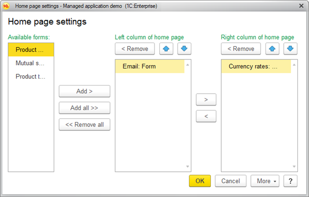
Fig. 270. Home page setting dialog box
Use the Add or Add all buttons to add forms. Use the
To revert to the default settings, click More – Set default settings. This does not apply the default settings immediately. Instead, you can proceed with the settings customization. To apply the changes, click OK.
9.1.2. Customizing panel view
To show or hide panels, on the main menu, point to Service and settings – Settings and click the respective command.
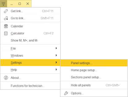
Fig. 271. Setting menu
Use this menu to manage panel visibility, sections panel content, and home page content. Hiding unneeded panels leaves more space for forms and reduces the need for scrolling. To hide all panels, click Service and settings – Settings – Hide all panels, or press Ctrl + Shift + `.
9.1.3. Sections panel
You can customize the list of available sections.
To open the dialog box for sections panel setup, on the main panel, click Service and settings – Settings – Sections panel setup....
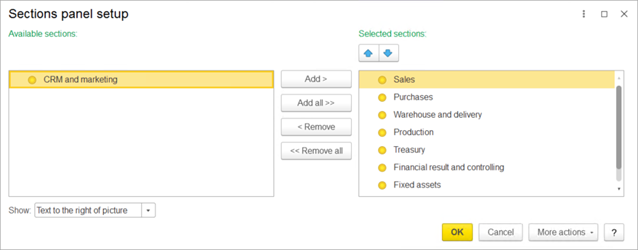
Fig. 272. The sections panel setup form
To add a section to the panel, select it in the list of available sections and click Add. You can select or drag multiple sections at once.
To add all the available sections to the panel, click Add all. You can also move sections between the lists by double-clicking them.
To remove sections from the panel, click Remove or Remove all.
To change the order of sections, select a section and move it by clicking the arrow buttons above the list of selected sections.
To select the section view, in the Show list, select one of the following:
-
Picture. Display section pictures, hide section names.
-
Text. Hide section pictures, display section names.
-
Text to the right of the picture. Display section pictures and section names to the right of the pictures.
-
Text below picture. Display section pictures and section names below the pictures.
To apply the selected settings and close the form, click OK. This saves the settings to the infobase.
To revert to the default settings, click More – Set default settings. This does not apply the default settings immediately. Instead, you can proceed with the customization.
9.1.4. Navigation panel
You can customize the arrangement of navigation panel commands in the Navigation panel setup dialog box.
To go to the dialog box for customizing the section navigation panel, open the section panel and, in the upper right corner of the panel, select Settings (gear icon) – Navigation settings.
To customize a form navigation panel, click the form Menu (three dots) – Window – Form navigation panel setup.
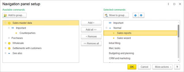
Fig. 273. Navigation panel setup
- Commands that open list forms, such as Banks, Contractors.
- Subordinate sections (for example, the Bank section is subordinate to the current section and includes the Our current accounts command).
All commands are arranged into groups:
-
Important
-
Normal
-
See also
To add a command to the panel, select it in the list of available commands and click Add.
To add all available commands to the panel, click Add all. You can also move commands between the lists by double-clicking them.
To remove commands from the panel, use Remove and Remove all buttons.
To change the order of commands within the panel, use the arrow buttons above the list of selected commands.
To add a command from the list of available commands to a group of selected commands, select it and click Add to group.
To move a command to a different group in the list of selected commands, select the command and click Move to group, or drag the command to that group. If you select a group of commands or a subsection, this moves all the commands from that group or subsection to the selected group.
You can drag commands between the lists and select multiple commands.
The See also group is an exception to this rule, it can contain any commands.
To apply the selected settings and close the form, click OK.
Note that you can only customize the order of commands.
9.1.5. Customizing actions panel
You can customize the arrangement of action panel commands in the Action panel setup dialog box. To go to the dialog box, open the section panel and, in the upper right corner of the panel, select
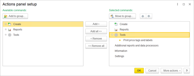
Fig. 274. Actions panel setup
-
Commands that create objects (for example, Contractor) available in the standard Create group.
-
Commands that open reports (for example, Mutual settlement report) available in the standard Reports group.
-
Commands that open data processors available in the standard Tools group.
-
Other commands.
Customization of the actions panel is similar to the customization of the navigation panel, see the section above.
9.1.6. Panel editor
To open the panel editor, click Service and settings – Settings – Panel settings.
This opens the panel editor form.
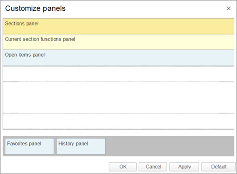
Fig. 275. Panel editor
The lower (shaded) part of the window contains panels that are not displayed in the application window but can be added to the interface.
The upper part of the window contains dotted boxes you can drag the panels to.
To add a panel to the interface, drag it to a box in the upper part of the window. If another panel is in the target area, the new panel is placed next to it. You can change the panel positions in the upper window by dragging them.
To remove a panel from the interface, drag it to the lower part of the window. To revert to the default panel layout, click Default.
To view the result of your changes, click Apply.
To finish editing the panel layout, click OK.
To show the panels, click Hide all panels again, or use the keyboard shortcut.
9.2. Customizing forms
1C:Enterprise applications often support form customization. Each user can customize a form to make it better suit their needs. To customize a form, open the form and then click More – Change form. This opens the form editor window.
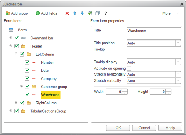
Fig. 276. Form customization
The left part of the window displays a tree of form items. The right part displays properties of the selected form item.
The content and appearance of a form are defined by the assortment of items included in the form:
-
Groups (multiple types)
-
Tables
-
Fields (multiple types)
-
Buttons
Items have properties that affect their appearance. Item hierarchy defines placement of the items in a form.
You can change the assortment of items, their placement (relative to each other), their grouping, and properties.
Changing item positions. To change an item position in the hierarchy, use the Move up and Move down buttons or drag the item within the tree.
Changing item properties. To edit item properties, click the item in the left pane and edit its properties in the right pane. The description of the selected property is displayed at the bottom of the right pane.
Changing item visibility. To show or hide form items, select or clear the checkboxes near the items. Note that you cannot hide the root Form item and the form customization command. You also cannot hide the command bar that includes the Change form button.
Creating groups. To add a group to a form, click the Form root item in the tree and then click Add group. In the group properties, select the group type (Regular group, Pages, or Command bar).
Adding fields. Some fields might have the Add fields button available. This means that the data displayed in the field or column has attributes that can also be displayed in the field or column. To add the field attributes to the form, click Add fields and select the attributes.
Applying changes. The changes are applied either when you close the editor by clicking OK or when you click Apply. The changes are also saved in the infobase, so that they are applied next time you open the form.
To revert to the default form view, click More – Set default settings. This does not apply the form changes immediately. Instead, you can proceed with the settings customization. The changes are only applied when you click OK or Apply.
9.2.1. Form customization example
This section explains the form customization procedure using the form of the Sale document as an example.
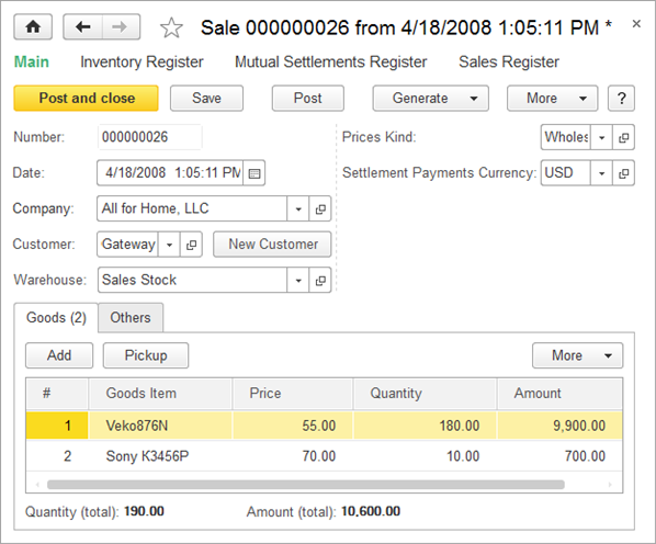
Fig. 277. Sale document form
Suppose that you need to display the part number (SKU) and the supplier of goods in the Goods table. Click More – Change form.
In the form customization window, expand TabularSectionsGroup – Goods, click the Goods Item field, and then click Add fields.
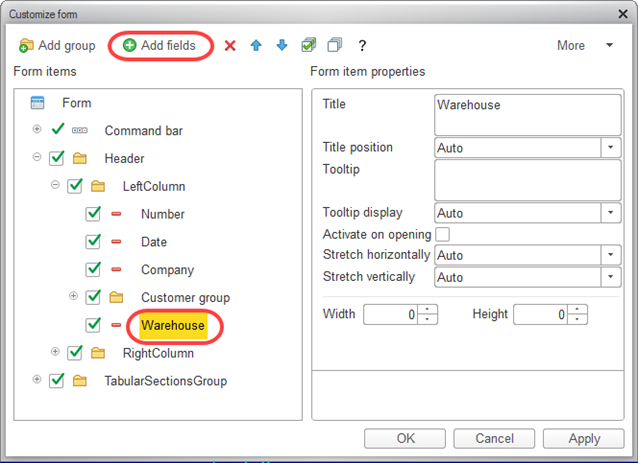
Fig. 278. Adding fields
In the window that is opened, select the fields SKU and Supplier as shown below.
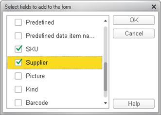
Fig. 279. Selecting fields
Then click OK. In the form customization window, click OK or Apply. The Sale document changes its view as follows:
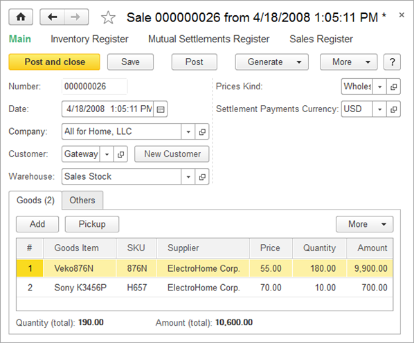
Fig. 280. Sale document form
Let us assume that you need to display the country of the supplier. In the form customization window, select the Supplier field and click Add fields. In the window that is opened, select the Country field and click OK.
The table structure is now as follows:
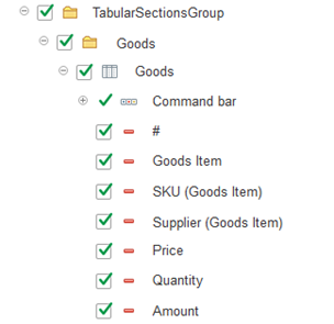
Fig. 281. Table structure in Sale document
Now you need to group the columns of the table. In the Goods table, add two groups by clicking Add group. The first group will contain the goods details, drag the Goods Item and SKU fields to this group. The second group will contain the supplier details, drag the Supplier and Country fields to this group. Arrange the fields in the order shown in the figure using the arrow buttons.
The modified document table looks as follows:
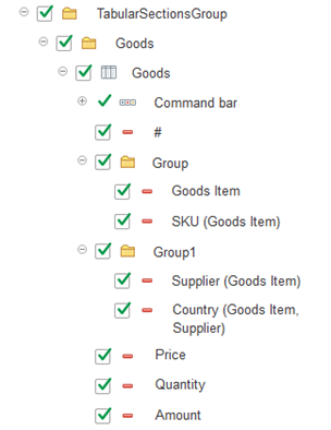
Fig. 282. Table structure in Sale document
The modified form now looks as follows:
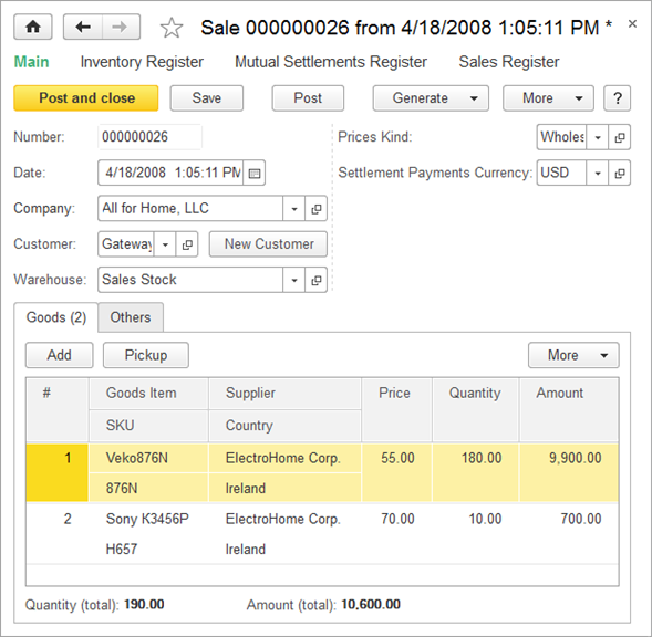
Fig. 283. Form customization Form with new columns
Fig. 284. Sale document form
Let us simplify the form by hiding rarely used commands.
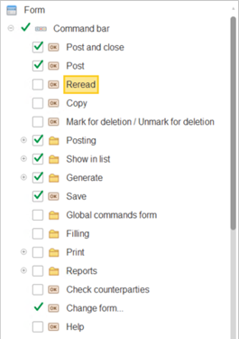
Fig. 285. Hiding the Recalculate button
The document form command bar now looks as follows:

Fig. 286. Sale document commands
Usually, the Sale documents only list indivisible items. This means that we do not need precision of two decimal digits in the
In the form customization window, click Quantity (total) field. In the right pane, in the
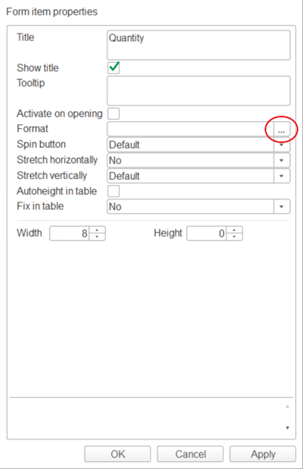
Fig. 287. Opening format string wizard
In the format string wizard window, select the Precision checkbox and click OK, then apply the changes.
The resulting Sale document looks as follows:
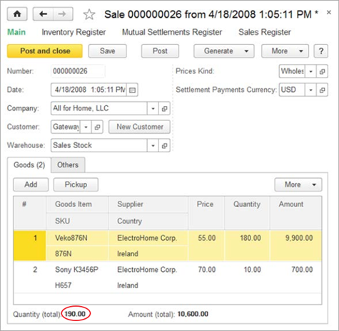
Fig. 288. Resulting Sale document form
So, you can perform the following actions in 1C:Enterprise mode: group related items, customize their order, hide the items that you do not need, and change the appearance of form items.
9.3. Customizing system options
The system options dialog box is intended for application developers and administrators. It includes settings related to debugging, and it might also provide the option to change the application appearance.
To open the dialog box for setting up 1C:Enterprise parameters, on the main panel, click Service and settings – Settings – Parameters.
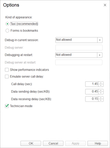
Fig. 289. Options setup dialog box
The dialog box can include the following options:
-
Appearance. Select the user interface option that you want to use. To apply the selected option, restart the application. These options might be unavailable in some applications.
-
Debugging in the current session. If it is set to
-
Debug server. The debug server address and port number.
-
Debugging on startup. If it is set to
-
Debug server on startup. The debug server address and port number to be used next time the application is started.
-
Show performance indicators . Display performance indicators in a separate window. By default, this window is located at the lower-left part of the screen.
-
Emulate delay on server calls. Emulate a slow connection network for testing purposes.
-
Technician mode. If this checkbox is selected, the Functions for technician command is added to the menu. It includes a variety of actions. This command provides access to all configuration objects, even those that are not included in the user interface. This option is only available to users that have the right to use the Functions for technician mode.
Also, if this checkbox is selected, the Information for technician item is added to the form menu and to the context menu of the following objects (except for system forms):
-
Form header (before the Close item)
-
Auxiliary form header
-
Child form header
-
Open items panel item
-
Functions menu item
When this command is selected, the Information for technician dialog box opens. It contains the full path to the corresponding object in the configuration.
If debug mode is enabled in 1C:Enterprise mode, the Open in Designer command is added to the context menu of these objects. When you click this command, the application attempts to go to Designer and open the corresponding configuration object.
For more information about these options, see 1C:Enterprise 8.3. Developer Guide.
9.4. Switching between application windows
To view the list of all open windows, click Service and settings – Windows – All windows.
In this list, to switch to a specific window, select it and click Switch to. This closes the All windows dialog box.
To close multiple windows simultaneously, select the windows by clicking them while holding down Shift, and then click Close windows. The main window cannot be closed using this method.
Alternatively, you can use the following keyboard shortcuts to switch between the windows: Ctrl + Tab, Ctrl + Shift + Tab, and
9.4.1. Viewing two windows simultaneously
The system interface is aimed to display a single window at a time. However, it provides the option to view two windows simultaneously. This can be handy in some scenarios, such as comparing documents or reports.
There are two method you can use to view two windows simultaneously:
- Dock one of the windows
- Show two windows side-by-side
If you open a window from a docked window or from a window that is in "show side-by-side" mode, the new window is displayed in the work area of the parent one.
Commands for switching between the windows (Forward / Back buttons and keyboard shortcuts) treat docked windows and windows that are in "show side-by-side" mode just like any other open windows.
Commands for docking windows and showing them side-by-side are available if the following conditions are met:
-
The current form is not the home page.
-
The work area of the main window contains an open form.
-
The current form allows switching to other forms without closing that form.
9.4.2. Docking windows
A docked window is displayed next to the main window work area. That is, it is always displayed in the main window.
The following rules apply to docked windows:
-
Only one window can be docked at a time.
-
When you dock a window, the previous docking is canceled.
-
A docked window cannot be displayed side-by-side with another window.
To dock a window, use one of the following commands: Dock left, Dock right, Dock top, or Dock bottom. They are available in the context menu of the form header or open items panel.
When you close a docked window, the main window work area reverts to its original size.
To undock a window, click Undock/Show separately.
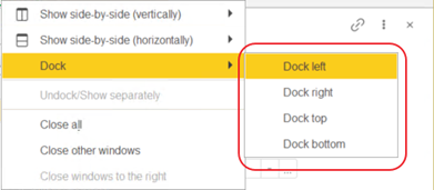
Fig. 290. A context menu of a window
Sales orders window is docked on the left in the figure.
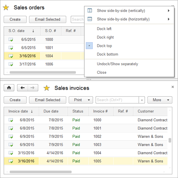
Fig. 291. The Sales orders window is docked on the left
9.4.3. Showing two windows side-by-side
You can display two windows side-by-side in the main window work area. Switching to any one of these windows displays both of them.
The following rules apply to windows that are displayed side-by-side:
- A window can be displayed side-by-side with one other window only.
- Docked windows cannot be displayed side-by-side with other windows.
To show two windows side-by-side, click Show side-by-side (vertically)/Show side-by-side (horizontally). The command is available:
- In the system command bar (the Dock/Show side-by-side with another window button)
- In the context menu of an open window or an item on the open items panel
You can also use the Show side-by-side with current window (vertically)/Show side-by-side with current window (horizontally) command of the context menus of items in the open items panel.
The commands perform the following actions:
-
Show side-by-side (vertically). The second window is displayed to the right of the first one. If the command is executed from the context menu of an inactive window, it becomes active.
-
Show side-by-side (horizontally). The second window is displayed below the first one. If the command is executed from the context menu of an inactive window, it becomes active.
-
Show side-by-side with current window (vertically). The current window is displayed at the left.
-
Show side-by-side with current window (horizontally). The current window is displayed at the top.
Two side-by-side windows are shown as a single tab on the open items panel.
To show the windows separately, right-click a form title or an item of the open items panel, and then click Undock/Show separately.
9.4.4. Restoring initial window size and location
You can change the position and size of windows in the application. The size and position are saved whenever the main window is closed, and they are applied automatically when it is opened again.
To restore the initial size and location of this window, select Window - Restore window location in the Service and settings menu. This will reset the parameters to default values.
To restore the size of an auxiliary window, click Window - Reset sizes in the form header menu or in the form context menu.
Chapter 10. Getting help
Use the application help system to obtain general information about the application, as well as information about specific application objects and modes (the Help command or F1 button). To open the help, click
When you open the help from a specific form, this opens the help topic for that form. To open the help contents, press Shift + F1 or, on the main menu, click Help – Help contents.
10.1. Help window
The upper part of the help window contains a search field and a navigation toolbar. The lower part displays a help topic.
If a topic does not fit the help window, scroll bars appear at the right and at the bottom.
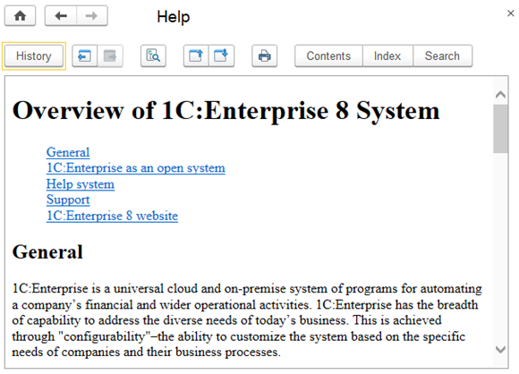
Fig. 292. The help window
10.1.1. Viewing help
To find a required topic, you can use the table of contents. In the Help window, click Contents.
This opens the tree of topics in the left part of the window.
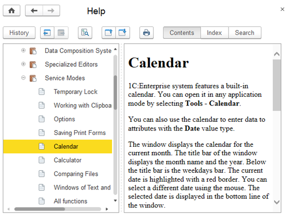
Fig. 293. Help content
The tree of topics is generated automatically and includes both 1C:Enterprise help and application help. This may include manuals for specific sections of the application.
You can expand or collapse each tree branch.
- (plus sign) in a branch node indicates that this branch can be expanded. To expand a tree branch, click the plus sign or double-click the topic name. Once you expand a branch, the + (plus sign) is changed to - (minus sign). To collapse a branch, click - (minus sign) next to it.
To expand all of the tree branches, select the root topic in the tree and press * on the numeric keypad.
The first level of the tree includes section names.
To reach a specific topic, you may need to expand multiple nested branches sequentially.
To navigate through the topics, you can use the topic tree or the Help window toolbar.
To view topic text, select the topic in the tree and press Enter. The right part of the window displays the topic text.
To navigate through the topic text, you can use arrow keys or press Page Down or Page Up.
If the topic text is long enough, use scroll bars to the right and at the bottom of the window.
The buttons in the Help window toolbar provide quick navigation between topics.
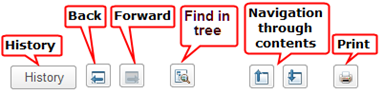
Fig. 294. Help window toolbar (left part)
To go to the next topic, click Go to next topic. If the next topic is located in a collapsed tree branch, the branch is expanded and the selection is moved to that topic. To go to the previous topic, click
To find the position of the current topic in the tree, click Find current topic in the tree.
If you viewed multiple help topics, you can navigate through them using the Go forward, Go back, and History buttons.
To print the current help topic, click Print. This opens the standard print dialog box.
10.1.2. Searching help
There are several methods for searching for help content.
Search by index. In the Help window command bar, click Index. The left part of the window displays the help topics.
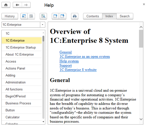
Fig. 295. Opening Help index
This opens an ordered list of help topics with a search field at the top. If you start typing a topic name in the search field, the cursor moves to the topic beginning with the search string.
When you find the topic, press Enter. This displays the topic text in the Help window.
If multiple topics match the search string, they are displayed in the Select topic window.
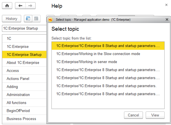
Fig. 296. Selecting a Help topic
Select a topic and click View.
Search in help. To find topics containing a specific string, on the main menu, click Help – Search help. This opens a search panel. The upper part contains a search field and a field that displays the search results.
To begin the search, type a text and then click Find (or press Enter). The application searches for topics that contain the search string. The search is not case-sensitive and matches whole words only (unless the search string contains the * operator), including all word forms. You can use search operators, see Search expressions form.
While you are typing, the help system displays the list of matching topics.
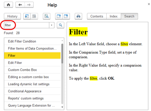
Fig. 297. Searching the Help
When you open a topic, the help system highlights the first occurrence of the search string in that topic.
To view a topic, select it in the list and press Enter. The description of the selected topic is displayed in the nearby field.
10.2. The "About 1C:Enterprise" window
To open the About window, on the main panel, click
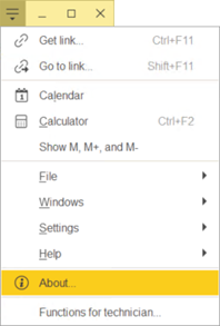
Fig. 298. Opening the "About 1C:Enterprise" window
The about program text can also be entered in the global search field.
This window displays general information about 1C:Enterprise and its startup options.
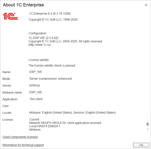
Fig. 299. The "About 1C:Enterprise" window
The window displays the following data:
-
1C:Enterprise version.
-
Configuration name and version, the list of configuration extensions, and the result of license validity check.
-
Infobase details:
-
Infobase name, as defined in the infobase list that is displayed during 1C:Enterprise startup.
-
Mode: file or client/server. Data compression mode is specified in parentheses. In slow connection mode, the "Slow connection" text appears in parentheses. This information is retrieved from parameters of the infobase specified in the infobase list.
-
Infobase directory and regional infobase settings.
-
Application (startup mode: Thick client, Thin client, or Web client). Connection speed, and data compression mode: none, normal, or enhanced.
-
Username of the current user. If the full name of the current user is specified, and it does not match the short name, the name of the current user is displayed in the following format: Short name; Full name.
-
Data about infobase and session localization.
-
1C:Enterprise client and server license information, which includes the current license and all the previous ones.
-
Information for technical support hyperlink, which displays the application info and the error log. To copy the information displayed in the window to the clipboard, use the context menu command or press
Chapter 11. Web client
This chapter covers operations with 1C:Enterprise web client.
Web client access to an infobase is available if the infobase is running on a server configured for web access.
A web client runs in a web browser. The following browser types are supported:
-
Google Chrome version 49 or later for Windows, macOS, and Linux.
-
Mozilla Firefox version 52 or later for Windows, macOS, and Linux.
-
Microsoft Internet Explorer version 11.
-
Safari version 4.0.5 or later for macOS version 10.5 or later.
-
Google Chrome for Android.
-
Safari Mobile for iPhone/iPad.
-
Chromium-based browsers:
-
chromium-gost version 49 or later for Windows, macOS, and Linux.
-
Microsoft Edge version 19 or later for Windows, macOS, and Linux.
-
Yandex Browser version 22 or later for Windows, macOS, and Linux.
You can embed a web client in a third-party website.
11.1. Starting the web client
To run the web client, enter the infobase address in the following format to the web browser address bar:
Where host is the address of the infobase website.
Once the infobase is loaded, a combination of characters specifying the language and country is added to the address. It looks like /aa_BB, where aa is the interface language ID and
Usually, additional setup of the browser is not required. In case of an error, make sure the browser settings are correct. For more information about browser setup, see Microsoft Internet Explorer setup, Mozilla Firefox setup, Setting up Google Chrome and Chromium with GOST support, and Safari setup.
You can run the web client and open an external link simultaneously. When you enter an external link to the web browser address bar, this loads an application and opens the link data.
For more information about links, see Using links.
Running multiple application sessions in a single browser is allowed. Each session will be located in a separate browser tab and use one client license.
11.1.1. Web client window
In the web client the application command interface looks similar to the thin client interface.
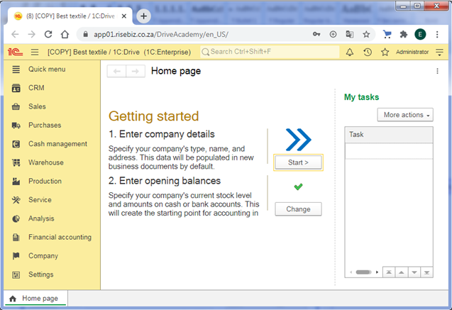
Fig. 300. Main window of the web client
When you switch between application areas (sections, lists, and so on) in the main window, the areas are stored in the application history.
To exit the application and load a blank web page, on the main menu, click File – Exit.
11.1.2. Printing in the web client
In the web client print form, near the Print button, click How to set print parameters. The respective help topic opens. This topic describes how to set up printing in your web browser.
11.1.3. File operations
File operations in the web client have some specifics that originate from web browser security models.
Without file system extension, all file system operations (downloading a file from the server, uploading a file to the server, deleting a file, and so on) are always performed interactively.
Some applications provide the option to enable the file system extension manually.
The file system extension allows both interactive and non-interactive operations with the file system.
Information about file system extension setup in browsers:
- For Microsoft Internet Explorer, see Installing file system extension.
- For Mozilla Firefox and Google Chrome, see Setting up 1C:Enterprise extension for Mozilla Firefox and Google Chrome.
11.2. Web client specifics
This section describes the features specific to the web client.
11.2.1. Saving documents
For web browser security reasons, all file system operations require manual confirmation.
If the file system extension is installed, every time you attempt to save a file to your disk, the web client displays the warning: Get file <path> from server?
If the file system extension is not installed, the standard browser dialog box is displayed instead.
11.2.2. Screen sharing (collaboration system)
Screen sharing is available for Google Chrome and Mozilla Firefox web browsers only.
Google Chrome. Functionality is supported for Google Chrome 72 or later. To start screen sharing, install 1C:Enterprise plug-in and use a secure https connection. The browser plug-in needs to be granted auxiliary rights (Screenshot Content). After the installation is finished, you need to refresh the page.
In addition to screen sharing, you can also share contents of your browser tab and window of open applications.
Mozilla Firefox. To start screen sharing, use a secure https connection.
11.2.3. Hardware settings in the Collaboration System
The hardware selection dialog box is supported in Google Chrome and Mozilla Firefox if a secure https connection is used or the web client is published at localhost. For more information about the hardware selection dialog box, see Setting up video and sound.
For the dialog box to function correctly, allow the website where the web client is published to access the camera and microphone.
The list of devices and their names may differ from the list in Thick client and Thin client startup modes.
Mozilla Firefox. The dialog box does not display the speaker selection field.
11.2.4. Other specifics
11.2.4.1. Selecting slow connection mode
To select slow connection mode, click Service and settings – Settings – Parameters. In the options dialog box, select the Enable slow connection mode on startup checkbox. The slow connection mode is enabled next time you run the web client.
11.2.4.2. File operations
-
To create only text documents or spreadsheet documents, click Service and settings – File – New in the main menu.
-
The file comparison mode is not supported.
-
The list of last opened files is not supported.
-
File preview is not supported.
11.2.4.3. Graphical schema operations
The web client supports opening, saving, and printing graphical schemas. Graphical schemas cannot be edited.
11.2.4.4. Managing spreadsheet documents
11.2.4.4.1. Spreadsheet document print settings
In the web client, spreadsheet documents are printed in PDF format by default. To print a document in HTML format, in the main menu, click Service and settings – Settings – Parameters. Then, in the Print method group, select HTML.
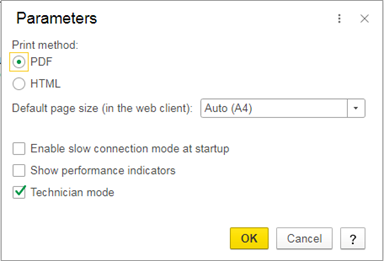
Fig. 301. Print method. The default option
The Default page size (in the web client) option sets the page size used for splitting a spreadsheet document into pages.
In Google Chrome, if Acrobat Reader is not installed, you might be prompted to install Acrobat Reader before printing.
11.2.4.5. Input fields
Depending on the application settings, the input field might have the autofill feature enabled. If the autofill is available for the field, you will see a hint.
11.2.4.6. Picture fields
In the web client, the picture preview window does not have commands for scaling. To stretch an image to fit window borders, on the Size menu, click Stretch proportionally.
11.2.4.7. Progress indicator window
In Mozilla Firefox, the progress indicator is refreshed upon each server query and upon completion of each 1C:Enterprise language command.
11.2.4.8. Other specifics
-
In the navigation panel, to collapse all command groups, press Ctrl + Alt + Shift + Num–. To expand all command groups, press Ctrl + Alt + Shift + Num+.
-
You cannot shut down the application by pressing Ctrl + Break or Ctrl + Alt + E if this option is available in other clients.
-
You cannot customize the view of charts, dendrograms, graphical schemas, and geographical schemas inserted in the table document.
-
Gantt chart customization options are limited.
-
Only a limited set of operating system fonts is available in the web client. Other fonts cannot be selected in the font selection dialog box. When they are used, they are replaced with supported fonts.
-
To access the main menu, press F10. Accessing the main menu using
-
Web browser scales other than 100% and custom dpi values are not supported.
-
When time-consuming operations are in progress, the pointer is not changed in the situations when such changes occur in other clients.
-
In Mozilla Firefox and sometimes in Microsoft Internet Explorer, the color of scroll bars of HTML document fields is the one specified in the operating system.
-
The effect of undo and redo commands in multiline input fields is different from their effect in other clients. In the web client, the browser determines the number of changes that are rolled back.
-
Pressing Shift + Del in a multiline input field deletes the entire line, while automatic text wrapping based on the input field width is ignored.
-
If a tooltip text includes line breaks, Mozilla Firefox displays spaces instead of them.
-
For multiline input fields and text document fields, the following commands are available on the Edit menu: Find and Replace.
-
Safari does not support add-ins and cryptography extensions.
-
The automatic user authentication with operating system tools is unavailable in Safari.
-
In Google Chrome and Safari, the option to edit headers or footers when printing documents is unavailable.
-
In Safari, the web client interface language matches the web browser interface language (unless it is overridden by a startup option).
-
In Google Chrome, the print setup and print preview dialog boxes are unavailable.
-
In Google Chrome and Safari, the Back/Forward commands of HTML document fields do not work if the field content is set as a string. They only work if the field content is set as a URL.
-
The calculator setup dialog box is not supported.
-
In the Functions for technician window, the only way to perform search is pressing Ctrl + F. This opens a search dialog box.
-
When printing a spreadsheet document in PDF format, if the document uses a non-standard page size and the document does not use the "fine print" mode, you should check before printing and, if necessary, set the required page size in the print dialog box of the web browser.
-
Speech recognition is not supported:
-
In a web client that is only accessible over HTTP and is not a localhost.
-
In a web client that runs in:
-
Google Chrome version 65 and earlier.
-
Microsoft Internet Explorer of any version.
-
Mozilla Firefox of any version.
-
Safari of any version.
-
Chromium-based browsers version 65 and earlier.
-
Outgoing videos in Mozilla Firefox during video calls always have a high quality.
11.2.5. iPad specifics
-
Use double tap instead of double-clicking. Use long tap (over 1 second) instead of right-clicking.
-
The on-screen keyboard may not open up automatically while editing a spreadsheet cell or a spreadsheet document (typing text in the input field). To display the keyboard, tap the cell input field again.
-
Dragging is not supported.
-
Navigation to the main window while auxiliary windows are open is not supported.
-
Printing is not supported.
-
Input fields do not have context menus.
-
Formatted document fields allow you to only view documents. Editing is unavailable.
· It is recommended that you close the web client using the close button in the upper right corner of the main window.
- File system extension, cryptography extension, and add-ins are unavailable.
11.3. Microsoft Internet Explorer setup
To get started in the browser, apply the following settings:
-
Start the browser.
-
In the Tools menu, select Browser properties.
-
In the window that opens, go to the Security tab.
-
Click Other.
-
In the window that opens:
-
In the Scripts section, set Active Scripts parameter to Allow or Enable.
-
Click OK.
-
Go to the Privacy tab. In the Settings section, click Advanced. In the First-party Cookies parameter, select Accept. In the Third-party Cookies parameter, select Accept. You can also click the Sites button in the Parameters section and specify the required parameters for infobase addresses.
-
Click the Advanced tab. In the Multimedia section, select the Show pictures checkbox.
If you intend to use add-ins (barcode scanner, electronic scales, and other), file system extensions, cryptography extensions and more, select the appropriate zone on the Security tab: Trusted sites or Local intranet, and then do the following:
-
On the Security tab, click Other.
-
In the Security Settings dialog box, select the ActiveX controls and plug-ins group. Under the group, Allow the following parameters by selecting Enable:
-
Automatic queries of ActiveX controls
-
Script ActiveX controls marked safe for scripting
-
Run ActiveX controls and plug-ins
-
Download signed ActiveX controls
-
In the same window (Security Settings), set
You can also configure ActiveX using the ActiveX Installation Service (for Windows Vista, Windows 7, Windows Server 2008, Windows Server 2008 R2). A detailed description of settings can be obtained:
-
For Windows Vista, Windows Server 2008: http://technet.microsoft.com/en-US/library/cc721964(WS.10).aspx.
-
For Windows 7, Windows Server 2008 R2: http://technet.microsoft.com/en-US/library/dd631688(WS.10).aspx.
11.3.1. Installing file system extension
Internet Explorer requires the ActiveX component 1C:Enterprise 8.3. File system extension for Internet Explorer (x86) or its x64 version. The component is a part of 1C:Enterprise platform but applications must provide the option to install it. If you do not have enough rights for installing the component, ask an administrator.
To be able to work with the component, the browser must have the rights for installation and use of signed ActiveX controls for the zone where the website is located.
For a list of MSXML module versions, limitations, and installation recommendations, see http://support.microsoft.com/kb/269238.
11.4. Mozilla Firefox setup
Before you run the web client in Mozilla Firefox, you have to configure its settings.
-
Click Options in the menu.
-
In the Privacy & Security panel, make the following settings:
-
In the Cookies and website data group, set the Allow cookies and website data parameter or add the addresses of the infobases to the exception list. To do this, click Exceptions….
Start 1C:Enterprise web client by typing the infobase address in your web browser address bar.
We recommend that you set up the web browser to ask you where to save files. To do this:
-
Select Settings in the browser menu.
-
Go to the Main section and perform the following settings:
-
Under the Downloads section, select the checkbox next to Always ask you where to save files.
To enable add-in support or cryptography operations, you have to install the browser extensions that provide these options.
The availability of browser extensions depends on the application settings.
11.4.1. Setting up 1C:Enterprise
To be able to perform all clipboard and cryptography operations, use files and add-ins in Mozilla Firefox, install the browser extension. If the extension is not installed, you will be prompted to install it when you attempt to use the clipboard (for example, when you copy a list item by pressing Ctrl + C).
To install the browser extension:
-
Click Install.
-
In the pop-up window, click Allow, then Add, and OK.
-
In the extension installation dialog box, click Install.
Clicking Cancel interrupts the extension installation and returns the focus to the previous window.
The browser extension can also be installed from Firefox extension store. Go to https://addons.mozilla.org/ru/firefox/addon/1c-enterprise-8-extension/ and follow the instruction on the website.
11.4.2. Automatic authentication
You can customize Mozilla Firefox for automatic OS authentication with some exceptions.
You can also apply these settings manually:
- In the address bar, type about:config.
- On the settings page, enter the name of the parameter in the search bar.
This setting can be performed for three parameters:
- network.automatic-ntlm-auth.trusted-uris.
- For some network and web server configurations, you might need to set values for the network.negotiate-auth.trusted-uris and network.negotiate-auth.delegation-uris parameters.
Next, specify a list of web servers used to connect to the 1C:Enterprise infobase. Read more about this feature in the article: HTTP authentication on MDN.
Below you can find information about the above mentioned parameters used with different authentication methods:
- Web server supports NTLM authentication.
If the name of the web server that is being accessed is listed in the list of names contained in the network.automatic-ntlm-auth.trusted-uris parameter, an automatic authentication will be attempted. If the name of the web server is not found, the browser will show a dialog box where you must specify the username and password of the user to access the web server.
- Web server supports Kerberos authentication.
In order to access the web server with this type of authentication, add the name of this web server to the network.negotiate-auth.trusted-uris parameter. For a file infobase, this is enough. If you need to provide users of web server with automatic authentication in 1C:Enterprise client/server mode, add the DNS name of this web server to the network.negotiate-auth.delegation-uris parameter.
11.5. Setting up Google Chrome and Chromium with GOST support
Before you run the web client in Google Chrome, you have to configure its settings.
-
On the browser menu, click Options.
-
Click Advanced.
-
Click Content settings.
-
In the Cookies section, select the Allow sites to save and read cookie data (recommended) checkbox or add infobase addresses to the exceptions list.
-
In the JavaScript section, select the Allowed (recommended) checkbox or add infobase addresses to the exceptions list.
We recommend that you set up the web browser to ask you where to save files. For that:
-
On the browser menu, click Options.
-
Click Advanced.
-
In the Downloads section, select the Ask where to save each file before downloading checkbox.
11.5.1. Setting up 1C:Enterprise extension for Mozilla Firefox and Google Chrome
Using the 1C:Enterprise extension, the web client might request permissions to access the clipboard and the hard drive for a specific website. The user decision is saved and can be later edited in the extension settings.
11.5.1.1. Customizing browser extension parameters
The set parameters can be changed using the Hard drive access and
You can find the specific application settings by entering the website address in the Search field.
You can also delete stored settings by clicking Delete website.
11.5.1.1.1. Calling the extension settings dialog box in Google Chrome
To call the extension settings dialog box, you can use one of the following methods:
- In the toolbar, click 1C:Enterprise extension – Parameters.
- In the menu, click Customization and management of Google Chrome – Advanced Tools – Extensions.
In the list of extensions on the 1C:Enterprise extension tile, click Details.
- Enter the following link in the browser address bar: chrome-extension://pbhelknnhilelbnhfpcjlcabhmfangik/options.html.
11.5.1.1.2. Calling the extension settings dialog box in Mozilla Firefox
To call the extension setup dialog box, click Open menu – Additions.
In the Manage my extensions list, next to the 1C:Enterprise extension item, click Menu (...) – Settings.
11.6. Safari setup
Before you run the web client in Google Chrome, you have to configure its settings. On the Safari settings menu, click Preferences and perform the settings:
- Allow JavaScript: on the Security tab, select the Enable JavaScript checkbox.
- Allow cookies: on the Security tab, in the Accept cookies group, select the Only from sites I visit checkbox.
We recommend that you configure the file download settings as follows: For that:
- In the Safari Settings menu, click Preferences.
- On the General tab, select the Always prompt before downloading checkbox.
11.7. Safari setting for iPad
Before you run the web client in Google Chrome, you have to configure its settings.
On the Home page, click Settings, and select Safari application. Configure the following settings:
-
Allow JavaScript:
-
In the Additions section, enable JavaScript.
-
Allow cookies:
-
Set the Block all cookies parameter to Disable.
11.8. Progressive web application
If an application is published over HTTPS and runs in Yandex Browser (version 22 or later), Microsoft Edge (version 73 or later), or Google Chrome (version 73 or later), it can be installed as a progressive web application. The progressive web application allows you to use the web client as an application on the user's device and use it offline by content caching.
The main menu of the web client will contain the Display as a separate application command.
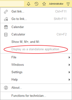
Fig. 302. Display as a separate application
If you click this command, you will be prompted to install the progressive web application. You can also click the installation icon on the right side of the browser address bar to start the installation.
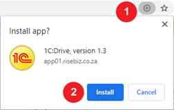
Fig. 303. Install the application
To install the application and open it in a new window, click Install.
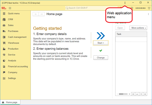
Fig. 304. Progressive web application
The web application menu contains standard web application commands.
The shortcut of the installed application will be available:
- In the Start menu and on the Desktop for Windows.
- In Dock for Linux and macOS.
Chapter 12. Search expressions form
You can search by multiple words, use search operators, or search by exact phrases.
By default, the search does not include search for synonyms and fuzzy search features. To access these features, use specific search operators.
The following table describes operators available both in the help search and in the full-text search in application data. If an operator is unavailable in any of these search types, it is explicitly stated in its description.
| Operator | Example | Description |
|---|---|---|
Space AND & | document entry AND document entry & document | Find topics containing both "entry" and "document" (any word forms). |
OR | , | entry OR document entry | document entry, document | Find topics containing at least one of the words, either "entry" or "document" (any word forms). |
| NOT | closing NOT month | Find topics containing "closing", but not "month" (any word forms). |
| NEAR/[±]n | Example 1: sale NEAR/3 product Example 2: sale NEAR/+3 product Example 3: sale NEAR/-3 product | Find topics that contain the specified words (in any word form), separated by n or less words. The sign determines the relative position of the second word ("+" if the second word comes after the first one, "-" if the second word comes before the first one). If the sign is not specified, the search returns topics that contain both words separated by n or less words. Their order does not matter. Example 1 returns topics where "product" comes before or after "sale", separated by 3 words or less. Example 2 returns topics where "product" comes after "sale", separated by 3 words or less. Example 3 returns topics where "product" comes before "sale", separated by 3 words or less. |
| NEAR | Posting NEAR document | A simplified version of the previous operator. Find topics where both words are present, separated by maximum of 8 words, their order does not matter. |
| "" | "document posting" | Find the exact word sequence, each word can have any word form (equivalent to: document NEAR/+1 posting). |
| () | (post | create) & (account, document) | Use to specify the order of operators (the number of nesting levels is not limited). |
| * | docu* | A wildcard replacing the end of the word. The search string must contain more than 1 significant character. The "docu*" query finds "document", "documenting", "documentation", and so on. If the search index finds over 300 words beginning with "docu", the system prompts you to clarify the query. If the full-text query contains an asterisk * in quotation marks, * is considered an ordinary character. For example, the search for "arch*" in quotation marks returns "arch*". In the full-text search, you can use an asterisk * only once and it must be at the end of the word. So, the search for "arch*" returns "archaeology". In the help search, you can use an asterisk * several times and in any part of the word. For example, "*oc*nt*". |
| ~ | ~System System~2 | Fuzzy search for words with the specified number of differences from the search string (1 if the number is omitted). "~System" query (equivalent to "System~1") finds "systwm" and "sydtem". "System~2" query finds "syttwm" and "suttem". This operator is supported in the full-text search. It is not supported in the help search. |
| ! | !red tile | Find synonyms (supports English, Russian, and Ukrainian). "!" should precede the word whose synonyms you want to find. For example, the search for "!red tile" finds "scarlet tile" and "coral tile" as well. This operator is supported in the full-text search. It is not supported in the help search. |
If the search string does not include any operators (the words are separated by spaces), the spaces are treated as AND operators.