- Overview
- Starting applications and the home page command interface
- Tables
- Tabs and navigation panels
- Spreadsheets
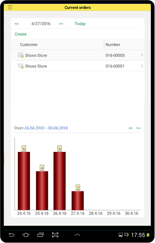
The mobile platform interface is designed to provide applications with the look and feel that is natural to the system where they are running: iOS, Android, Windows smartphone or tablet. Designed for the modern user, the interface is user-friendly and organic. At the same time, the mobile platform interface looks very similar to the Taxi interface of 1C:Enterprise desktop applications.
Overview
The mobile platform interface is based on the newest mobile interface trends, which may look unorthodox to the desktop developers. Shortly, the design should not compete with the content. Instead, the design should help to grasp the content.
Currently, many mobile application developers tend to avoid brightly colored backgrounds, gradients, text box, and button borders. These days the interface is purely text and pictures. And pictures are losing bright colors, too. They tend to be flat, unshaded, drawn with a single color. This makes them similar to font characters.
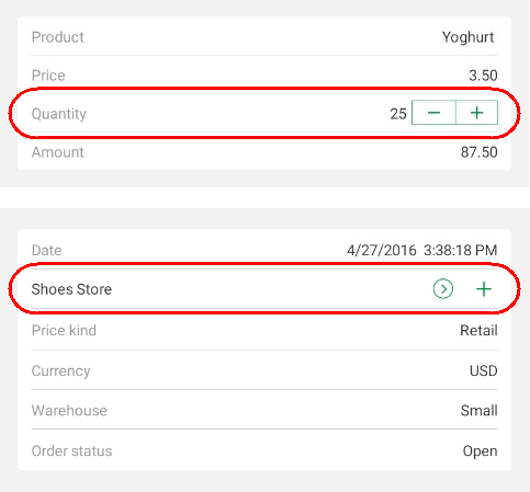
The mobile platform also uses this approach. For example, the increment/decrement, opening, and selection buttons look as follows:
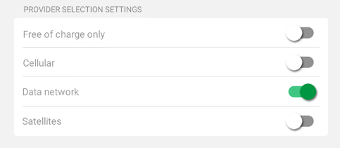
A flag field (a field that can have exactly two states) has a look that is specific to mobile interfaces:
You can see that many form items do not have borders. Horizontal separators are used instead, making the application look very similar to a school exercise book.
Field titles, field values, and button titles differ only by color and meaning. Field titles are gray, field values are black, and button titles are green. For some fields, titles are replaced with input hints. This saves the screen space:
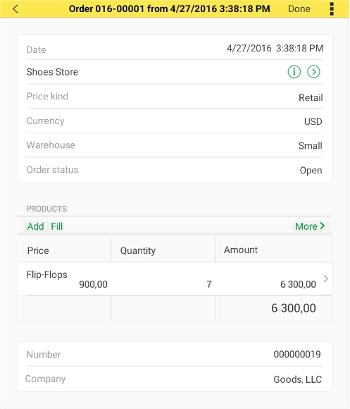
The buttons stand out because of their green titles and clear call to action, like Add.
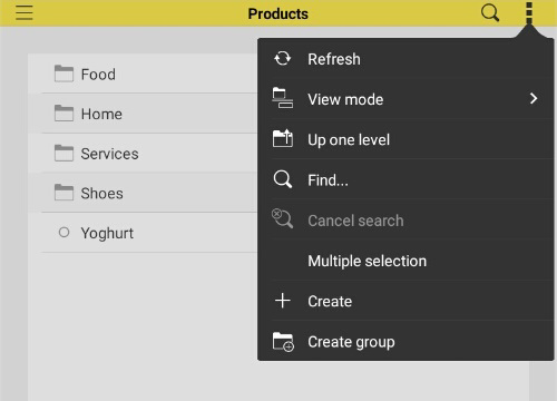
The window caption saves more space because it contains the form command bar, while the full list of commands is available as a drop-down list:
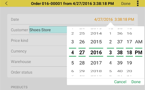
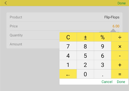
Input fields are often implemented as buttons. Especially date input, number input, and selection fields. The easiest way to input data on a mobile device is scrolling and tapping large buttons, while typing is less convenient. That is why date input involves a spin-wheel date picker and number input involves a calculator:
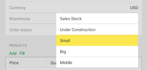
Text input fields that support quick selection do not provide the option to enter text at all, they behave like big selection buttons:
Starting applications and the home page command interface
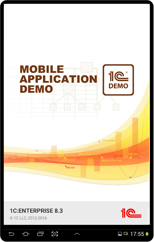
When you start an application, a full-screen splash picture is displayed. A few moments later, a 1C logo and a copyright notice appear at the bottom, overlapping the splash screen:
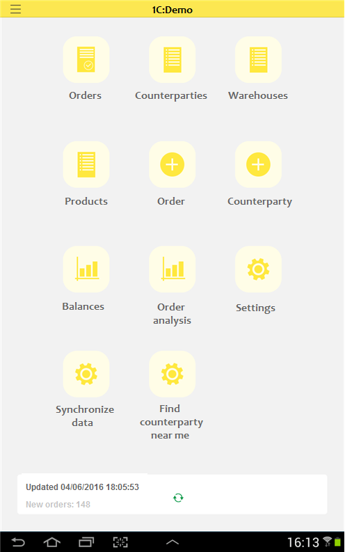
A mobile application home page is a menu with large buttons. The buttons (each button includes an icon and a name) represent the main section commands. To start their work, users tap these buttons:
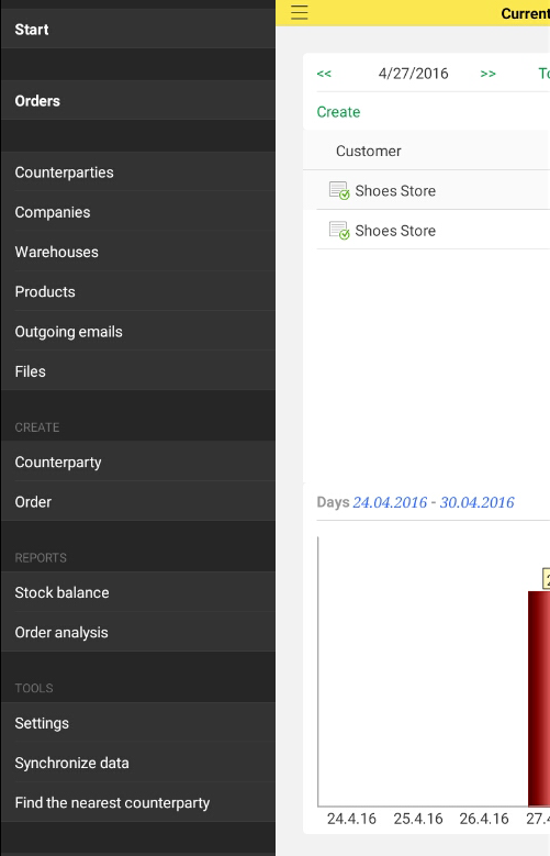
The function menu can be opened not only by tapping a button but also by swiping right:
Tables
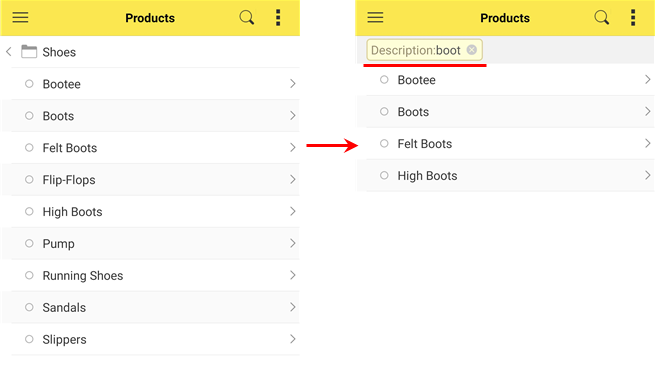
Form tables have a search button. When you search for a specific string, the table is filtered showing only the rows that match the search:
You can order table rows using gestures and select multiple rows.
A table command enables row ordering. Then you can drag table rows to order them:
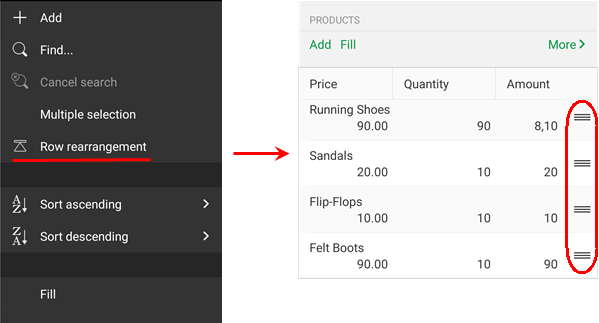
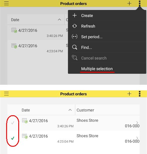
Another table command enables multiple selections. Then you can mark several rows and select a command that will affect all of the selected rows:
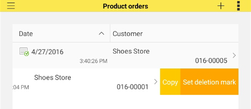
To view a row's context menu, pan a row to the left:
Tabs and navigation panels
The mobile platform provides several options for displaying form tabs. One of these options, the flicking, is unique to the mobile platform:
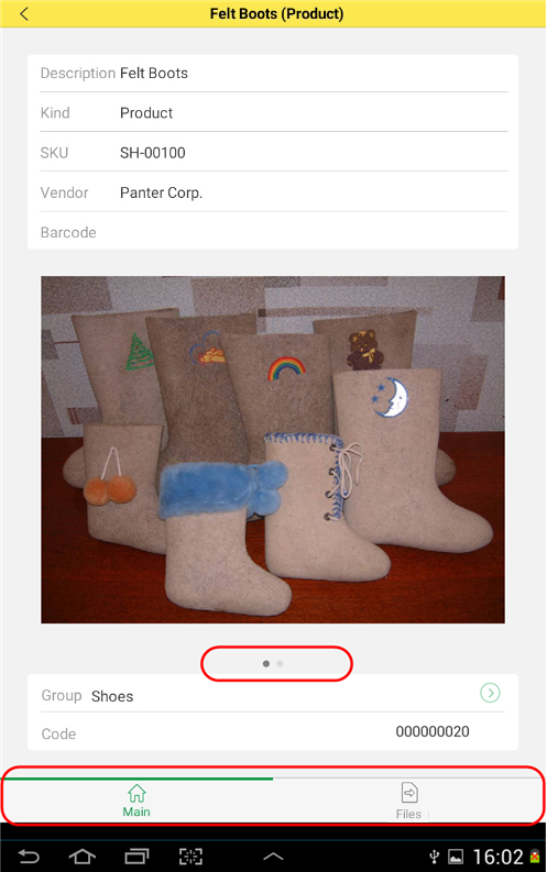
In this mode, tabs are shown as dots at the bottom. Tab names or icons are not displayed. You can flick through the tabs, which is similar to using the main menu of a mobile device.
Spreadsheets
In a spreadsheet, you can select a cell range, and then a context menu pops up. The menu commands include copying the selected area to the clipboard, viewing details, and more.
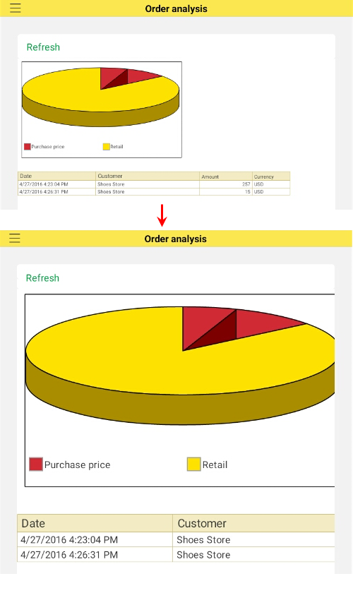
You can change the spreadsheet scale in the range between 50% and 300% by pinching or stretching the spreadsheet:
Next page: Mobile platform architecture
See also: