Look at the Daily chart report. In general, it is fine, but a user may be confused about some technical information, the format of dates, and the legend. In addition, it would be much better to be able to see points of the plot directly on the chart, not only when hovering over them with the mouse.
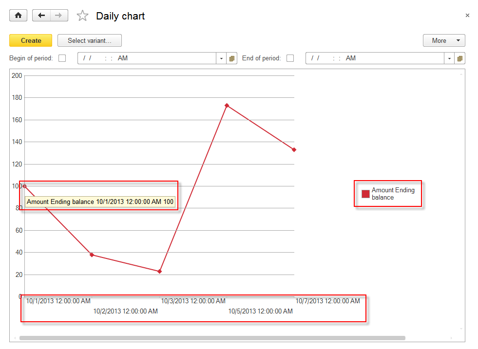
Figure 8-60. Daily chart report
It is easy to improve this chart. In Designer mode, open the MainDataCompositionSchema template for this report.
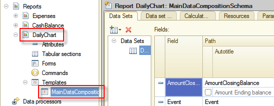
Figure 8-61. MainDataDompositionSchema of the Daily chart report
On the Data sets tab, adjust the legend by editing titles of AmountClosingBalance and Period fields. In addition, for Period field set a more user-friendly date format.
Next, set the title of the AmountClosingBalance field to Balance. To be able to do this, find this field in the list of fields and then select a checkbox on the left to the title that you want to edit. The autotitle caption of this column will automatically change to Title. Then instead of Amount Ending balance enter Balance.
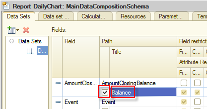
Figure 8-62. Setting the title of the AmountClosingBalance field
Do the same with the Period field, change its title to Date.
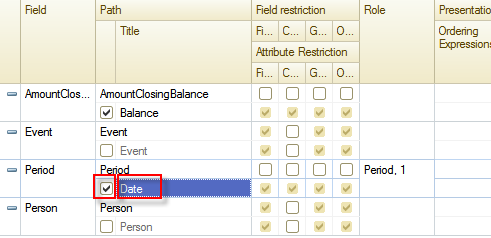
Figure 8-63. Setting the title of the Period field
Now for the Period field change the date format. Enter the appearance column of Period by clicking Select  .
.
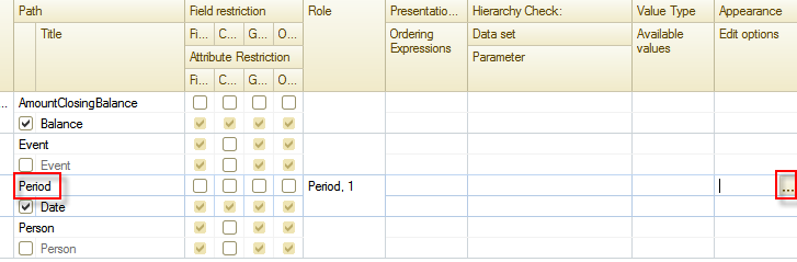
Figure 8-64. Editing the field appearance
Open the Field format editor, and find the Format property.
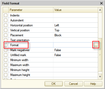
Figure 8-65. The Field format editor
Open Format String Wizard by clicking Select , and then click the Date tab and in the Date format field enter MM/dd/yyyy. After that, click OK.
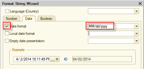
Figure 8-66. Format String Wizard
Next, click OK to close the Field format editor. After that value in the Appearance column on the Data Set tab for the Period field will look as follows:
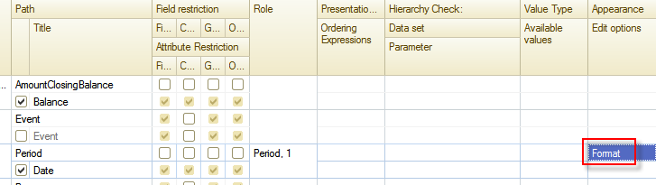
Figure 8-67. The adjusted Period field
The last thing is left to do is to adjust the view of plot points. To do this, click the Settings tab. Then, on the bottom tabs click the Other settings tab.
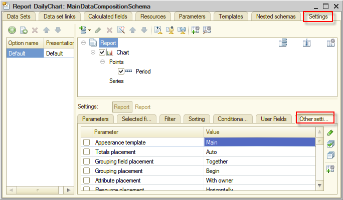
Figure 8-68. The Other settings tab
Find the Label list parameter under Chart type, and then from the drop-down list select Value.
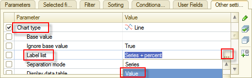
Figure 8-69. Selecting Value as a value of the Label list parameter of Chart type
Now, check it in 1C:Enterprise mode to see the result of changes.
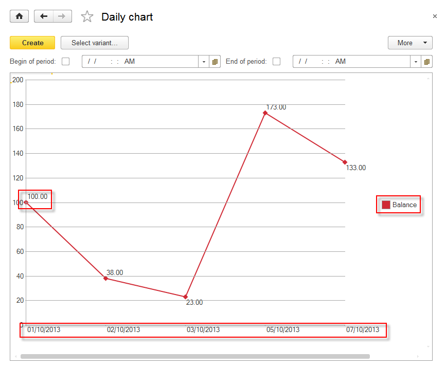
Figure 8-70. The adjusted chart
Excellent! Everything that was required is implemented. The chart shows meaningful legend and values are displayed next to plot points. This allows for analyzing finances easier.
Next page: Report variants