Let is add a chart to the report structure.
- On the Settings tab, in the command bar, click the Add
 button and then click New chart (fig. 13.103).
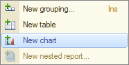
Fig. 13.103. Adding a chart to report structure - Click the Points branch and add a grouping by the Customer field to this branch.
Keep the chart series unchanged. A pie chart is perfect for displaying profit by customers and this chart type only requires specifying points, so you do not have to specify series.
The chart values always represent one or several report resources. - Click the Selected fields tab and include the Profit field in the report.
The report structure should look as shown in fig. 13.104.
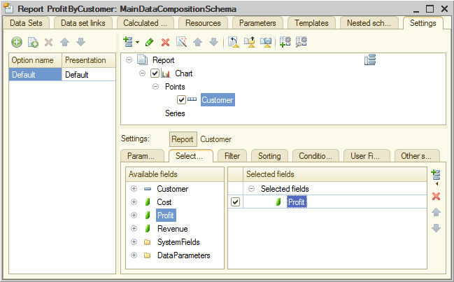
Fig. 13.104. Report structure and chart settings - Click the Other settings tab, set Chart type to Pie 3D and include Chart type in the list of quick user settings (fig. 13.105).
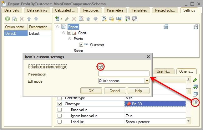
Fig. 13.105. 3D pie chart - Enter the Profit by customer report title.
Finally, let us specify the subsystems where the report is available. - Close the data composition schema wizard and then, in the editor of the ServiceList report configuration object, click the Subsystems tab.
- Select the Accounting and Services checkboxes.